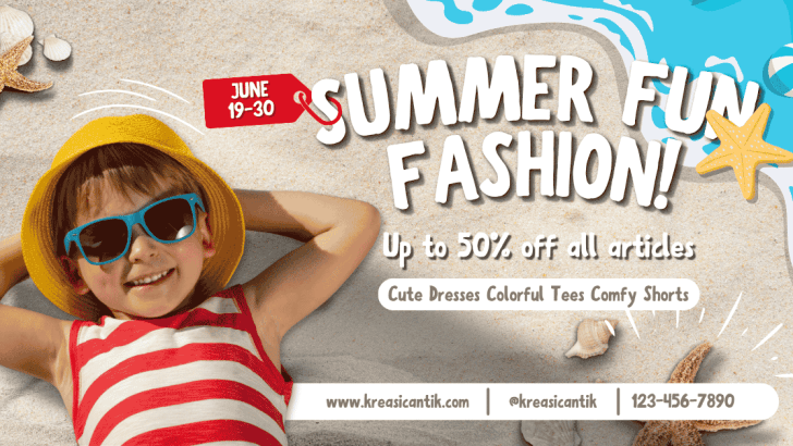
Applying the right summer sale typography tips for posters and social media can make a seasonal promotion easier to notice, understand, and remember. Bright colors and tropical visuals may create the summer mood, but typography communicates the actual offer. It tells customers what is on sale, how much they can save, and what they should do next.
A strong summer campaign should feel lively without becoming difficult to read. Whether you are designing a store poster, Instagram post, Story, banner, or digital advertisement, every font choice should support the message. The goal is to create excitement while keeping the promotion clear and trustworthy.
Start With a Clear Summer Sale Message
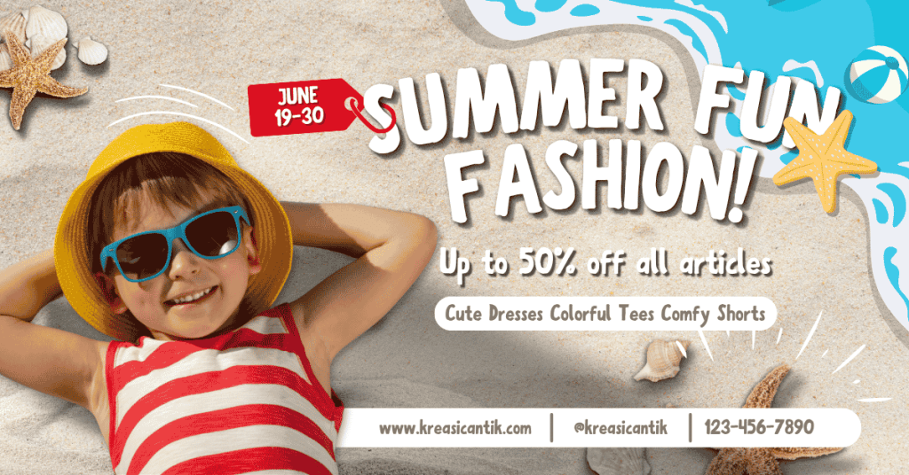
Before choosing a font, decide which message deserves the most attention. A poster cannot emphasize every line equally.
Your main message might be:
- Summer Sale
- Up to 50% Off
- Limited Summer Collection
- Weekend Beachwear Deals
- Shop the New Season
Keep the headline short so it can remain readable at a large size. Supporting details, such as the promotion period and product category, should appear below it in a smaller style.
A clear message also makes the design easier to adapt. You can reuse the same typographic structure across posters, Instagram posts, Stories, and website banners without rewriting the entire campaign.
Create a Strong Typography Hierarchy
Typography hierarchy guides viewers through the design in a logical order. They should notice the campaign name first, followed by the discount, supporting details, and CTA.
Make the Headline the Main Focus
Use your most distinctive typeface for the primary headline. A bold serif can create an editorial summer mood, while a clean sans-serif may feel more modern and casual. The headline should be large enough to remain visible when the social media post appears as a small thumbnail. Avoid making it too long, especially when working with square or vertical formats.
Highlight the Discount Clearly
Customers often look for the discount before reading anything else. Make “50% Off,” “Buy One Get One,” or “Special Price” easy to find. You can use a heavier weight, a larger size, or a contrasting color. However, do not apply all three treatments to every text element. Selective emphasis creates a cleaner and more convincing layout.
Keep Supporting Information Simple
Dates, product details, terms, and locations need a more readable font. A simple sans-serif is often suitable because it stays clear at smaller sizes. Keep supporting copy brief. Instead of writing a long paragraph, use direct phrases such as “Valid Until August 31” or “Selected Items Only.”
Choose Fonts That Match the Summer Mood
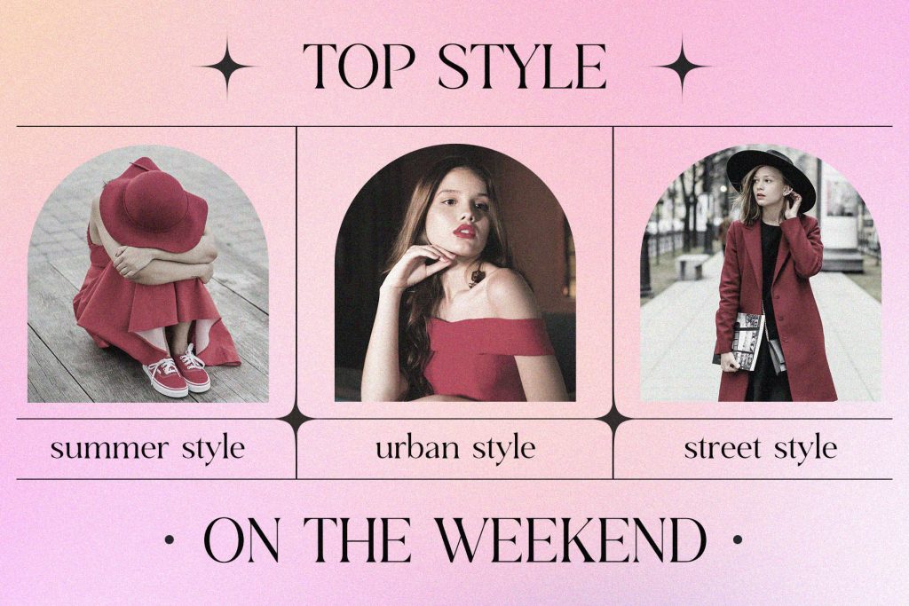
Summer typography does not need to look playful in every campaign. The font should match the brand, product, and target customer. A fashion boutique may use an elegant serif to create a refined seasonal identity. A surf shop could choose a bold display font with a more relaxed personality. Meanwhile, a wellness or skincare brand may benefit from soft, clean letterforms.
For curated font inspiration, explore Best Fonts for Summer Sale Posters That Feel Fresh and Exciting. The article can help you compare typefaces for coastal, fashion, lifestyle, and modern promotional designs.
Use Font Pairing With Restraint
Two complementary fonts are usually enough for a summer sale design. One font can handle the headline, while another supports prices, descriptions, and CTA text.
Pair an Expressive Font With a Simple Font
A decorative serif or display font can make the campaign memorable. Pair it with a clean sans-serif to maintain readability. For example, use an elegant serif for “Summer Collection” and a modern sans-serif for “Up to 40% Off.” This pairing creates contrast without making the layout feel chaotic.
Avoid Competing Font Personalities
Do not combine two fonts that both demand attention. A script font, decorative serif, and bold display typeface in one design may create confusion. If the headline font already has dramatic details, keep the supporting typeface neutral. This allows each style to perform a clear role.
Adjust Typography for Social Media Formats
A typography system that works on a large poster may not work in an Instagram Story. Each format has different viewing conditions.
Instagram Posts
For square or portrait posts, place the headline where viewers can notice it immediately. Keep important text away from the edges because platform previews may crop part of the image. Use fewer words and stronger contrast. The design should still make sense when viewed quickly in a crowded feed.
Instagram Stories
Stories require larger text because viewers usually see them on smaller screens. Keep the headline and CTA within safe areas, so interface buttons do not cover them. A short message such as “Summer Sale Ends Tonight” often performs better than several lines of promotional text.
Printed Posters
Printed posters can include more information, but the main offer should remain visible from a distance. Test the design at its actual size and step away from the screen or print sample. If you cannot identify the headline and discount quickly, the hierarchy needs improvement.
Use Spacing to Improve Readability
Good typography depends on more than font size. Line spacing, letter spacing, and margins also affect how the promotion feels. Give the headline enough space around it. Crowded text can reduce its impact, even when the font is attractive. Avoid using extreme letter spacing for long phrases. Wider spacing may suit short labels such as “SUMMER SALE,” but it can make smaller information harder to read. Whitespace also helps bright colors and seasonal imagery feel more organized. You do not need to fill every empty area with text, stickers, or decorative icons.
Match Text Color With the Background
Summer campaigns often use photographs of beaches, pools, clothing, food, or travel destinations. These images may contain many colors and details. Make sure the text has enough contrast. White lettering may work over a dark sunset, while deep navy or black can remain clear against pale yellow and light blue backgrounds. When the photograph is too busy, add a soft overlay or place the text inside a simple shape. This approach improves readability without hiding the seasonal visual.
Write a Clear Call to Action
The CTA should tell customers exactly what to do next. Use direct wording such as:
- Shop the Summer Sale
- Explore the Collection
- Get the Offer
- Visit Us Today
- Save Before It Ends
Make the CTA visible, but do not allow it to compete with the main headline. A contrasting button, bold weight, or clean text block can give it enough emphasis.
Build a Consistent Summer Campaign
Effective summer sale typography should remain consistent across every channel. Use the same headline font, supporting typeface, hierarchy, and tone on posters, Stories, posts, banners, and landing pages.
This consistency helps customers recognize the campaign and makes the promotion feel more professional. It also saves time because designers can adapt one visual system instead of creating unrelated layouts.
Ready to develop a more attention-grabbing seasonal style? Read Summer Poster Design Trends: Typography Techniques That Capture Attention for more ideas on layouts, hierarchy, and type treatments that can make your next summer campaign feel fresh, cohesive, and ready to convert.
