
Understanding kerning in typography is essential for anyone who wants to create polished and professional designs. Kerning may seem like a small detail, but it has a powerful impact on readability, balance, and visual harmony. Designers who ignore kerning often end up with awkward letter spacing that weakens the overall layout.
In this complete guide, we’ll explore the history of kerning, its purpose and benefits, when to use it, the difference between manual and automatic kerning, and how kerning differs from tracking.
The History of Kerning in Typography
Kerning in Metal Type
In traditional printing, letters were cast in metal blocks. Some letter combinations, such as “A” and “V,” created uneven gaps when placed side by side. To fix this, printers physically trimmed or adjusted parts of the metal type so letters could fit closer together. This manual adjustment was called kerning.
The term “kern” originally referred to the part of a metal letter that extended beyond its block to overlap another character.
Digital Evolution of Kerning
With the rise of desktop publishing and digital fonts, kerning became software-based. Instead of trimming metal pieces, designers now adjust spacing inside design programs.
Modern fonts include built-in kerning pairs, allowing software to adjust specific letter combinations automatically.
If you want to revisit typography fundamentals, you may read: What Is Typography? Definition, Examples, and Practical Uses
The Purpose of Kerning in Typography
Kerning improves visual consistency between individual letters. Even when letters are technically spaced evenly, they may not look visually balanced. Some shapes create optical illusions that make spacing appear too wide or too tight.
Kerning in typography ensures:
- Balanced spacing between letters
- Improved readability
- Professional appearance
- Visual harmony in logos and headlines
Without proper kerning, words can look awkward or poorly designed.
Benefits of Proper Kerning
Small adjustments can dramatically improve your layout.
1. Enhanced Readability
Balanced spacing prevents distracting gaps that interrupt reading flow.
2. Stronger Brand Identity
Logos with refined kerning feel premium and intentional.
3. Improved Aesthetic Balance
Kerning enhances symmetry and visual rhythm.
In branding, especially logo design, kerning in typography can define the difference between amateur and professional work.
When Should You Use Kerning?
Headlines and Display Text
Large text sizes make spacing issues more noticeable. Kerning is especially important in:
- Logos
- Posters
- Website hero sections
- Magazine titles
Typography in Branding
Brand names must look balanced. Designers often manually adjust kerning to ensure harmony between letters.
Short Words or All-Caps Text
All-caps text often requires extra kerning adjustments to avoid tight or uneven spacing.
Manual vs Automatic Kerning
Modern design software offers automatic kerning features. However, manual adjustments still play an important role.
Automatic Kerning
Most fonts contain predefined kerning pairs. When kerning is set to “metrics” or “optical,” software automatically adjusts spacing between certain letter combinations.
Advantages:
- Fast and efficient
- Consistent with font design
- Ideal for body text
However, automatic kerning may not always produce perfect visual balance.
Manual Kerning
Manual kerning allows designers to adjust spacing between specific letters.
Advantages:
- Greater control
- More precision for logos
- Better customization for display text
Manual kerning is often necessary for branding projects.
Kerning vs Tracking: What’s the Difference?
Many beginners confuse kerning with tracking.
Kerning in Typography
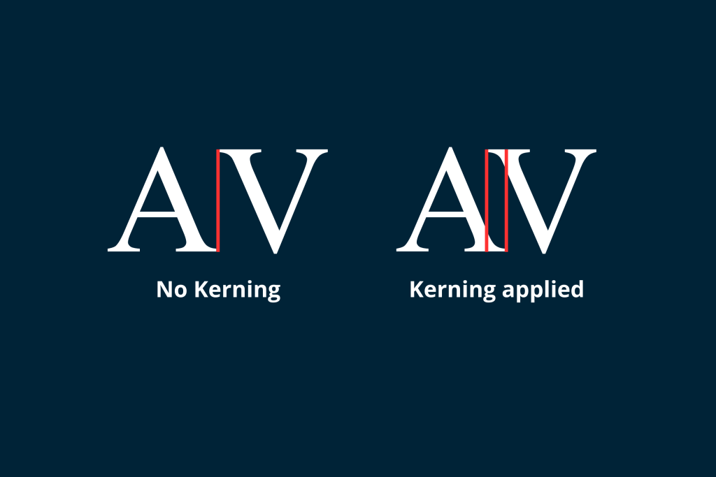
Kerning adjusts the spacing between individual letter pairs.
Example:
Adjusting spacing between “A” and “V” only.
Tracking in Typography
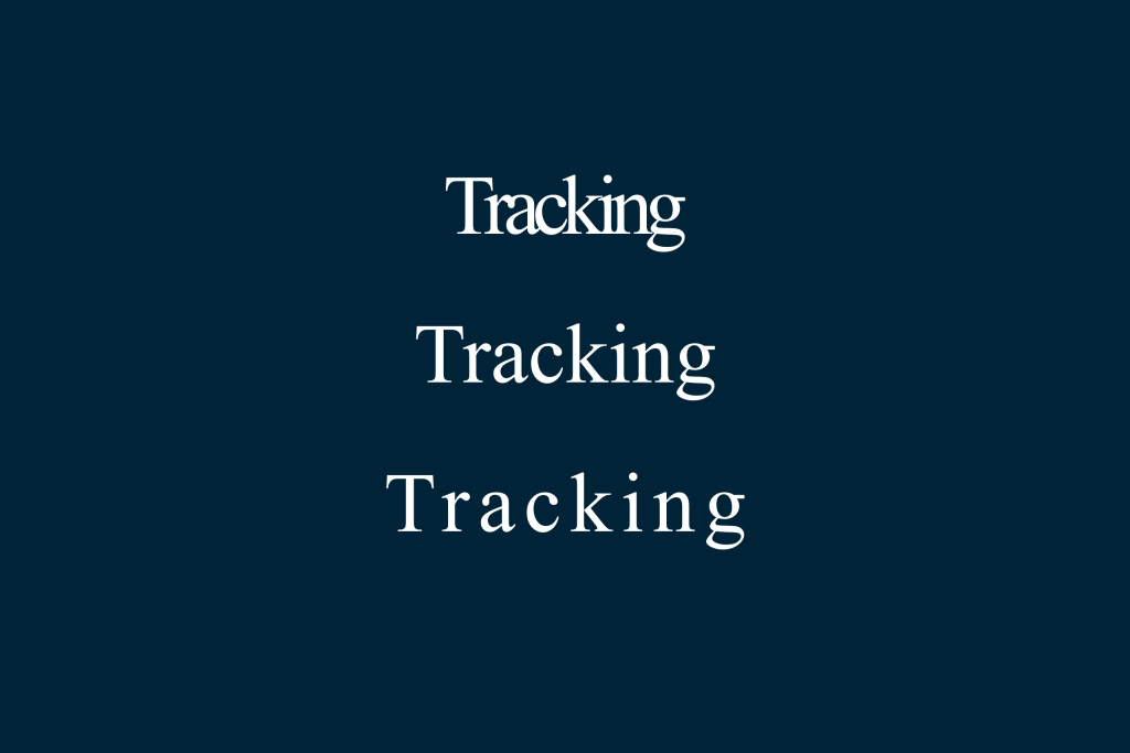
Tracking adjusts spacing evenly across an entire word or block of text.
Example:
Increasing spacing across all letters in a headline.
Key Difference
Kerning = selective spacing
Tracking = overall spacing
Both are important, but they serve different purposes.
Practical Examples of Kerning
Problem Letter Pairs
Some letter pairs naturally create uneven space:
- AV
- WA
- To
- Ly
- Ta
These combinations often require kerning adjustments to look visually balanced.
How to Check Your Kerning
1. Zoom Out
Viewing text from a distance reveals uneven gaps.
2. Flip the Design
Turning text upside down helps you focus on spacing rather than meaning.
3. Compare Shapes
Look at the negative space between letters. The white space should appear consistent.
Why Kerning Is Essential for Designers
Typography communicates more than words. It reflects quality, precision, and professionalism.
When kerning is handled carefully:
- Designs feel intentional
- Logos look refined
- Headlines appear balanced
- Brand identity strengthens
Design is often about subtle adjustments. Kerning is one of those subtle but powerful tools.
Final Thoughts on Kerning in Typography
Understanding kerning in typography gives designers greater control over visual balance and readability. From its origins in metal type to modern digital tools, kerning has always been about improving harmony between letters.
Whether you rely on automatic kerning or adjust spacing manually, attention to detail matters. Combined with proper tracking and hierarchy, kerning enhances both aesthetics and communication.
Typography excellence lives in the details. Mastering kerning helps transform ordinary text into a refined design.