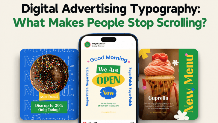
Strong digital advertising typography can make the difference between an ad people ignore and one that makes them pause. On social media, users move quickly through feeds filled with images, videos, promotions, and branded content. Typography has only a few seconds to communicate the message and create enough curiosity to earn attention.
A beautiful font alone is not enough. The most effective advertising typography combines readability, contrast, hierarchy, and personality. It helps viewers understand the offer before they decide whether to click, swipe, or continue scrolling. For brands, this means typography should not be treated as decoration. It should work as part of the communication strategy.
What Makes Digital Advertising Typography Stop the Scroll?
Use a Headline That Can Be Read Instantly
The headline should communicate one main idea. Avoid filling the first visual with several competing messages.
Instead of writing a long sentence, focus on a short phrase such as:
- Refresh Your Living Space
- Summer Deals Up to 40% Off
- Build a Brand People Remember
The shorter the headline, the more space you have to make it visually strong.
Use enough font size and contrast so users can understand it without zooming. This is especially important for Instagram, Facebook, TikTok, and mobile display ads.
Create Clear Visual Hierarchy
Not every piece of text should have the same importance. A simple advertising hierarchy may include a large headline, medium supporting line, smaller product detail, and clear CTA. Viewers should understand this order immediately. Avoid making every sentence bold or oversized. When everything demands attention, nothing becomes the focus. Instead, decide which message should be noticed first. Then use font size, weight, spacing, and placement to guide the eye toward supporting information.
Choose Fonts That Match the Advertising Message
Modern Sans Serif for Clean Campaigns

Sans serif fonts are useful for technology, lifestyle, furniture, fitness, beauty, and modern consumer brands. Their clean structures often remain readable even in compact social media layouts. They also work well when the advertisement includes detailed photography. A simple typeface can provide contrast without competing with the product.
Serif Fonts for Premium Positioning

Serif fonts can create a more editorial or sophisticated feeling. They may work well for fashion, luxury interiors, hospitality, beauty, and premium products. Use them for short headlines where their details remain visible. For smaller information, consider pairing the serif with a simpler sans serif.
Display Fonts for Strong Personality
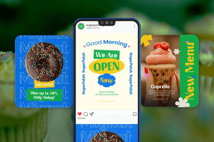
A distinctive display font can help a campaign feel more memorable. This approach works particularly well when brand personality is an important part of the advertisement. However, readability should remain the priority. Use expressive fonts for short phrases rather than product descriptions or long promotional details.
For practical inspiration related to lifestyle advertising, explore Best Fonts for Living Spaces Couch Ads and Social Media Creatives to see how font personality can support furniture and home-focused campaigns.
Use Contrast to Make Text Stand Out
An interesting font will not help if viewers cannot see it clearly. Text needs enough contrast against photographs, videos, gradients, or colorful backgrounds. Light text may work well over darker photography, while dark lettering usually performs better on pale backgrounds. If the image is visually busy, consider placing text inside a simple block or adding a subtle overlay behind it. Do not sacrifice readability simply to preserve every detail in the background image. The advertising message should remain easy to understand.
Keep the Copy Short and Typographically Strong
Digital advertising is not the place for long paragraphs. Short copy gives typography more room to breathe. It also allows designers to use larger type sizes and stronger spacing.
Focus on Benefits
Rather than listing several technical features, highlight the benefit that matters most.
Instead of:
“Made from premium materials with several available colors and multiple configurations.”
Try:
Designed for Comfortable Everyday Living
Supporting text can explain the details afterward. This approach gives the typography a clearer role and makes the message more emotional.
Highlight Numbers and Offers
Discounts, prices, dates, and percentages are easy scanning points. Use typography to make them visible.
For example:
50% OFF
3 DAYS ONLY
FROM $29
A heavier font weight or larger type size can make these details easier to notice.
Design the CTA as Part of the Typography
The call to action should feel connected to the rest of the layout.
Use direct phrases such as:
Shop the Collection
Get the Offer
Explore More
Book Today
CTA text should be easy to identify but should not overpower the main headline. A button shape, contrasting background, or medium-bold font can provide enough emphasis. Place the CTA where the viewer naturally reaches it after reading the main message.
Adapt Typography for Different Social Platforms
One advertising layout cannot always be copied directly across every platform. A square Instagram post may offer enough space for a larger headline and supporting copy. A vertical Story requires careful placement so interface elements do not cover the text. Mobile ads should use larger typography than desktop creatives because the viewing area is smaller. Always test the design at its actual display size. Zooming into a design program can make tiny text look more readable than it really is.
Keep Typography Consistent With Brand Identity
Advertising should attract attention, but it should still look like it belongs to the brand. Use consistent typefaces, weights, and spacing across campaign variations. This makes different creatives feel connected even when the images or promotional messages change. Consistency can also improve recognition over time. Customers may begin to associate a particular typographic style with the company before they even notice the logo.
For a broader approach to building this consistency, read Best Fonts for Business Advertising to Build a Strong Brand Identity and explore how typography can support brand recognition across different advertising channels.
Make the First Few Seconds Count
Effective digital advertising typography does more than make an ad look attractive. It helps people understand the message quickly.
Start with a short headline, create a clear hierarchy, use strong contrast, and choose fonts that match the brand personality. Keep supporting information brief and make the CTA easy to recognize. The goal is not to use the loudest font possible. It is to create enough visual interest to stop the scroll while making the message effortless to understand.
