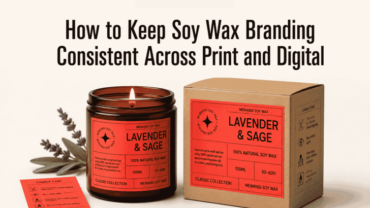
Learning how to keep soy wax branding consistent across print and digital can help a candle business look more professional, trustworthy, and memorable. Customers may first discover a soy wax candle through Instagram, an online shop, a printed label, or a market display. Wherever that first interaction happens, the brand should feel familiar.
Consistency does not mean every design must look identical. Instead, the same personality should appear across candle labels, packaging boxes, websites, social media posts, advertisements, thank-you cards, and product photography. When these elements work together, customers can recognize the brand more easily and feel more confident about buying.
Why Consistency Matters in Soy Wax Branding
Soy wax candle brands often sell more than fragrance. They also communicate a lifestyle, atmosphere, and emotional experience. A candle may represent relaxation, mindful living, warm interiors, sustainability, or thoughtful gifting. If the packaging feels calm and premium but the website looks colorful and playful, customers may receive mixed signals. The same problem happens when a social media campaign uses different fonts, colors, and image styles from the product label.
A consistent identity reduces that confusion. It makes every touchpoint feel connected to one clear brand story. Consistency can also improve customer recall. A shopper who sees the same typography and color palette on a candle jar, Instagram post, and website banner is more likely to remember the brand later.
Define the Soy Wax Brand Personality First
Before designing print or digital materials, decide what the brand should communicate.
Choose Three to Five Brand Keywords
Start by selecting a few words that describe the desired identity. For example:
- Calm
- Natural
- Refined
- Warm
- Minimal
Another candle brand may choose playful, colorful, handmade, youthful, and friendly. These words should guide future decisions about fonts, colors, photography, packaging materials, and copywriting. Whenever you create a new design, ask whether it reflects those keywords. This simple check can prevent the visual identity from drifting over time.
Understand the Target Customer
A premium soy wax candle for luxury interiors needs a different branding approach from an affordable candle made for casual gifting. Think about the customer’s taste, budget, lifestyle, and shopping habits. A younger audience may respond well to bold social graphics and informal copy. Meanwhile, customers looking for sophisticated home fragrance may prefer muted colors, refined typography, and editorial photography. A clear target audience makes it easier to build a consistent identity across different formats.
Build a Consistent Typography System
Typography is one of the most recognizable parts of a brand. It appears on product labels, packaging, websites, social media graphics, care cards, and advertisements.
Select a Primary Brand Font
The primary font should carry the main personality of the candle brand. You can use it for the logo, fragrance names, packaging titles, and campaign headlines. The main font should remain distinctive without becoming difficult to read.
A modern sans serif may communicate cleanliness and simplicity. A refined serif can create a more elegant and premium mood. Meanwhile, a softer display font may suit handmade or gift-focused products.
Add a Supporting Font
A second font can handle practical information such as ingredients, burn instructions, product descriptions, website text, and shipping details.
Choose a supporting typeface that complements the primary font. It should remain readable at smaller sizes and across different screens. Two font families are usually enough. Adding several unrelated fonts may make the brand feel inconsistent.
For more typography inspiration, explore Sans Serif Fonts for Clean Soy Wax Candle Packaging. The article explains how clean typefaces can support modern labels while keeping scent names and product details easy to read.
Keep Font Roles Consistent
Once each font has a role, use that system everywhere. For example:
- Primary font: logo, fragrance names, headlines
- Supporting font: descriptions, labels, website body text
- Bold supporting style: buttons, prices, short promotional details
This structure helps designers create new content without changing the visual direction every time.
Use One Recognizable Color Palette
Color helps customers identify a brand quickly. However, inconsistent color use can weaken that recognition.
Create a Core Palette
Choose two or three primary colors and a few supporting shades. A clean soy wax brand might use cream, charcoal, warm beige, muted green, or soft brown. Keep the main colors consistent on packaging, websites, email graphics, and social media templates. Supporting colors can help separate fragrance collections without changing the brand’s overall appearance.
For example, lavender candles may use muted purple, while citrus scents use soft yellow. The label structure and typography should stay the same so the products still feel like one collection.
Document Color Codes
Print and digital platforms use different color systems. Digital designs usually use RGB or hexadecimal codes, while printed materials often require CMYK or Pantone references.
Record each approved color in multiple formats. This helps prevent a warm cream website background from becoming a yellow-toned packaging box after printing. Always request print samples before producing a large quantity of labels or boxes.
Keep Packaging and Digital Layouts Connected
Printed packaging and digital content do not need identical dimensions. However, they should share the same design language.
Repeat Key Visual Elements
Use recurring elements such as border styles, spacing, icon shapes, botanical illustrations, or label structures. A small leaf icon used on the candle label could also appear in Instagram Story graphics or website dividers. These repeated details create familiarity without making every layout look copied.
Maintain the Same Hierarchy
The order of information should remain consistent. If the fragrance name is the main focus on the jar, it should also be prominent in online product images.
A typical hierarchy may include:
- Brand name
- Fragrance name
- Soy wax candle
- Fragrance notes
- Weight or burn time
Using this same order across packaging and e-commerce pages creates a smoother shopping experience.
Develop a Consistent Photography Style
Photography connects the physical product to its digital presentation. Even strong packaging can appear inconsistent when every photo uses a different mood.
Choose a Clear Visual Direction
Decide whether the photography should feel bright and airy, warm and cozy, dark and luxurious, or natural and handcrafted. Then maintain similar lighting, backgrounds, props, and editing across product images. A brand with soft beige packaging may use linen, wood, ceramics, and neutral interiors as supporting elements. Avoid switching between heavily saturated photos, dark cinematic images, and bright minimalist scenes without a clear reason.
Show the Product Accurately
Digital product images should reflect the actual label colors, materials, and proportions. Excessive filters may make the candle look different from what customers receive. Include a mix of clean product shots and lifestyle images. Clean photographs explain the product, while lifestyle scenes communicate the mood.
Keep the Brand Voice Consistent
Visual consistency is important, but the writing style should also feel connected.
Define the Tone of Voice
A calming candle brand might use gentle, sensory language. For example:
“Create a quiet evening with soft notes of white tea and cedar.”
A more playful brand could write:
“Light it, relax, and pretend your inbox does not exist.”
Neither tone is automatically better. The important part is choosing one that matches the brand and using it consistently.
Repeat Product Terminology
Use the same terms across packaging and digital content. If the label says “fragrance notes,” avoid changing it to “scent profile” or “aroma ingredients” without a reason.
Consistent terminology improves clarity and strengthens the product identity.
Create Reusable Brand Templates
Templates make consistency easier, especially when several people create content.
Develop templates for:
- Product labels
- Instagram posts
- Instagram Stories
- Promotional banners
- Email headers
- Product information cards
- Thank-you notes
- Market signage
Each template should already include approved fonts, colors, logo placement, spacing, and image areas. Designers can then update the content without rebuilding the brand style from the beginning. However, avoid making every social post identical. Use several flexible layouts within the same system.
Test the Brand Across Real Applications
A visual identity may look consistent in a presentation but perform differently in real use. Print the label at its final size and place it on the jar. View the website on a phone. Upload social graphics as drafts and check how they appear in a crowded feed.
Ask whether the logo remains clear, the fragrance name is easy to find, and the colors feel connected. Also review whether the brand remains recognizable without the candle itself in every image. Regular testing helps identify small inconsistencies before they become part of the final customer experience.
Build Recognition Through Repetition
Knowing how to keep soy wax branding consistent across print and digital comes down to creating clear rules and repeating them thoughtfully. Use the same brand personality, typography system, color palette, hierarchy, photography style, and tone of voice across every touchpoint.
Beatrice-style minimalism, neutral packaging, and calming product photography may work beautifully for one candle brand. Another may need friendlier typography, pastel color coding, and more playful social content. Consistency should support the brand’s unique identity rather than force every business into the same aesthetic.
