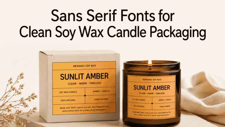
Choosing the right sans serif fonts for clean soy wax candle packaging can help a product feel modern, natural, and trustworthy before customers experience the fragrance. Typography appears on the front label, scent name, ingredient list, warning text, box, lid sticker, and promotional materials. Therefore, the selected font needs to support both visual identity and practical readability.
Soy wax candles are often associated with calm interiors, mindful routines, natural ingredients, and thoughtful gifting. A clean sans serif typeface can communicate these qualities without making the packaging feel overly decorative. Its simple letterforms also give scent names, product details, and minimalist illustrations more room to breathe.
However, not every sans serif font creates the same impression. Some feel refined and premium, while others appear bold, friendly, or contemporary. The best choice depends on the candle’s fragrance, target customer, price point, and packaging material.
Why Sans Serif Fonts Work for Soy Wax Candle Packaging
Sans serif fonts have clean letterforms without the small decorative strokes found in serif styles. This simplicity makes them suitable for labels that need to present several pieces of information within a limited area.
A typical soy wax candle label may include the brand name, scent, wax type, weight, burn time, and care instructions. If every element uses an elaborate font, the packaging can quickly feel crowded. A sans serif typeface creates a clearer structure and helps customers scan essential details.
These fonts also work naturally with common candle packaging styles. Amber jars, matte glass, kraft paper boxes, white ceramic containers, and neutral labels all pair well with uncluttered typography. The result can feel contemporary while still retaining the warmth expected from a handmade product.
What Clean Candle Packaging Should Communicate
Clean design does not mean removing personality. Instead, it means giving each visual element a clear role.
A Calm and Intentional Mood
Customers often buy candles to create a particular atmosphere. The packaging should introduce that feeling before the candle is lit. Soft spacing and carefully sized typography can make a lavender candle feel relaxing. Meanwhile, stronger weights and darker contrast can give coffee, tobacco, or cedar scents a more grounded personality.
Ingredient Transparency
Soy wax customers may pay attention to wax type, fragrance information, and product care. These details should remain visible rather than being hidden in very small print. A clear sans serif font can help the brand present practical information honestly. This supports trust, especially for customers comparing several products on a shelf or online store.
A Recognizable Brand Identity
Minimal packaging can become forgettable when every brand uses the same generic typeface and layout. The font still needs enough personality to make the label recognizable. Distinctive letter shapes, thoughtful capitalization, and consistent spacing can create a signature look without adding unnecessary decoration.
Best Sans Serif Fonts for Clean Soy Wax Candle Packaging
The following fonts can support different candle branding directions, from understated luxury to modern handcrafted products.
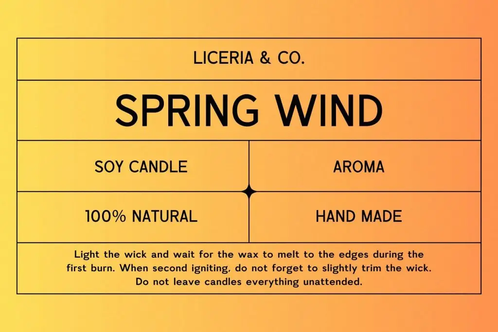
1. Beatrice
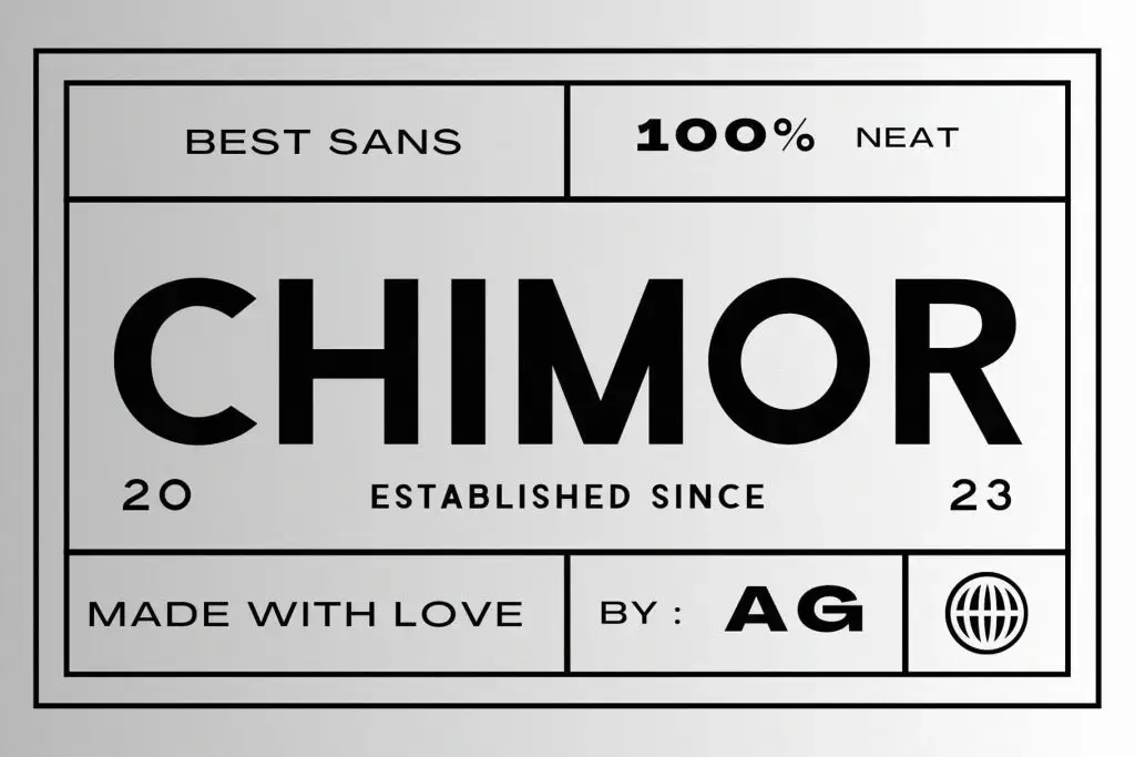
2. Chimor
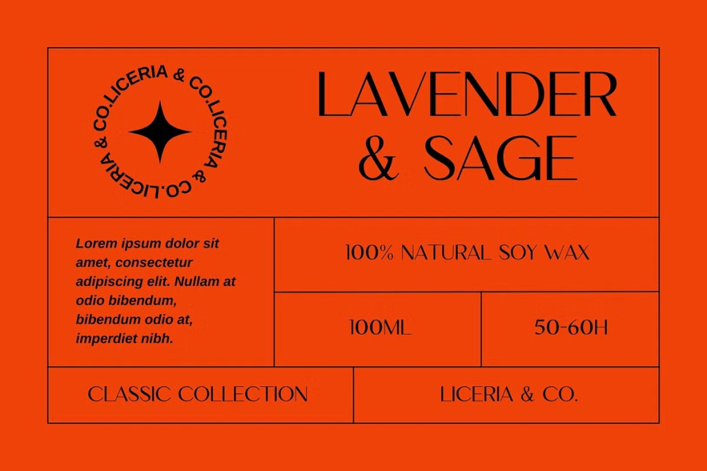
3. Quenko
How to Build a Clear Typography Hierarchy
A clean candle label should show customers what to read first, second, and third. Typography hierarchy creates this order.
Make the Brand or Scent the Main Focus
Decide whether the brand name or fragrance name should be most prominent. Some candle businesses emphasize the company identity, while others make each scent the hero of the label. Use the largest size and strongest weight for this primary element. Avoid making both lines equally dominant because the label may lose its focal point.
Separate Product Details
Information such as “soy wax candle,” fragrance notes, burn time, and net weight should remain secondary. Use a smaller size, regular weight, and consistent spacing.
Keep Safety Text Readable
Warning labels and care instructions are functional information. Do not use the most stylized font or extremely small lettering for these sections. A simple sans serif with comfortable line spacing is usually the safest option. If the primary display font is difficult to read at small sizes, pair it with a more neutral supporting typeface.
Test the Label Before Production
A label that looks balanced on a large monitor may become difficult to read when printed at actual size. Always test the design on the intended jar, lid, and box. Print several versions with different font sizes and weights. Check them from a normal viewing distance and under different lighting conditions. Make sure the most important information stays visible on curved surfaces. You should also test the label material. Text may appear differently on textured paper, transparent film, metallic foil, or matte vinyl.
Review the Font License Before Selling
A candle label is a commercial application. Before using Beatrice, Chimor, Quenko, or another font, confirm that the license covers product packaging, logos, advertising, websites, and merchandise. Some fonts may allow personal projects but require a separate license for products sold to customers. Reviewing this early helps prevent costly changes after labels, boxes, and promotional materials have already been produced.
Read Font Licensing Explained for Commercial Use in Product Packaging to understand which usage terms should be checked before launching a candle collection.
Create Candle Packaging That Feels Clean and Memorable
Sans serif fonts for clean soy wax candle packaging can help a product communicate simplicity, quality, and modern craftsmanship. Beatrice supports refined minimalism, Chimor brings a warmer and more approachable personality, while Quenko creates a sophisticated premium impression.
The strongest packaging combines an appropriate typeface with clear hierarchy, comfortable spacing, strong contrast, and accurate product information. Test every label at its final size and keep the typography consistent across jars, boxes, stickers, and online promotions.
