
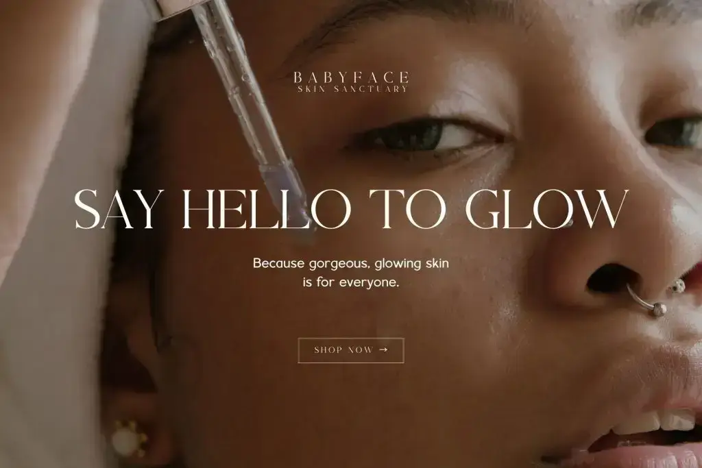
Choosing the right skincare brand fonts is essential for building a strong and memorable beauty brand. In the skincare industry, visual identity plays a major role in attracting customers and building trust. Typography, in particular, is one of the most powerful tools to communicate brand values.
When customers see a product for the first time, they often judge it based on packaging. Therefore, the font you use can instantly influence how your brand is perceived. A clean and elegant font may suggest premium quality, while a playful font may feel more casual and approachable.
In this article, we will explore how skincare brand fonts shape beauty branding, including key characteristics, font styles, and practical tips for designers.
Why Skincare Brand Fonts Matter in Beauty Branding
Understanding skincare brand fonts helps brands stand out in a highly competitive market. With so many products available, visual differentiation is crucial.
Typography helps:
- Build brand recognition
- Communicate product quality
- Attract the right audience
- Create an emotional connection
Moreover, consistent typography across packaging, websites, and social media strengthens brand identity. As a result, customers are more likely to remember and trust your brand.
How Typography Shapes Beauty Branding
1. Creates First Impressions
Fonts are often the first visual element customers notice. Therefore, they set the tone for the entire brand.
2. Communicates Brand Personality
Different fonts express different personalities:
- Serif fonts → Classic and premium
- Sans-serif fonts → Clean and modern
- Script fonts → Elegant and feminine
Because of this, choosing the right font is essential.
3. Builds Emotional Connection
Typography influences how customers feel. For example, soft and curved fonts create a calming effect, which is ideal for skincare products.
4. Enhances Brand Consistency
Using consistent fonts across all platforms ensures a cohesive brand image.
Characteristics of Skincare Brand Fonts
1. Clean and Minimalist
Skincare brands often use simple fonts to reflect purity and clarity.
2. Elegant and Refined
Thin strokes and balanced spacing create a luxurious feel.
3. Soft and Gentle Appearance
Curved letterforms help convey calmness and comfort.
4. High Readability
Labels and packaging must remain easy to read, even in small sizes.
Popular Font Styles for Skincare Branding
Different font styles can be used depending on your brand identity.
Serif Fonts for Luxury Branding
Serif fonts are often used by premium skincare brands.
Best for:
- High-end products
- Anti-aging skincare
- Luxury packaging
Sans-Serif Fonts for Modern Brands
Sans-serif fonts create a clean and contemporary look.
Best for:
- Minimal skincare brands
- Organic products
- Digital-first brands
Script Fonts for Elegance

Script fonts add a personal and sophisticated touch.
Best for:
- Brand names
- Highlight text
- Special packaging
How to Choose the Right Skincare Brand Fonts
Choosing the right skincare brand fonts requires careful consideration.
1. Define Your Brand Identity
First, determine your brand personality:
- Luxury → Serif fonts
- Minimal → Sans-serif fonts
- Feminine → Script fonts
2. Understand Your Target Audience
Different audiences respond to different styles. For example, younger audiences prefer modern fonts, while premium customers prefer elegant fonts.
3. Focus on Readability
Even the most stylish font must be easy to read. Therefore, test your fonts in different sizes.
4. Limit Font Choices
Use 2–3 fonts only:
- Primary font → Logo
- Secondary font → Headings
- Body font → Product details
To improve your branding strategy, read our article, “How Beauty Brands Use Typography to Build Trust,” to create more effective designs.
How to Use Skincare Brand Fonts Effectively
Using skincare brand fonts effectively ensures better branding results.
1. Combine Fonts Strategically
Pair fonts for balance:
- Serif + Sans-serif
- Script + Sans-serif
This improves readability and visual appeal.
2. Maintain Consistency
Use the same typography across:
- Social media
- Packaging
- Website
Consistency builds trust.
3. Use Proper Spacing
Spacing enhances clarity and creates a premium look.
4. Align Typography with Design
Fonts should match colors, images, and overall layout.
How Skincare Brand Fonts Influence Customer Perception
Typography directly affects how customers perceive a product.
For example:
- Elegant fonts → Premium quality
- Clean fonts → Safe and natural
- Bold fonts → Modern and innovative
As a result, typography can influence purchasing decisions.
Conclusion
Choosing the right skincare brand fonts is essential for building a strong beauty brand. Typography shapes how customers see, feel, and trust your products.
Moreover, by focusing on clean design, readability, and consistency, designers can create branding that stands out in the market. Fonts are not just visual elements; they are powerful tools for communication and storytelling.
In the end, the right typography can elevate your skincare brand and create a lasting impression.