
Swiss Design is one of those visual styles that can feel surprisingly modern even decades after it first became influential. Clean grids, strong typography, generous negative space, and carefully organized information give the style a clear and confident appearance. Instead of decorating every empty area, Swiss Design focuses on making communication easier to understand.
For designers today, that simplicity is still highly relevant. The style appears in posters, editorial layouts, websites, brand identities, and social media graphics. Its influence is especially visible whenever typography and structure become the main visual elements.
What Is Swiss Design?
Swiss Design, also known as the International Typographic Style, is a graphic design movement built around clarity, function, and visual order. It often uses grid-based layouts, sans serif typography, asymmetrical compositions, and strong alignment. Every element is expected to have a clear reason for being there.
This does not mean Swiss layouts need to look boring or identical. Designers can create strong visual tension through scale, spacing, photography, and type hierarchy. The difference is that decoration rarely exists without a purpose.
A Brief History of Swiss Design
Swiss Design developed primarily in Switzerland during the 1940s and 1950s, although its roots connect to earlier European modernist movements. Ideas from Bauhaus, Constructivism, and the New Typography helped shape a design philosophy that prioritized function over decoration. Schools and designers in cities such as Basel and Zurich played an important role in developing the style.
Designers including Josef Müller-Brockmann and Armin Hofmann became strongly associated with its visual language. Their posters demonstrated how grids, photography, geometric forms, and typography could communicate information with remarkable precision. By the 1950s and 1960s, this approach had spread internationally.
Why Did Swiss Design Become So Influential?
One reason was its ability to communicate across languages and cultures. Rather than depending heavily on decorative traditions, the style relied on universal systems such as grids, photographs, icons, and straightforward typography. This made it useful for international organizations, cultural institutions, transportation systems, and corporations.
Its systematic approach also made designs easier to reproduce consistently. That principle feels especially familiar today, when brands need visual systems that work across websites, mobile screens, presentations, and social platforms.
The Grid Is the Foundation
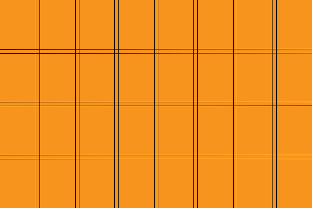
One of the most recognizable principles of Swiss Design is the grid. Designers divide the page into columns, rows, and consistent spatial relationships before arranging the content. The grid creates structure without necessarily becoming visible in the finished composition.
This system helps headlines, paragraphs, photographs, and captions feel connected. More importantly, it makes complex information easier to navigate. A well-designed grid gives the viewer a clear path through the content.
Typography Should Communicate Clearly
Typography plays a central role in Swiss Design. Sans serif typefaces became especially popular because their clean forms supported the movement’s preference for clarity and neutrality. Large differences in font size and weight then create hierarchy without requiring excessive decoration.
Spacing matters just as much as font choice. Kerning, tracking, line height, and alignment can dramatically change how structured a layout feels. For a deeper understanding of letter spacing, explore What Is Kerning in Typography? A Complete Guide for Designers.
Asymmetry Creates Controlled Energy

Swiss Design does not always center everything on the page. In fact, asymmetrical layouts are one of its most recognizable characteristics. Text and imagery can sit toward one edge while negative space occupies another area.
This approach creates visual energy without losing structure. The grid keeps everything connected even when the composition feels uneven. The result can feel more dynamic than a traditional symmetrical layout while remaining highly organized.
Negative Space Is Part of the Design
Empty space is not considered wasted space in Swiss Design. It helps separate information, establish hierarchy, and give important elements room to stand out. A strong layout often becomes more effective when unnecessary elements are removed.
This idea remains useful for digital design today. Websites and mobile interfaces need visual breathing room so users can understand content quickly. Swiss Design demonstrates how simplicity can improve communication rather than make a layout feel unfinished.
Photography and Geometric Forms
Photography is another common element in Swiss-inspired compositions. Designers often use straightforward photographs rather than decorative illustrations, allowing the image to communicate directly. Cropping, scale, and placement can then create visual impact.
Simple geometric shapes also appear frequently. Circles, lines, rectangles, and blocks of color can help organize information or direct attention. Because these shapes are simple, typography remains a strong part of the composition.
Examples of Swiss Design Today
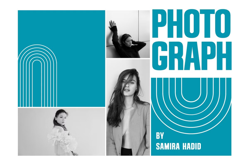
Swiss Design principles can be applied to much more than classic cultural posters. Editorial covers, portfolio websites, event posters, corporate identities, magazines, and presentation layouts can all benefit from its structured approach. Modern designers often adapt the style rather than reproducing historical examples exactly.
Fonts That Work Well with Swiss Design
Swiss Design is often associated with clean sans serif typography, so the best font choices usually have simple forms, strong readability, and balanced proportions. Instead of relying only on classic names such as Helvetica or Univers, designers can also explore modern sans serif fonts that support the same principles of clarity, hierarchy, and visual order.
At Font Kingdom, Govers is a strong option for Swiss-inspired layouts because its clean lines and balanced proportions work well in structured editorial, branding, and web compositions. Hoodger is another useful choice, especially when you want a minimalist sans serif with sharp edges and a more refined appearance.
For headlines that need more vertical impact, Casendro offers a condensed, all-caps structure with a bold and precise character. Jacob’s can also work well when you need a modern condensed sans serif that saves horizontal space without losing readability. These characteristics make both fonts useful for Swiss-inspired posters, strong headings, and modular compositions.
Designers who prefer a softer and more elegant interpretation can consider Vaneska or Reghita. Both maintain a clean contemporary direction while offering enough personality for branding, editorial work, and digital layouts. The key is to use them within a disciplined grid and let spacing, scale, and hierarchy do most of the visual work.
Do You Have to Use Helvetica?
No. Using Helvetica is not what makes a layout Swiss. The real foundation lies in hierarchy, alignment, readability, consistency, and controlled spacing.
A modern sans serif from Font Kingdom can work just as well when it supports those principles. Fonts such as Govers, Casendro, Hoodger, Vaneska, Reghita, and Jacob’s can all be explored for Swiss-inspired compositions, as long as the typography serves the information instead of becoming unnecessary decoration.
Final Thoughts
Swiss Design remains influential because it turns organization into visual expression. Its grids, sans serif typography, asymmetric layouts, negative space, and controlled use of imagery create designs that feel clear without feeling passive. Those principles can still guide everything from posters to digital interfaces.
For designers exploring the style, the best starting point is not copying an old Swiss poster. Start with the information, create a strong grid, establish a clear hierarchy, and let typography do more of the work. Once the structure is strong, the design can become distinctive without relying on unnecessary decoration.
