
Understanding Labor Day 2026 typography trends is essential for designers seeking to create impactful, relevant holiday campaigns. Labor Day is more than just a public holiday; it is a moment to celebrate workers, productivity, and achievement. Therefore, typography used in campaigns must reflect strength, unity, and energy.
In 2026, design trends continue to evolve, especially in digital marketing and social media. As a result, brands must adapt their typography choices to stay modern and engaging. Fonts are no longer just decorative; they communicate emotion, identity, and purpose.
In this article, we will explore the latest Labor Day 2026 typography trends, including font styles, design strategies, and tips to create effective holiday campaigns.
Why Labor Day 2026 Typography Trends Matter
The importance of Labor Day 2026 typography trends lies in how audiences respond to visual content. During holiday campaigns, people are exposed to many promotional designs. Therefore, typography must stand out quickly.
Good typography helps:
- Capture attention instantly
- Communicate strong messages
- Build brand recognition
- Increase engagement
Moreover, typography sets the tone of your campaign. For example, bold fonts convey power, while clean fonts communicate professionalism.
Key Characteristics of Labor Day Typography Trends
To understand Labor Day 2026 typography trends, it is important to identify the key characteristics.
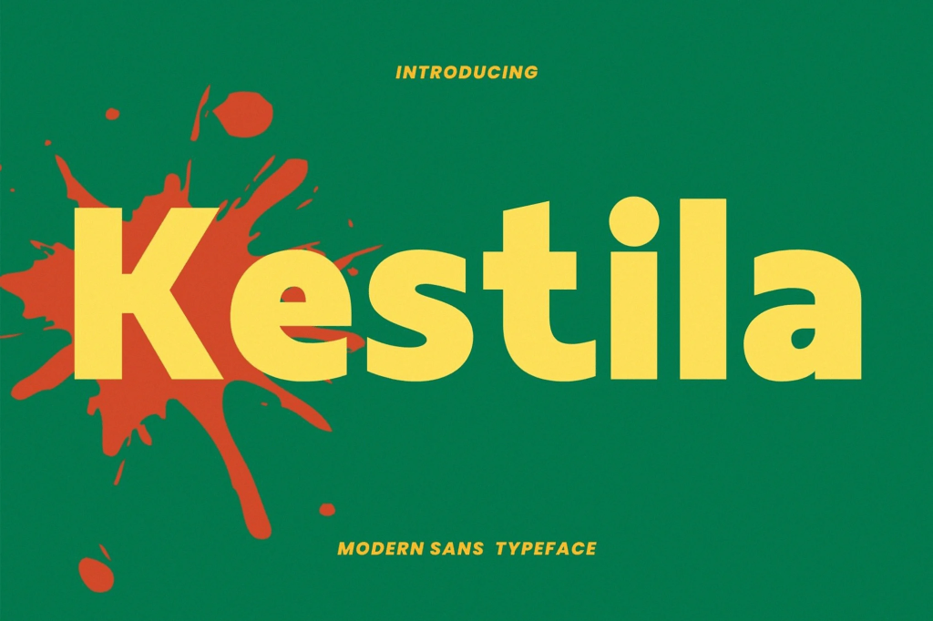
1. Bold and Strong Letterforms
Labor Day is associated with strength and hard work. Therefore, bold typography is widely used.
These fonts:
- Create impact
- Improve visibility
- Convey confidence
2. Industrial and Structured Style
Many Labor Day designs use fonts inspired by industrial themes.
Characteristics include:
- Geometric shapes
- Solid structures
- Clean edges
3. Minimal but Powerful Design
Minimal typography is trending in 2026. However, it still maintains a strong visual impact.
4. High Contrast Colors
Typography is often paired with bold colors like:
- Red
- Blue
- Black
- White
This enhances readability and theme relevance.
Labor Day 2026 Typography Trends in Font Styles
Let’s explore the most popular font styles in Labor Day 2026 typography trends.
Sans-Serif Fonts for Modern Campaigns
Sans-serif fonts remain a top choice.
Why they work:
- Clean and modern
- Easy to read
- Perfect for digital campaigns
They are ideal for:
- Social media posts
- Website banners
- Email marketing
Condensed Fonts for Strong Headlines
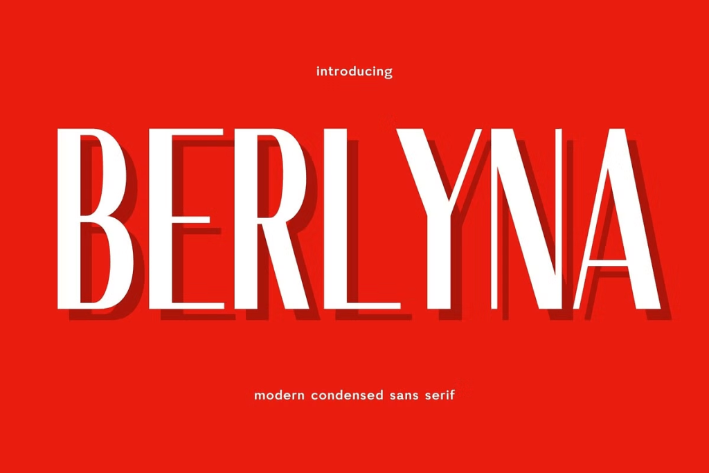
Condensed fonts are widely used in headlines.
Benefits:
- Save space
- Create a strong visual hierarchy
- Look professional
These fonts are effective for bold statements like:
- “WORK HARD”
- “HAPPY LABOR DAY”
Bold Display Fonts for Impact
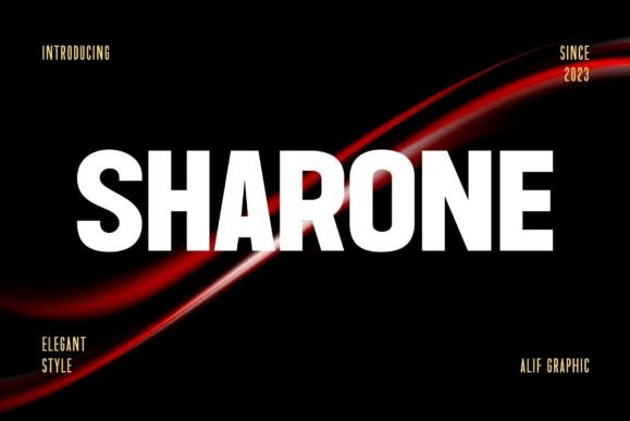
Display fonts are perfect for grabbing attention.
Best for:
- Posters
- Promotional graphics
- Campaign headlines
However, use them carefully to maintain readability.
Vintage Fonts for Classic Themes
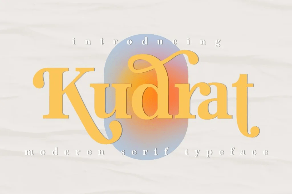
Some brands use vintage typography to reflect tradition and heritage.
Best for:
- Classic campaigns
- Americana-style branding
- Nostalgic visuals
How to Use Fonts for Labor Day Campaigns
Applying Labor Day 2026 typography trends effectively requires a strategy.
1. Use Bold Typography for Headlines
Headlines should be clear and powerful.
For example:
- “CELEBRATE HARD WORK”
- “PROGRESS STARTS WITH PEOPLE”
These phrases need strong fonts to stand out.
2. Combine Fonts for Balance
Use font pairing:
- Bold font → Headline
- Simple font → Body text
This improves readability and structure.
3. Create a Clear Hierarchy
Hierarchy helps users scan content.
Use:
- Large text → Main message
- Medium text → Subheading
- Small text → Details
4. Use Spacing Effectively
Spacing improves clarity.
Tips:
- Avoid overcrowded text
- Use line spacing for readability
- Add margins for balance
To improve your typography strategy, read our guide The Rise of Bold Typography in Modern Graphic Design for more inspiration.
Labor Day Typography Trends for Social Media
Social media plays a major role in campaigns.
Use Eye-Catching Text Layouts
Experiment with:
- Large typography
- Layered text
- Center alignment
Optimize for Mobile Screens
Most users view content on mobile devices. Therefore, ensure fonts are readable on small screens.
Keep Text Short and Clear
Short messages perform better.
For example:
- “LABOR DAY”
- “LIMITED OFFER”
How Typography Influences Campaign Success
Typography plays a major role in campaign performance.
For example:
- Bold fonts → Higher attention
- Clean fonts → Better readability
- Structured layouts → Easier navigation
As a result, good typography can improve engagement and conversions.
Conclusion
Understanding Labor Day 2026 typography trends allows designers to create powerful, effective holiday campaigns. Typography is not just about style; it is about communication, emotion, and impact.
Moreover, by using bold fonts, strong hierarchy, and clean layouts, designers can create visuals that stand out in a crowded market. In the end, the right typography can turn a simple design into a memorable campaign.