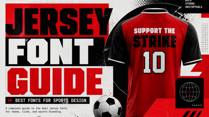
Understanding a complete jersey font guide is essential for designers who want to create bold, dynamic, and professional sports designs. In the world of sports, typography is more than just numbers and names; it represents identity, strength, and team spirit.
Whether you are designing jerseys, team logos, or sports posters, choosing the right font can significantly impact the overall look. Therefore, designers must focus on readability, style, and visual impact when selecting fonts.
In this article, we will explore a jersey font guide, including key characteristics, tips, and recommended fonts such as Yoksen, Karome, Casendro, Feriska, Kinzle, Berlyna, Hoodger, Querich, Maktron, and Woodzy.
Why Jersey Font Guide Matters in Sports Design
A well-planned jersey font guide helps designers create designs that are both functional and visually appealing. In sports, typography must be readable from a distance while still looking stylish.
Good jersey fonts help:
- Improve player name visibility
- Strengthen team identity
- Create a professional appearance
- Enhance audience recognition
Moreover, typography plays a key role in branding. As a result, the right font can make a team stand out.
Characteristics of the Best Jersey Fonts
Before choosing fonts, it is important to understand the key characteristics of a good jersey font.
1. High Readability
Jersey fonts must be highly readable, even from a long distance, such as in stadiums or on large screens. This is important because players’ names and numbers need to be recognized quickly by audiences, commentators, and referees. Therefore, designers should avoid overly complex or decorative letterforms that can reduce clarity.
2. Bold and Strong Style
A bold and strong style is essential in jersey typography because it reflects the energy and competitiveness of sports. Thick strokes and solid shapes help the text stand out against dynamic backgrounds and fast movement. As a result, bold fonts create a powerful visual presence that aligns with athletic performance.
3. Clear Letter Spacing
Clear letter spacing ensures that each character is distinct and easy to read, especially when viewed from a distance. Proper spacing prevents letters and numbers from blending, which can confuse. In addition, balanced spacing improves the overall neatness and professionalism of the design.
4. Versatility
Versatility is important because jersey fonts are used across multiple applications, including uniforms, merchandise, and digital media. A good jersey font should maintain its readability and style in different sizes and formats. Therefore, designers should choose fonts that adapt well to both print and screen environments.
Jersey Font Guide: Best Fonts for Sports Design
Here are some of the best fonts included in this jersey font guide.
Yoksen
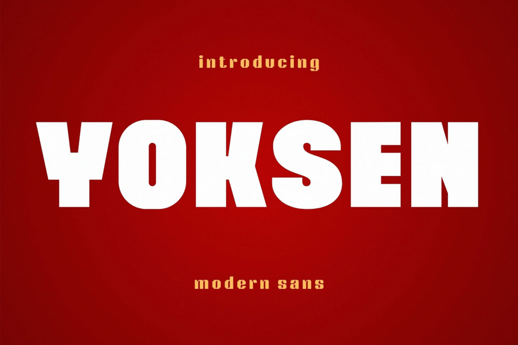
Yoksen’s clean fonts are perfect for modern, visually appealing writing. They have a modern feel, yet still look elegant when used for writing.
Karome
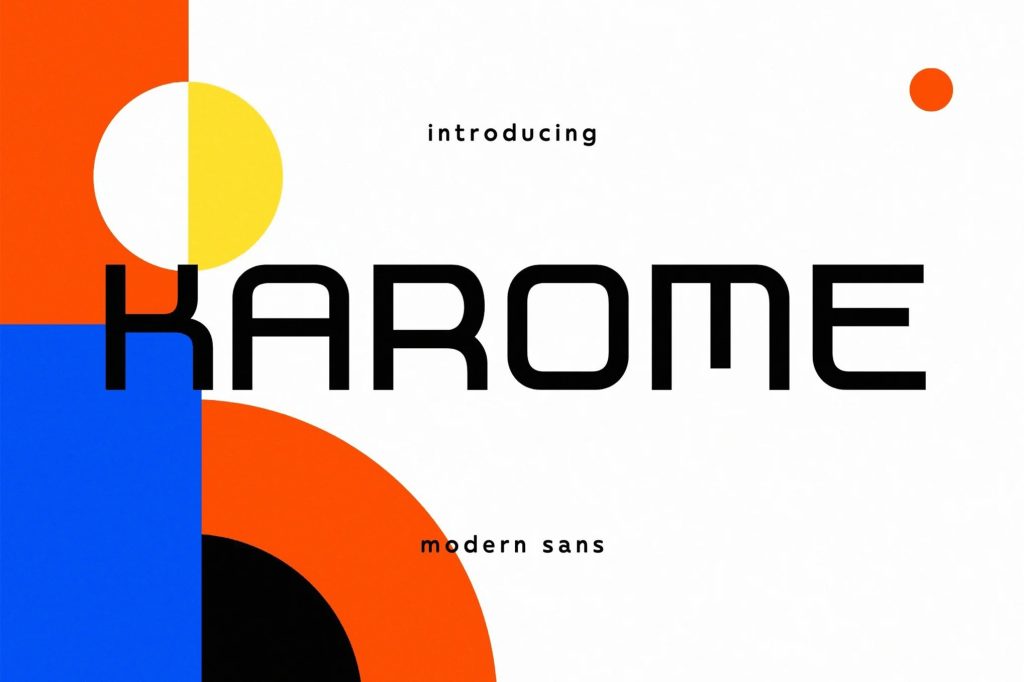
The clean Karome font is perfect for modern and visually appealing writing. It has a modern feel, yet still looks elegant when used for writing.
Casendro
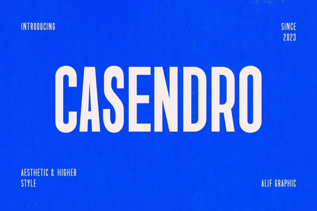
Meet Casendro, a modern higher sans serif font designed to deliver a striking impact with every letter. Featuring a condensed, all-caps structure and sharp precision, Casendro combines boldness and elegance for designs that command attention.
Feriska
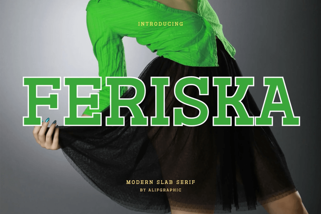
Introducing “Feriska” – a modern slab serif font that seamlessly blends contemporary style with timeless solidity. With clean lines and a strong, confident presence.
Kinzle

Kinzle is a retro fun display font that effortlessly blends bold 70s and 90s charm with a modern twist. Not only does it feature playful, chunky letterforms, but it also brings an undeniable energy to every project.
Berlyna
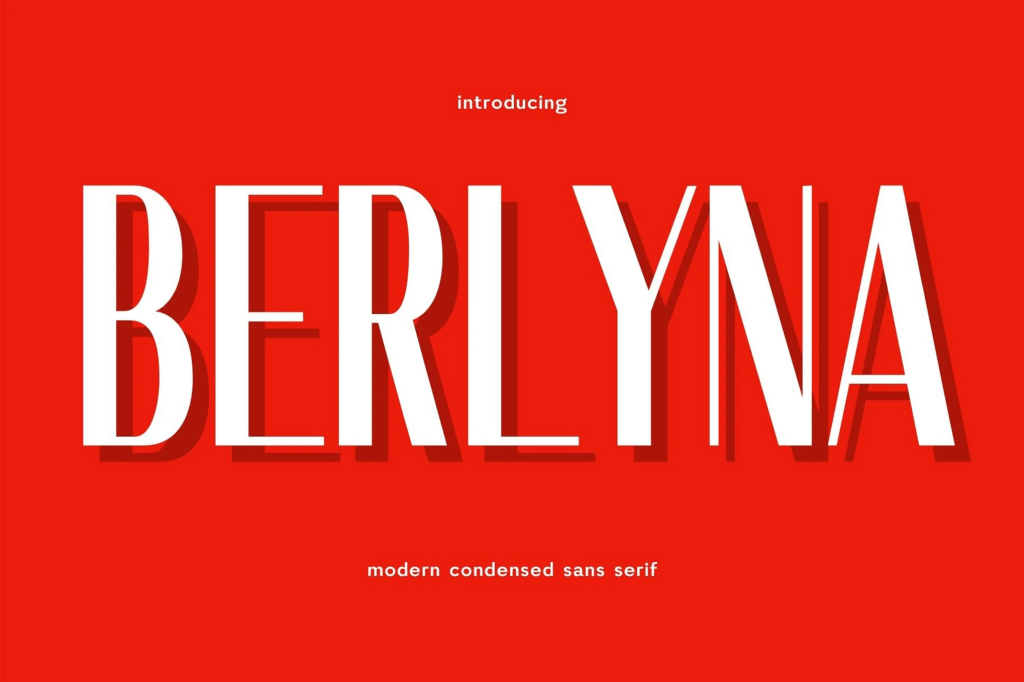
Introducing “Berlyna,” a modern condensed sans font that embodies sleek simplicity. With clean lines and a space-efficient design, Berlyna offers a contemporary and sophisticated aesthetic.
Hoodger

Hoodger is an elegant sans-serif typeface that blends modernity with sophistication. This elegant sans serif typeface features clean and minimalist letterforms with sharp edges and balanced proportions.
Querich
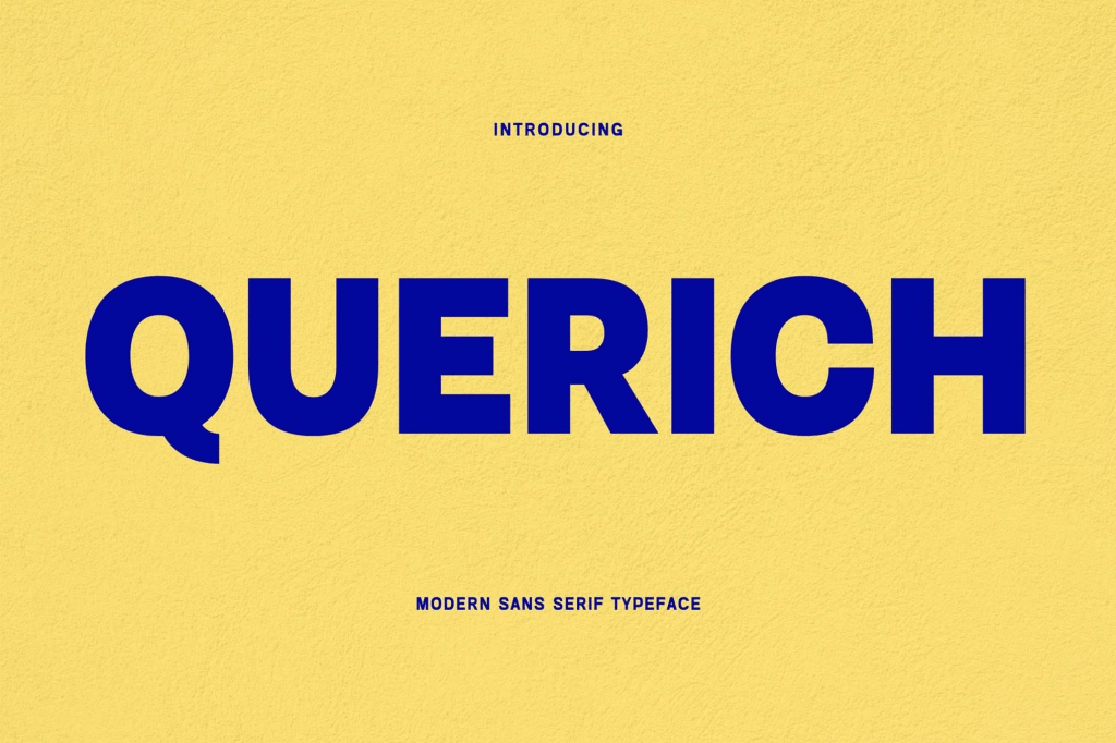
Querich is an exquisite font series designed to elevate your creative projects. Immerse yourself in the allure of meticulously crafted letters that strike the perfect balance between modernity and elegance.
Maktron
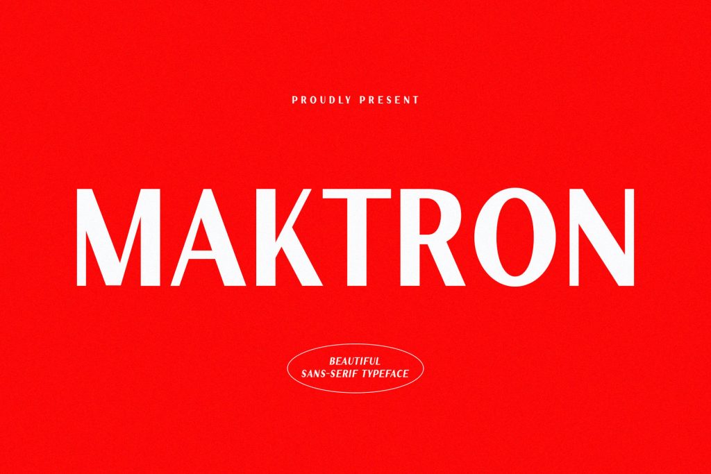
Discover Maktron, an elegant sans-serif font carefully designed to bring sophistication and boldness to your creative projects.
Woodzy

Woodzy is the perfect playful font for kids, bringing a sense of adventure to your designs. Featuring rounded edges, quirky details, and bold strokes, Woodzy adds charm and fun to any project.
How to Choose the Right Jersey Font
Choosing the right font from this jersey font guide depends on your design needs.
1. Match the Sport Type
Different sports require different styles:
- Football → Bold and strong
- Basketball → Modern and dynamic
- Esports → Futuristic fonts
2. Consider Visibility
Ensure fonts are readable from a distance.
3. Focus on Simplicity
Avoid overly decorative fonts that reduce clarity.
4. Test in Real Conditions
Always test your design on:
- Jerseys
- Screens
- Printed materials
How to Use Jersey Fonts Effectively
Using fonts effectively is just as important as choosing them.
1. Use Bold Fonts for Numbers
Numbers should be the most visible element.
2. Create Hierarchy
Use different sizes for:
- Player name
- Number
- Team name
3. Maintain Consistency
Use consistent typography across all team materials.
4. Combine Fonts Carefully
Pair bold fonts with simpler fonts for balance.
How Typography Enhances Sports Branding
Typography plays a major role in branding.
For example:
- Bold fonts → Strength and power
- Clean fonts → Professionalism
- Unique fonts → Team identity
As a result, typography helps teams build recognition and loyalty.
Conclusion
Following a proper jersey font guide helps designers create sports designs that are bold, readable, and professional. Fonts like Yoksen, Karome, Casendro, Feriska, Kinzle, Berlyna, Hoodger, Querich, Maktron, and Woodzy. offer a wide range of styles for different needs.
Moreover, by focusing on readability, consistency, and strong visual impact, designers can create jerseys and branding that stand out. In the end, typography is not just about style; it is about performance and identity.