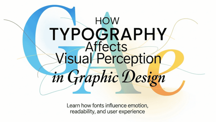
Understanding how typography affects visual perception is essential for every designer. Typography is not just about choosing fonts; it shapes how people see, feel, and understand a design. The right typography can guide attention, create emotion, and improve readability, while the wrong choice can confuse or even repel your audience.
In graphic design, typography plays a key role in communication. Before users read the content, they already form an impression based on its visual style. This means typography directly influences perception, behavior, and decision-making.
In this article, we will explore how typography affects visual perception, including its impact on readability, emotion, hierarchy, and overall user experience.
Why Typography Matters in Visual Perception
Typography is one of the first elements people notice in a design. It affects how information is processed and how messages are interpreted.
When typography is well-designed, it helps users quickly understand content. However, poor typography can create confusion and reduce engagement.
Some key roles of typography in perception include:
- Guiding the reader’s attention
- Creating visual hierarchy
- Influencing emotional response
- Improving readability and clarity
Because of these functions, typography becomes a powerful tool in shaping how users perceive visual content.
How Typography Affects Visual Perception in Design
1. Typography Shapes First Impressions
The first thing people notice about a design is not always the images; it is often the typography.
Fonts communicate personality instantly. For example:
- Serif fonts feel traditional and trustworthy
- Sans-serif fonts feel modern and clean
- Script fonts feel elegant and personal
- Display fonts feel bold and expressive
These impressions happen within seconds. That is why choosing the right font is crucial in branding and marketing.
2. Typography Influences Readability
One of the most important aspects of typography’s impact on visual perception is readability.
Readable typography helps users process information more easily. Poor readability, on the other hand, causes frustration and reduces engagement.
Factors that affect readability include:
- Font size
- Line spacing
- Letter spacing
- Contrast between text and background
Designers must balance aesthetics with functionality to ensure the text remains clear and accessible.
3. Typography Creates Visual Hierarchy
Visual hierarchy helps users understand which information is most important.
Typography creates hierarchy through:
- Font size differences
- Font weight (bold, regular, light)
- Font style (uppercase, italic)
- Spacing and alignment
For example, headings are usually larger and bolder than body text. This helps users scan content and find key information.
Without a proper hierarchy, a design may look cluttered and difficult to navigate.
4. Typography Affects Emotional Response
Typography is closely linked to emotion. Different font styles can trigger different feelings.
Examples:
- Rounded fonts → friendly and approachable
- Sharp fonts → strong and bold
- Elegant scripts → luxurious and romantic
- Minimal fonts → modern and professional
This emotional impact is essential in branding. Designers use typography to create a connection between the brand and its audience.
5. Typography Impacts User Experience

Typography is a key part of user experience (UX). It determines how easily users can interact with content.
Good typography:
- Improves reading speed
- Reduces cognitive load
- Enhances navigation
- Increases engagement
Bad typography:
- Causes eye strain
- Confuses users
- Leads to higher bounce rates
Understanding how typography affects visual perception helps designers create user-friendly designs that feel intuitive and comfortable.
Key Elements That Influence Typography Perception
- Font Choice
The typeface you choose sets the tone of your design. Each font has its own personality and visual impact.
- Size and Scale
Larger text attracts attention, while smaller text is used for details. Proper scaling creates balance and hierarchy.
- Spacing (Kerning, Leading, Tracking)
Spacing affects readability and aesthetics. Good spacing makes text easier to read and visually appealing.
- Color and Contrast
High contrast improves readability, while poor contrast makes text difficult to see.
- Alignment
Text alignment (left, center, right) influences how content is perceived and organized.
Conclusion
Understanding how typography affects visual perception is essential for creating effective graphic design. Typography influences how users see, feel, and interact with content.
From shaping first impressions to improving readability and emotional impact, typography plays a central role in communication. Designers who understand these principles can create designs that are not only visually appealing but also meaningful and effective.
By using the right fonts, spacing, hierarchy, and contrast, you can enhance user experience and deliver stronger visual messages.
Typography is not just design—it is perception.
Font Kingdom