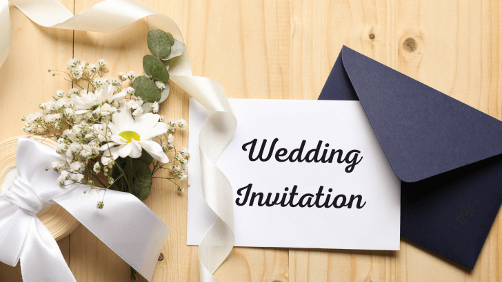
Choosing the right romantic wedding fonts is one of the most meaningful steps in designing wedding invitations and cards. Long before guests read the ceremony details, typography already sets the mood, whether the celebration feels classic, intimate, modern, or timelessly romantic.
Wedding typography is not just about beauty. It is about emotion. The curves of a script font, the softness of spacing, and the balance of letterforms all work together to express love, commitment, and celebration. In this article, we’ll explore how romantic fonts are used in wedding invitations and cards, what makes them feel romantic, and how to choose the right typography for your special day.
Why Typography Matters in Wedding Invitations
Wedding invitations are often the first physical or digital expression of a couple’s story.
Fonts Set the Emotional Tone
Romantic typography instantly communicates whether a wedding feels:
- Elegant and formal
- Soft and intimate
- Whimsical and playful
- Timeless and classic
A thoughtful font choice helps guests emotionally connect to the event even before it happens.
Typography Creates a Lasting Keepsake
Wedding cards are often saved for years. Romantic fonts ensure invitations remain beautiful and meaningful long after the celebration.
What Makes Fonts Feel Romantic?
Not all decorative fonts feel romantic. The best romantic wedding fonts share certain characteristics.
1. Flowing and Elegant Letterforms
Smooth curves and gentle strokes create a sense of movement and grace.
2. Balanced Simplicity
Romantic fonts avoid looking busy. Even script fonts should feel readable and refined.
3. Soft Spacing and Rhythm
Thoughtful spacing between letters and lines adds calmness and elegance to the design.
Script Fonts for Romantic Wedding Invitations
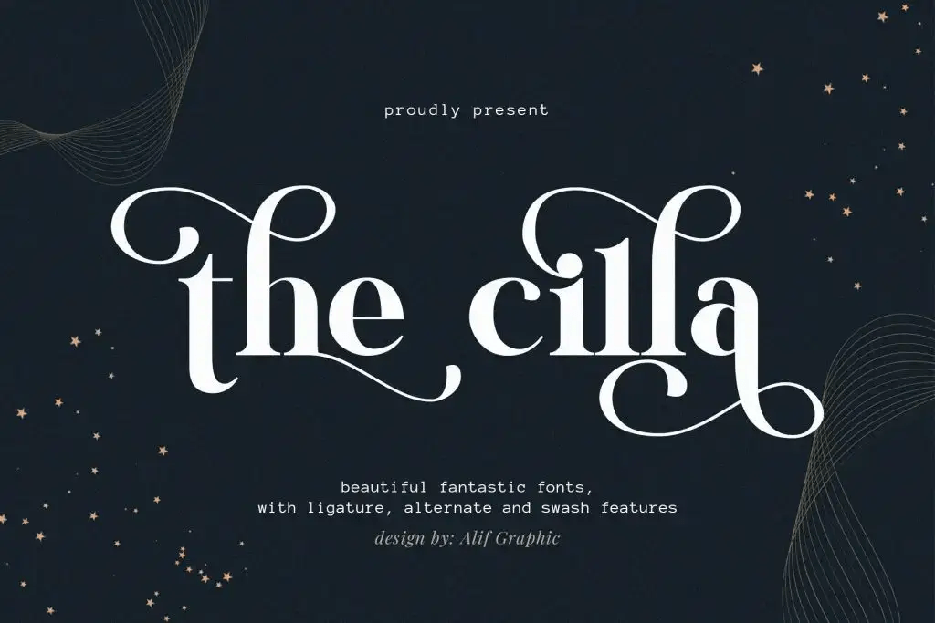
Script fonts are popular for wedding invitations because they feel personal and elegant. For this reason, they are often used for names and headlines. At the same time, they help create an emotional connection with guests.
They are perfect for:
- Names of the couple
- Invitation headlines
- Save-the-date cards
Script typography adds warmth and emotional depth to wedding designs.
Serif Fonts for Timeless Romance
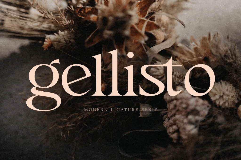
Romance is not limited to script fonts. Serif typography plays an important role in wedding design.
Serif fonts feel:
- Formal and classic
- Sophisticated
- Timeless
They are commonly used for ceremony details, dates, and locations.
Combining Fonts for Wedding Invitations and Cards
Popular Font Pairing for Romantic Wedding Fonts
- Script font for names + serif font for details
- Elegant serif headline + clean supporting font
- One script font paired with a neutral serif
The goal is harmony; romance should feel effortless, not overwhelming.
Readability Matters in Romantic Wedding Fonts
Avoid Overly Decorative Fonts
Highly ornate fonts can be difficult to read, especially for older guests.
Use Script Fonts Selectively
Script fonts are best used for names and headings, not long paragraphs.
Test Print and Digital Versions
Fonts may look different on screen versus print, so testing is essential.
Common Typography Mistakes in Wedding Invitations
1. Using Too Many Fonts
Limit your design to two or three fonts to maintain elegance.
2. Poor Contrast
Low contrast between text and background reduces readability and visual impact.
3. Ignoring Alignment and Spacing
Romantic typography relies on balance and breathing room.
How Romantic Wedding Fonts Enhance the Guest Experience
1. Romantic Fonts Create Anticipation
Elegant typography builds excitement and emotional connection.
2. Clear Fonts Reduce Confusion
Readable details help guests understand important information easily.
3. Consistent Typography Feels Thoughtful
Consistency across invitations, RSVP cards, and thank-you notes makes the experience feel cohesive.
Wedding Fonts as Part of a Complete Visual Theme
Typography works best when aligned with other design elements.
Romantic wedding fonts should complement:
- Color palettes
- Floral illustrations
- Paper textures
- Envelope styles
Together, these elements tell a unified love story.
Final Thoughts on Romantic Wedding Fonts for Invitations and Cards
Choosing the right romantic wedding fonts is about more than aesthetics; it’s about emotion, memory, and storytelling. The right typography brings elegance, warmth, and intimacy to wedding invitations and cards, helping couples express their love in a visual way.
By combining flowing script fonts with timeless serif typography and by prioritizing readability and balance, you can create wedding stationery that feels personal, beautiful, and unforgettable.
For visual inspiration and real examples of romantic typography in action, many designers explore curated wedding font collections on Font Kingdom’s Pinterest, where invitation layouts, calligraphy styles, and elegant font pairings are showcased in a practical and inspiring way.