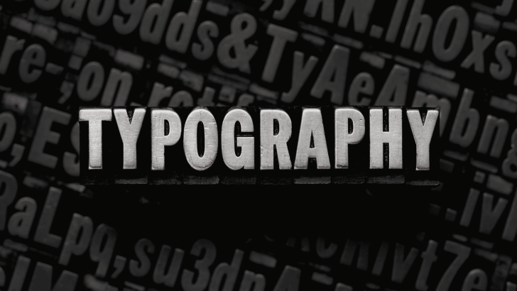
The anatomy of typography is the foundation of understanding how letters are structured and how they function in design. Before choosing beautiful fonts or experimenting with layouts, designers must first understand how letters are built. Every typeface is constructed using structural lines and detailed parts that influence readability, balance, and personality.
What Is the Anatomy of Typography?
The anatomy of typography refers to the structural components and measurements that define how letters are formed. Just like the human body has bones and muscles, typography has lines, curves, stems, and spaces that create readable characters.
When you understand the anatomy of typography, you stop seeing letters as random shapes. Instead, you begin to see systems, proportions, and relationships.
If you’re new to typography basics, you can also read:
What Is Typography? Definition, Examples, and Practical Uses
Key Structural Lines and Measurements in the Anatomy of Typography

Baseline
The baseline is the invisible line where most letters sit. Almost every character rests on this line.
Without a consistent baseline, text would appear uneven and difficult to read.
X-Height
X-height refers to the height of lowercase letters, specifically the letter “x.”
A larger x-height typically improves readability in digital environments. Many modern sans-serif fonts use taller x-heights to enhance clarity on screens.
Cap Height
Cap height measures the height of uppercase letters from the baseline to the top of the capital letter.
It determines how bold and dominant capital letters appear in a design.
Ascender Line
The ascender line marks the top of letters like:
- b
- d
- h
- k
These parts extend above the x-height.
Descender Line
The descender line marks how far letters like:
- g
- p
- y
- q
extend below the baseline.
Understanding these structural measurements is fundamental to mastering the anatomy of typography.
Essential Letter Anatomy Parts
Now let’s explore the visible components that form each letter.
Stem
The stem is the main vertical stroke of a letter.
Examples:
- The vertical line in “H”
- The upright stroke in “T”
It forms the backbone of many characters.
Serif
A serif is the small decorative stroke attached to the end of a letter’s main strokes.
Serifs are commonly associated with tradition, elegance, and editorial design.
If you want to explore more about serif structure, read:
What Is a Serif Font? History, Features, and Examples
Bowl
The bowl is the curved part of letters, such as:
- b
- d
- o
- p
It encloses space inside the character.
Counter
The counter is the enclosed or partially enclosed space within a letter.
Examples:
- The inside of “o”
- The space inside “a”
- The hollow area in “e”
Open counters improve readability, especially at smaller sizes.
Shoulder
The shoulder is the curved stroke that extends from a stem.
For example:
- The rounded part of “n”
- The curve in “m”
Spine
The spine is the curved stroke in the letter “S.”
This subtle curve defines the character’s personality and flow.
Crossbar
The crossbar is the horizontal stroke that connects parts of a letter.
Examples:
- The middle line in “A”
- The horizontal stroke in “H”
Commonly Used Terms in the Anatomy of Typography
In addition to structural parts, designers use specific terminology to discuss spacing and proportion.
Kerning
Kerning adjusts the spacing between individual letter pairs.
For example, the space between “A” and “V” may need correction.
Learn more here:
What Is Kerning in Typography? A Complete Guide for Designers
Tracking
Tracking controls overall spacing across a word or paragraph.
It affects how open or tight the text appears.
Learn more here:
Tracking in Typography: Common Mistakes and How to Fix Them
Leading
Leading refers to the vertical spacing between lines of text.
Proper leading improves readability and visual comfort.
You can read more about this here:
Leading in Typography: How Line Spacing Improves Readability
Weight
Weight describes the thickness of a font.
Common weights include:
- Light
- Regular
- Medium
- Bold
Weight influences hierarchy and emphasis.
Contrast
Contrast refers to differences in stroke thickness within a letter.
High contrast fonts feel elegant and dramatic. Low-contrast fonts feel modern and stable.
Understanding these terms strengthens your grasp of typography’s anatomy.
Why the Anatomy of Typography Matters in Design
Improves Readability
When you understand letter anatomy, you can identify:
- Why are some fonts easier to read
- Why others feel crowded
- How spacing affects clarity
Design becomes intentional instead of accidental.
Helps with Font Pairing
Knowing structural characteristics makes font pairing easier.
For example:
- High contrast serif + neutral sans serif
- Tall x-height + narrow display font
Enhances Professionalism
Designers who understand the anatomy of typography make better layout decisions.
They can:
- Adjust spacing precisely
- Balance headings and body text
- Maintain consistency across projects
This knowledge separates beginners from professionals.
How Beginners Can Practice Typography Anatomy
Learning the anatomy of typography becomes easier with practice.
1. Analyze Popular Fonts
Open a well-known typeface and examine:
- Stem thickness
- Counter size
- X-height proportion
Notice patterns.
2. Sketch Letters
Drawing letters by hand helps you understand the structure deeply.
Even simple sketches improve awareness.
3. Compare Serif and Sans Serif
Observe how structural differences change mood and readability.
Typography becomes more intuitive with observation.
Final Thoughts on the Anatomy of Typography
The anatomy of typography is the foundation of all good type design. By understanding key structural lines, essential letter parts, and common terminology, designers gain clarity and confidence.
Typography is more than decoration. It is a system of structure, proportion, and spacing. When you understand how letters are built, you can make informed design decisions that improve readability and visual harmony.
Mastering the anatomy of typography is not about memorizing terms; it’s about seeing letters differently. Once you do, every design becomes more intentional and refined.