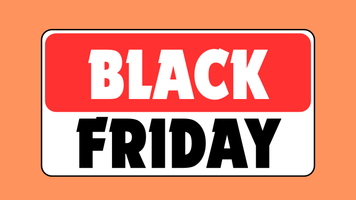
Choosing the right fonts for Black Friday deals is not only about making the headline look bold. The typeface also needs to communicate urgency, match the brand, and remain easy to read across posters, social media, banners, and landing pages. A strong font can make an offer feel more noticeable without making the design look noisy.
Black Friday campaigns usually contain several layers of information at once. The campaign title, discount, product category, date, and call to action all compete for attention. That is why font choice should support hierarchy from the beginning.
1. Start with Readability
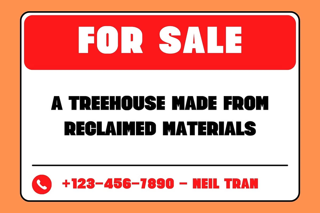
Black Friday graphics are often viewed quickly. A customer may see the design while scrolling, browsing a marketplace, or walking past a store display. The main message should be understandable within a few seconds.
Choose fonts with clear letterforms and strong contrast. Decorative styles can work, but they should not make words such as “Sale,” “50% Off,” or “Black Friday” difficult to recognize. Readability becomes even more important when the same design needs to work on mobile screens.
2. Match the Font with the Brand
Not every Black Friday campaign needs the same bold condensed sans serif. A fashion brand may benefit from an elegant serif or editorial display font, while a sports retailer may need something more energetic and condensed. Technology brands often work well with clean geometric sans serif fonts.
The font should feel connected to the brand before it feels connected to Black Friday. This helps the campaign stay recognizable instead of looking like a generic seasonal template.
Think About the Mood of the Offer
Different fonts create different emotional tones. A heavy condensed font feels urgent and direct, while a refined serif can make the promotion feel more premium. Rounded sans serif fonts may feel friendlier and more approachable.
This is useful when deciding how intense the campaign should feel. A flash sale and a luxury seasonal offer may both use the phrase “Black Friday,” but they should not necessarily use the same typography.
3. Use Strong Hierarchy
The most important information needs the strongest visual weight. Usually, that means the discount or campaign title should be larger than the supporting details. Font size, weight, and spacing can create hierarchy without adding more decorative elements.
Avoid making every line bold. If everything demands attention, the viewer does not know where to look first. A clear typographic hierarchy makes the design feel more organized and easier to scan.
4. Consider Condensed Fonts for Limited Space
Condensed fonts are especially useful when the layout has limited horizontal space. Their narrow proportions allow designers to keep headlines large without covering too much product imagery. This makes them practical for posters, social media graphics, and vertical campaigns.
They also work well for short promotional phrases. Large condensed type can create a strong retail feel while leaving enough room for pricing, buttons, and other details.
5. Test the Font with Real Copy
Do not choose a font based only on a preview word. Test it using the actual Black Friday message. A typeface may look impressive with one short word but become awkward when used for “Black Friday Special Offer.”
Check uppercase, numbers, percentages, and punctuation. Since promotional graphics often include prices and discount figures, the numerals should feel just as strong as the letters.
6. Use Contrast Between Headline and Supporting Text
One expressive font is often enough. Use it for the main headline, then pair it with a simpler typeface for dates, product details, or calls to action. This keeps the design from becoming visually overloaded.
A clean secondary font also improves readability. The contrast between expressive and functional typography creates a stronger hierarchy and helps the promotion feel more polished.
7. Learn from Modern Black Friday Layouts
Font choice becomes easier when it is considered alongside the full composition. Photography, color, product placement, and spacing all influence how typography performs. A font that works well in one layout may feel too weak or too aggressive in another.
For broader visual inspiration, read Black Friday Poster Design Trends for Modern Retail Campaigns. That article explores how modern retail campaigns use editorial layouts, urban graphics, bright palettes, and bold typography to create more distinctive promotions.
Final Thoughts
Choosing the right fonts for Black Friday deals means balancing visibility, readability, hierarchy, and brand personality. The strongest font is not always the loudest one. It is the typeface that helps the offer stand out while still supporting the overall campaign identity.
Start with the message, test the font with real copy, and check how it performs across different formats. When typography works together with color, imagery, and spacing, a Black Friday campaign can feel much more intentional and easier to remember.
