
Choosing the right fonts for Black Friday deals can make the difference between a promotion that gets noticed and one that disappears in a crowded feed. Black Friday graphics usually need to communicate discounts, urgency, and product information within seconds. For that reason, strong typography should feel bold while remaining easy to scan.
The best choice is not always the heaviest font available. Width, spacing, contrast, and personality also influence how effectively a headline communicates. Fonts such as Falermo, Yoksen, and Spektra offer different directions for creating Black Friday graphics without making every campaign look identical.
Why Bold Typography Works for Black Friday
Black Friday is visually competitive. Customers may encounter dozens of sales banners, emails, social posts, and marketplace promotions within a short period. Large typography helps important messages such as “50% Off,” “Flash Sale,” or “Black Friday” become visible immediately.
Strong hierarchy is just as important. The main offer should receive the largest or heaviest treatment, while dates and supporting information stay secondary. When everything is equally bold, nothing actually stands out.
Falermo for Clean and Bold Promotions
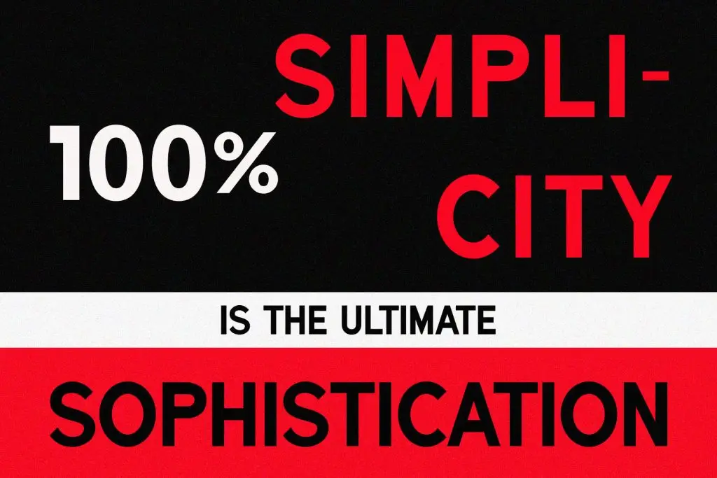
Falermo is a useful direction for Black Friday graphics that need a confident but relatively clean appearance. Its strong display character can support oversized headlines where typography becomes the main visual element. This approach works particularly well with simple layouts and high-contrast color combinations.
A black, white, and red palette can strengthen that visual impact. Large type can occupy much of the canvas, while short supporting copy creates hierarchy below it. This makes Falermo suitable for promotional posters, website banners, and bold social media campaigns.
Yoksen for High-Impact Sale Graphics
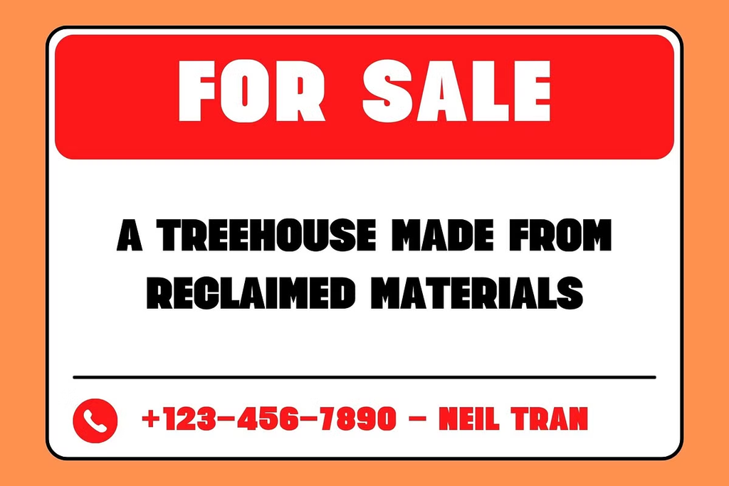
Yoksen can work well when a Black Friday campaign needs a heavier and more energetic personality. Strong, compact lettering is especially useful for words such as “SALE,” where immediate visibility matters more than subtle detail. It can give promotional graphics a direct, almost poster-like quality.
This type of font works particularly well with large rectangular blocks, price tags, stickers, and bold call-to-action areas. Designers can combine it with white space to prevent the heavy typography from overwhelming the composition. The result feels energetic without sacrificing clarity.
Spektra for Modern Black Friday Campaigns
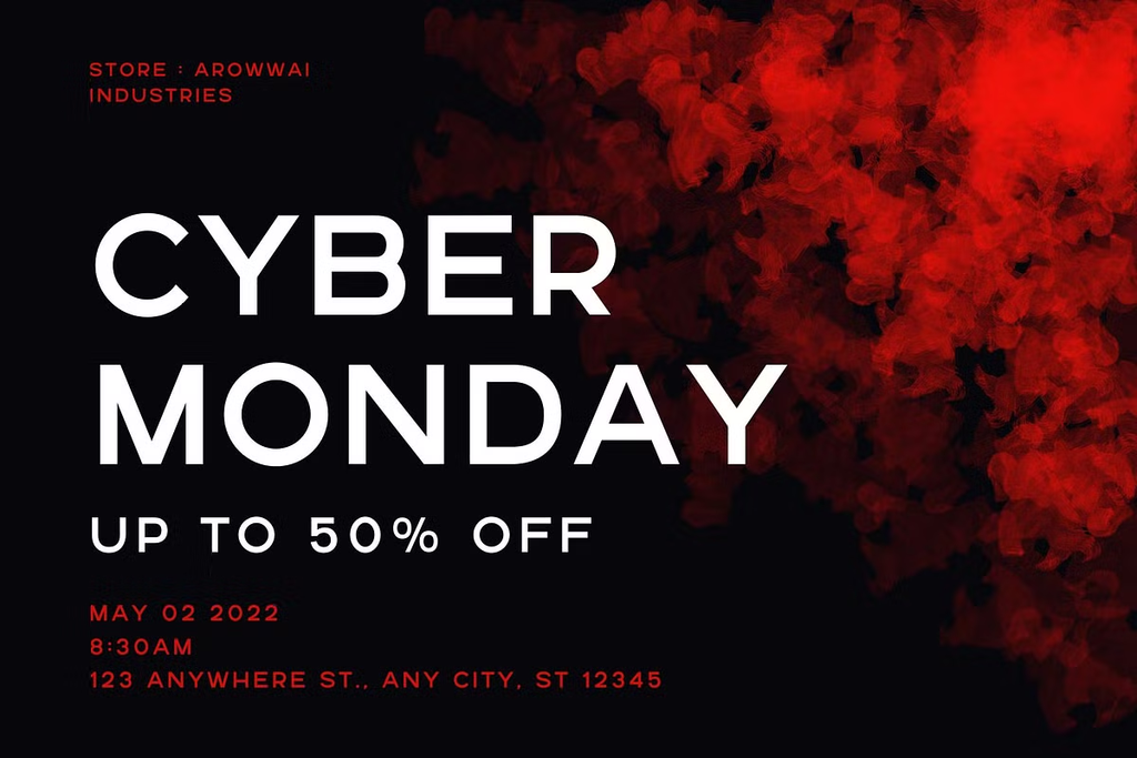
For a cleaner and more contemporary direction, Spektra can help Black Friday promotions feel modern rather than overly aggressive. Generous spacing and clean sans serif forms work especially well for fashion, technology, creative products, or premium sales campaigns.
Spektra can also support layouts where typography interacts with photography or abstract visuals. Instead of filling every area with promotional text, designers can use one large headline and allow negative space to create contrast. This gives the campaign a more polished visual identity.
Match the Font with the Brand
Not every Black Friday design should use the same condensed black type on a yellow background. The font should reflect the personality of the brand as well as the urgency of the promotion. A playful retailer and a premium technology brand may both run a 50% discount, but their typography should not necessarily look identical.
This is where exploring different font personalities becomes useful. Browse the Font Kingdom font collection when comparing display and sans serif options for promotional projects, then test the chosen typeface using the actual discount message rather than placeholder copy.
Use Contrast to Strengthen the Offer
Color and typography need to work together. Black, white, and red remain effective because they create immediate contrast, but orange, cobalt, or other brand colors can produce equally strong results. The important factor is ensuring that the primary offer remains dominant.
Avoid filling every element with a different bright color. Strong typography already creates visual energy. A limited palette often makes Black Friday graphics look more deliberate.
Final Thoughts
The best fonts for Black Friday deals combine visibility, personality, and readability. Falermo can support bold and structured promotions, Yoksen works well for energetic sale graphics, while Spektra offers a cleaner contemporary direction. Each font can create a different impression even when communicating the same discount.
Start with the hierarchy rather than decoration. Make the offer easy to notice, keep supporting information simple, and choose a typeface that matches the brand. When typography communicates the message immediately, Black Friday graphics have a much better chance of standing out.

2 Comments