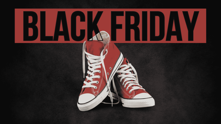
Using condensed fonts for Black Friday shoe sale designs can help promotional headlines feel bold without taking over the entire layout. Their narrow proportions make it easier to fit strong messages such as “New Arrival,” “Special Offer,” or “Black Friday Sale” beside product photography. For footwear campaigns, that balance is especially useful because the shoes still need enough visual space to remain the main attraction.
Condensed typography also creates a direct, energetic feeling that matches retail promotions. Tall letterforms can make a headline look larger even when horizontal space is limited. This makes the style useful for posters, social media graphics, landing pages, and online store banners.
Why Condensed Fonts Work for Shoe Promotions
Shoe sale graphics often combine large product imagery with short promotional copy. A wide display font can quickly compete with the product, especially in landscape or mobile formats. Condensed fonts solve this problem by creating strong visual impact in a smaller footprint.
They also support clear hierarchy. The main headline can appear oversized, while the price, discount, or call to action stays smaller. This gives customers an immediate reading order without making the layout feel crowded.
Jacob’s for Modern Activewear Campaigns
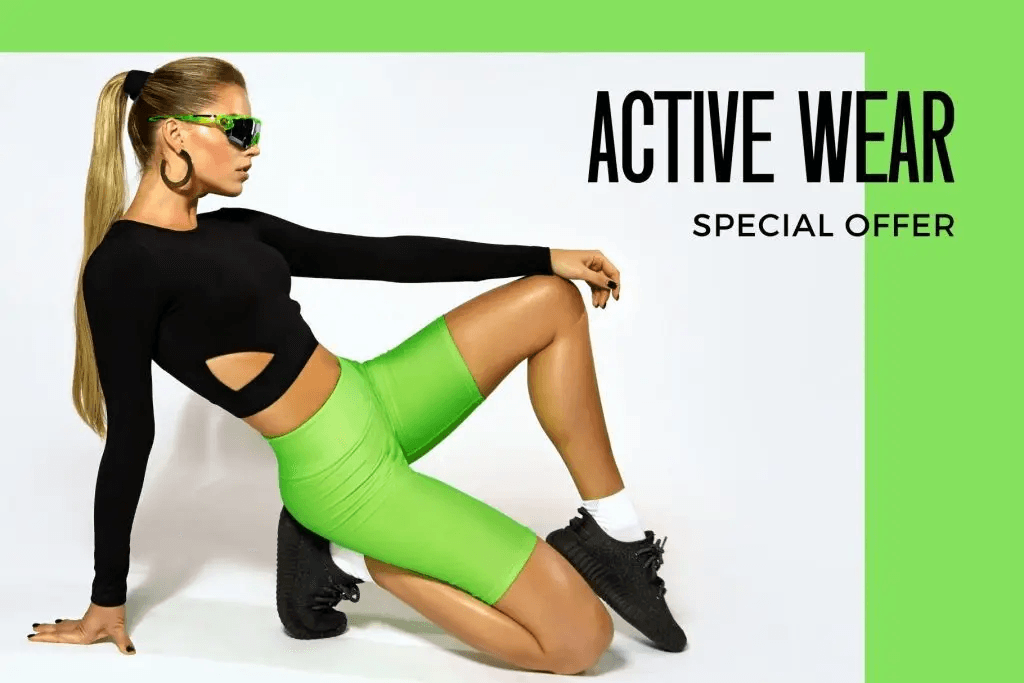
Jacob’s is a strong choice for shoe promotions that need a modern and energetic character. Its condensed structure works especially well with sportswear, activewear, sneakers, and lifestyle photography. The tall proportions give short headlines a strong presence while leaving plenty of room for the product.
The activewear direction works because the type stays clean while the photography carries most of the personality. Bright accent colors can make the campaign feel more energetic without requiring additional decorative elements. Jacob’s can therefore support a contemporary Black Friday layout that feels direct rather than overly aggressive.
Use Jacob’s for Short, High-Impact Headlines
Jacob’s works best when the message is concise. Phrases such as “Black Friday,” “Active Wear,” or “50% Off” allow the narrow letterforms to create a strong vertical rhythm. Short copy also makes the campaign easier to read while scrolling.
Pair it with a simpler sans serif for details such as dates, product categories, and discount conditions. This prevents the condensed style from being overused and keeps the typography system clear.
Jochepine for Retail and Sneaker Layouts
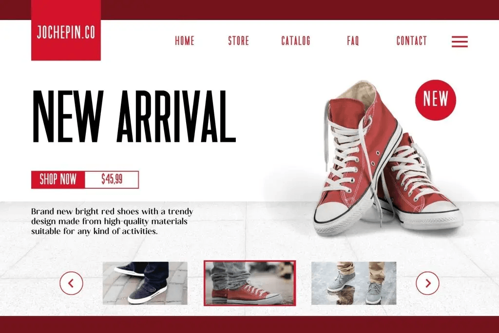
Jochepine offers another condensed direction, but its visual character can feel more retail-focused and structured. It works well for product landing pages, sneaker promotions, catalogs, and sale banners where several pieces of information need to fit into one composition.
A headline such as “New Arrival” shows how condensed lettering can stay large without covering the product. The narrow forms also leave more room for pricing, navigation, buttons, and product thumbnails. This makes Jochepine useful when the design needs both visual impact and practical information.
Condensed Fonts Create Better Space Efficiency
One of the biggest advantages of condensed typography is space efficiency. Designers can maintain a large font size without sacrificing product imagery or supporting information. This becomes even more important in Black Friday campaigns, where layouts often contain multiple promotional messages.
Instead of shrinking the headline, a condensed font lets the text stay visually dominant. That improves readability and helps the offer feel more urgent. It also makes the layout easier to adapt across different dimensions.
Pair Condensed Type with Strong Contrast
Condensed fonts perform best when there is enough contrast between the text and background. Black, white, red, neon green, or other strong brand colors can make the headline more visible. High contrast is especially useful when the campaign includes detailed photography.
Avoid combining condensed typography with too many decorative elements. The narrow letterforms already create a distinctive visual rhythm. Clean backgrounds and focused product imagery usually produce a stronger result.
Explore More Black Friday Typography
Condensed fonts are only one direction for seasonal retail campaigns. Bold sans serifs, expressive display fonts, and modern serif styles can create very different moods. Choosing the right one depends on the product category and brand personality.
For more ideas, read Best Fonts for Black Friday Deals to compare broader typography options for promotional campaigns. That article can help you decide when condensed type is the strongest choice and when another font style may work better.
Final Thoughts
The best condensed fonts for Black Friday shoe sale designs combine strong visibility with efficient use of space. Jacob’s can support modern activewear and lifestyle promotions, while Jochepine works well for structured sneaker and retail layouts. Both allow designers to build large headlines without overwhelming product photography.
Keep the copy short, maintain strong contrast, and use a simpler font for supporting details. When condensed typography is used strategically, a shoe sale campaign can feel bold, clear, and much easier to scan.
