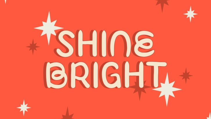
Choosing the right font styles for your design can completely change how a project feels before anyone reads the full message. A serif can make a brand feel refined, while a sans serif can create a cleaner and more modern impression. Handwritten and display fonts push personality even further, making typography an important part of the visual identity.
There is no single font category that works for every project. The better question is what kind of mood, readability, and visual impact your design needs. Understanding the differences between serif, sans serif, handwritten, and display fonts makes that decision much easier.
Why Font Styles Matter
Fonts communicate more than words. Their shapes, spacing, weight, and details influence whether a message feels formal, friendly, luxurious, modern, playful, or bold. This is why the same headline can create completely different impressions when the typeface changes.
Font Kingdom also recommends considering the purpose, audience, readability, and personality of a project before selecting a font. A design that needs long-form readability will naturally require a different approach from a poster built around one expressive headline.
Serif Fonts: Refined and Established

Serif fonts are recognized by the small strokes attached to the ends of many letterforms. These details often create a more traditional, editorial, or sophisticated appearance. Serif typography is commonly associated with publishing, professional communication, luxury branding, and designs where credibility matters.
From Font Kingdom, Aeloria is a useful example for editorial, branding, and professional applications. Qersa offers another refined direction, combining modern sophistication with an elegant serif structure that works across branding, websites, and social media.
When Should You Choose a Serif?
Choose a serif when the design needs to feel polished, established, or editorial. It can be especially effective for fashion brands, hotel identities, magazines, premium packaging, and storytelling-focused websites.
However, not every serif needs to feel traditional. Modern serif fonts can use high contrast and expressive shapes to create a much more contemporary appearance. The category gives designers plenty of room to move between classic and modern.
For a deeper introduction, read What Is a Serif Font? History, Features, and Examples to understand how different serif styles affect tone and readability.
Sans Serif Fonts: Clean and Versatile
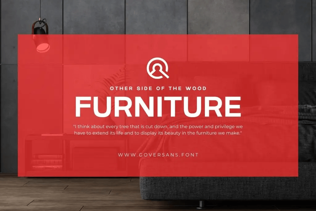
Sans serif fonts remove the small decorative strokes found in serif typography. Their simpler construction often makes them feel modern, neutral, and direct. They are especially common in technology, websites, apps, startups, e-commerce, and contemporary branding.
Govers from Font Kingdom is a strong example. Its clean lines, even spacing, and balanced proportions are designed for readability across branding, web design, advertising, and social media. Vaneska offers a softer interpretation with refined proportions suited to fashion, luxury branding, and editorial projects.
When Should You Choose a Sans Serif?
Sans serif fonts work well when information needs to feel straightforward and accessible. They are a practical choice for navigation, digital interfaces, advertising, corporate layouts, and modern brand systems.
Their neutrality also makes them useful for font pairing. A clean sans serif can support an expressive serif, handwritten, or display headline without competing for attention. That versatility is one reason the category appears across so many industries.
Handwritten Fonts: Personal and Human
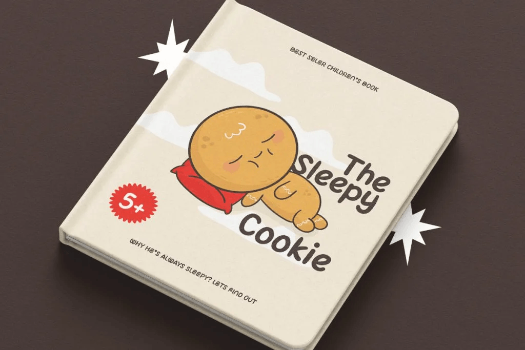
Handwritten fonts imitate natural writing through irregular strokes, curves, and less rigid letterforms. These imperfections can make typography feel friendly, authentic, handmade, or creative. They are often used in branding, packaging, invitations, educational designs, and social media graphics.
For playful projects, Font Kingdom offers Floomie, a handwriting font with rounded, naturally imperfect forms designed for children’s books, educational materials, packaging, and classroom graphics. Joylet takes a similarly approachable direction with soft curves and a hand-drawn feel that remains readable for child-focused applications.
When Do Handwritten Fonts Work Best?
Handwritten fonts are strongest when the design needs emotional warmth. They can make a bakery label feel more artisanal, a children’s worksheet more approachable, or a greeting card more personal.
Their personality is also their limitation. Long paragraphs in an expressive handwritten font can quickly become tiring to read. Use them mainly for headlines, short phrases, labels, or accents, then pair them with a simpler font for longer information.
Read Handwritten Fonts: When and How to Use Them in Graphic Design for more practical guidance on where this category performs best.
Display Fonts: Designed to Get Attention
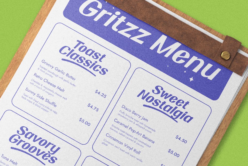
Display fonts are created primarily for visual impact. They may use exaggerated proportions, unusual shapes, bold weights, retro references, decorative details, or experimental forms. Instead of disappearing into the layout, they are meant to become part of the visual concept.
Font Kingdom specializes heavily in this category. Kinzle, for example, combines chunky retro letterforms with playful 70s and 90s influences, making it suitable for branding, social media, and posters. Boldova takes an even more energetic retro direction with thick rounded lettering and a strong visual presence.
When Should You Use a Display Font?
Choose display typography when the headline itself needs to attract attention. Posters, packaging, logos, merchandise, campaign graphics, and social media content are natural applications.
Avoid expecting one decorative display font to handle every role. Pair it with something quieter for body text and practical information. This allows the display type to remain memorable without making the entire design difficult to read.
How to Choose the Right Style
Start with the message rather than the font. Ask whether the design needs to inform, persuade, entertain, or create a particular emotional impression. Then think about where the typography will appear and how quickly people need to read it.
For most projects, one expressive font and one supporting font are enough. Font Kingdom’s own font-selection guidance recommends limiting the number of typefaces and testing pairings carefully so they complement rather than compete with each other.
Final Thoughts
Finding the right font styles for your design becomes easier once you understand what each category naturally brings to a composition. Serif fonts can communicate sophistication, sans serif fonts offer versatility, handwritten fonts add warmth, and display fonts create stronger visual personality.
Instead of choosing a font because it looks attractive in isolation, test it inside the actual design. Explore options such as Aeloria and Qersa for serif projects, Govers and Vaneska for modern sans serif layouts, Floomie and Joylet for handwritten personality, or Kinzle and Boldova when the typography needs to stand out. Font choice works best when style and function support the same message.
