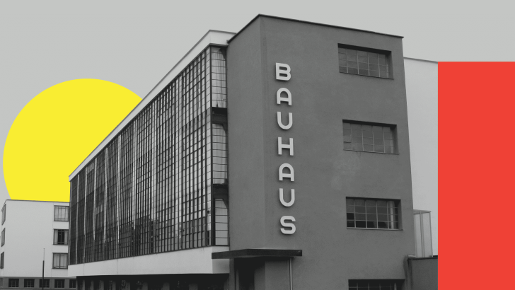
Bauhaus design is one of the most influential visual movements in modern art, architecture, typography, and graphic design. It is often recognized through geometric shapes, clean layouts, functional typography, and a strong relationship between form and purpose. Even today, Bauhaus-inspired design can feel surprisingly contemporary because its visual language is simple, bold, and adaptable.
What makes Bauhaus interesting is that it was never only about one aesthetic. It was also an educational approach that brought art, craft, technology, and design together. That wider philosophy is the reason its influence can still be seen in posters, websites, branding, interiors, furniture, and editorial design.
What Is Bauhaus Design?
Bauhaus was originally a German school of art and design rather than simply a visual style. Its approach encouraged designers to think about how form, material, function, and production could work together. Instead of treating decoration as the main goal, Bauhaus pushed toward clearer and more purposeful design.
This is why Bauhaus-inspired graphics often feel structured and direct. Designers frequently use simple shapes, bold typography, strong alignment, and limited visual elements. The goal is not to remove personality, but to make every element contribute to the overall composition.
A Brief History of the Bauhaus
The Bauhaus was founded in Germany in 1919 and developed a multidisciplinary approach to design education. Its teaching explored areas such as architecture, typography, photography, furniture, textiles, painting, and industrial design. The movement later became closely associated with modernist ideas about function, standardization, experimentation, and new methods of production.
Typography also became an important part of the Bauhaus identity. Bauhaus Dessau notes that typography at the school was shaped by reduction and geometry, with designers such as László Moholy-Nagy, Herbert Bayer, and Joost Schmidt influencing advertising and visual communication.
Bauhaus Was More Than “Red, Yellow, and Blue”
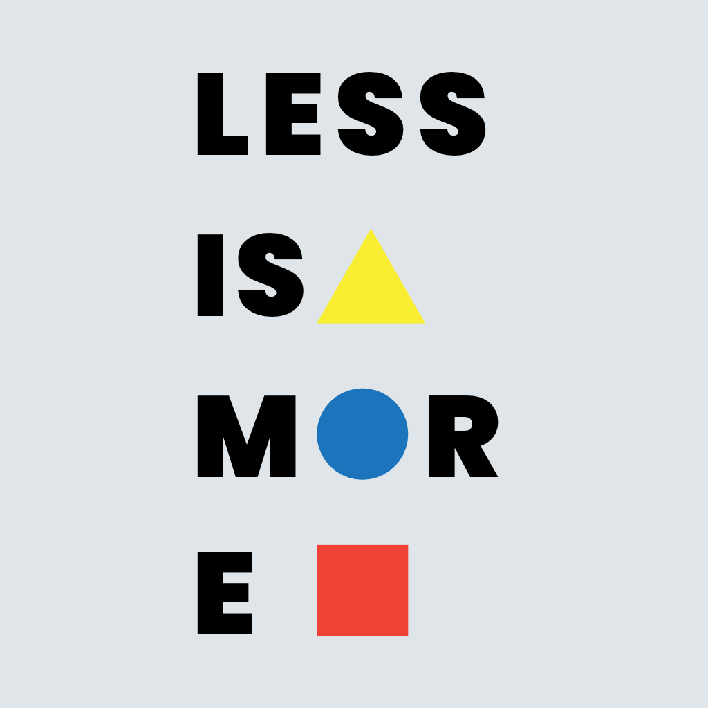
One common simplification is to treat Bauhaus as a formula made of circles, squares, triangles, and primary colors. Those elements can certainly appear in Bauhaus-inspired design, but they are not the whole story. Even the Bauhaus Dessau Foundation has pointed out that the movement used a richer palette than the primary-color stereotype often suggests.
The deeper idea is systematic experimentation. Bauhaus designers explored relationships between form, material, space, typography, technology, and human use. That is why copying a few geometric shapes does not automatically make a layout Bauhaus.
Function Should Guide the Design
One of the strongest ideas associated with modernism and Bauhaus is that design should respond to function. Ornament is not automatically forbidden, but decoration should not make the object or message harder to use. This encourages designers to simplify forms and think carefully about purpose.
In graphic design, this might mean using typography to establish hierarchy rather than adding unnecessary effects. A poster can feel visually exciting through scale, alignment, geometry, and contrast alone. The structure becomes part of the expression.
Geometry Creates a Strong Visual Language
Circles, squares, rectangles, lines, and other simple forms are common in Bauhaus-inspired work. These shapes are easy to combine, repeat, rotate, crop, and scale. They also create strong contrast without requiring detailed illustration.
A contemporary poster might use one oversized circle behind a headline, several rectangular color blocks, and a diagonal line connecting different areas of information. The result can feel playful while still remaining highly organized.
Simple Shapes Can Still Feel Dynamic
Bauhaus does not mean placing every element in a rigid symmetrical grid. Designers can use asymmetry, rotation, overlap, and strong scale changes to add energy. A small circle beside a huge block of text can create more tension than a complicated decorative composition.
This controlled contrast is one reason Bauhaus-inspired graphics remain useful for modern branding and social media. Simple elements can adapt easily to different formats while maintaining a recognizable visual system.
Typography Should Be Direct
Typography in Bauhaus-inspired design often favors clear, geometric, or sans serif forms. The Bauhaus Dessau Foundation describes Bauhaus typography as strongly connected to reduction and geometry.
The font should usually support the structure rather than become purely ornamental. Designers can create hierarchy with large headlines, narrow columns, uppercase text, or bold scale changes. Letter spacing and alignment also become important because typography is often one of the main visual elements.
Color Should Support the Composition
Bauhaus-inspired designs often use limited color palettes with strong contrast. Red, yellow, blue, black, white, and neutral tones are familiar choices, but modern interpretations can expand beyond them. The important thing is to use color intentionally.
One color might identify the main message, while another defines a geometric element or secondary section. Limiting the palette also makes the composition easier to control. Too many colors can weaken the strong graphic clarity associated with the style.
Examples of Bauhaus Design Today

A Bauhaus-inspired poster might use a bold sans serif headline, geometric forms, a limited palette, and asymmetric placement. A social media graphic could use simple circles and rectangles as supporting elements while keeping the message large and direct. Branding systems can also borrow the style through modular shapes and consistent typography.
The principles can extend to web and editorial design as well. Simple navigation, structured spacing, clear hierarchy, and strong typography all connect naturally with Bauhaus thinking. Modern designers do not need to recreate historical posters exactly; they can reinterpret the underlying logic.
If you want to compare Bauhaus with another modernist design system, read Design Style of the Week: Swiss Design. Swiss Design later developed its own strong emphasis on grids, clarity, typography, and systematic visual communication.
Font Kingdom Fonts for Bauhaus-Inspired Design
Font choice should reflect the project rather than imitate a historical Bauhaus typeface literally. For modern Bauhaus-inspired layouts, fonts with clean structure, strong geometry, or expressive display character can work especially well.
Govers is a strong option for layouts that need a clean modern sans serif. Font Kingdom describes it as having clean lines, even spacing, and refined proportions, which makes it useful for structured posters, branding, and web layouts.
Casendro works well when the design needs more vertical impact. Its condensed, all-caps structure and sharp character can create the strong headline hierarchy often seen in modernist-inspired posters. Font Kingdom specifically describes it as a modern higher sans serif with condensed construction and bold precision.
For a more playful interpretation, Kinzle offers a retro display direction with bold and energetic letterforms. It is less historically strict than Govers or Casendro, but it can work in contemporary Bauhaus-inspired graphics when paired with geometric shapes and a controlled layout.
What About Funkier Bauhaus-Inspired Layouts?
Modern Bauhaus references do not always need to feel minimal. A more expressive poster can combine geometry with a bold display face such as Boldova, which Font Kingdom describes as a chunky retro-inspired font with thick, rounded lettering and energetic personality.
The key is discipline. If the font already has a strong personality, the surrounding geometry and color system should stay controlled. Bauhaus-inspired design becomes weaker when every element tries to become the focal point.
Final Thoughts
Bauhaus design remains relevant because it is built on ideas rather than decoration alone. Geometry, function, typography, material awareness, and controlled experimentation give the style a visual language that still feels useful in modern design. Its strongest lesson is not “use circles and primary colors,” but “make every design choice intentional.”
For a contemporary approach, start with clear hierarchy and simple geometry. Then choose a typeface that supports the message, such as Govers for clarity, Casendro for stronger vertical impact, or Kinzle and Boldova for a more playful interpretation. When form, function, and typography work together, the Bauhaus influence feels much more convincing.
