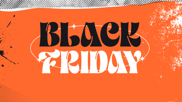
Modern Black Friday poster design trends are moving far beyond the usual black background, giant discount percentage, and red sale sticker. Retail campaigns now use typography, photography, color, and layout to reflect the personality of the brand instead of relying on one visual formula. This makes Black Friday design more flexible for fashion, beauty, technology, lifestyle, and youth-focused products.
The strongest campaigns still communicate urgency, but they do it with clearer visual hierarchy and more distinctive art direction. A poster needs to show the offer quickly while giving customers a reason to remember the brand behind it. That balance between promotion and identity is becoming one of the most important parts of modern retail design.
Bold Typography Still Leads Black Friday Design
Large typography remains one of the most effective tools in Black Friday advertising. Words such as “Black Friday,” “Sale,” and “70% Off” need to compete for attention in crowded feeds, websites, and store displays. Oversized type makes the offer visible even before viewers process the rest of the composition.
The difference is that modern layouts are becoming more expressive. Designers are experimenting with condensed sans serif fonts, elegant display serif styles, oversized numbers, and dramatic scale changes. Typography is no longer just information—it often becomes the main graphic element.
Strong Hierarchy Makes Promotions Easier to Scan
Black Friday posters usually contain several messages at once. The campaign title, discount, product image, offer details, and call to action all compete for limited space. Clear hierarchy helps viewers understand which information matters first.
A good structure typically gives the largest visual weight to the campaign or discount. Supporting details can then appear in smaller type or secondary positions. This approach makes even visually complex layouts feel easier to navigate.
Fashion Campaigns Are Becoming More Editorial
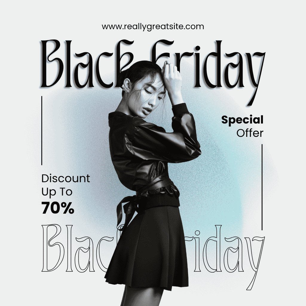
Fashion-focused Black Friday campaigns often move away from traditional retail graphics and toward editorial-style compositions. Large serif typography, monochrome photography, thin rules, and spacious layouts can make promotional graphics feel more like magazine covers. This helps sales content feel more premium.
The black-and-white fashion direction works especially well because it creates strong contrast without relying on excessive decoration. A single model image can carry most of the visual weight while typography builds the promotional hierarchy around it.
Beauty Brands Are Using Brighter Color Palettes
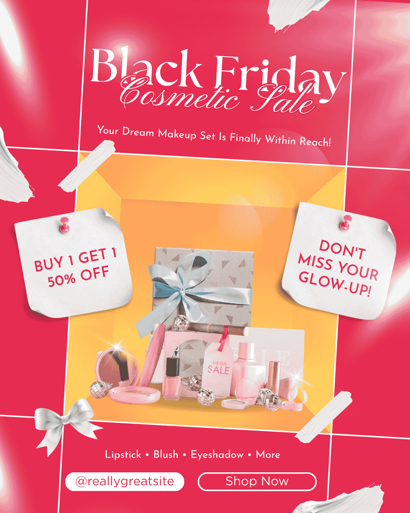
Black Friday does not always need to look dark. Beauty campaigns can use hot pink, coral, peach, and warm yellow to create a more energetic seasonal promotion. This allows the campaign to feel aligned with the brand while still communicating a major sale.
The cosmetic poster direction also shows how product presentation can become part of the layout. Gift boxes, cosmetic products, ribbons, labels, and handwritten-style accents create a more tactile visual experience. The result feels promotional without losing its beauty-brand personality.
Tech Retail Uses Clean, High-Contrast Visuals

Technology campaigns often benefit from a cleaner approach. Large geometric sans serif fonts, dark gradients, product renders, and bright accent colors can make a Black Friday poster feel modern and efficient. This style helps the product remain the center of attention.
Purple gradients and neon yellow accents can create a strong digital mood without becoming visually complicated. The structure is usually direct: product, headline, discount, and call to action. That simplicity works especially well for electronics, smart devices, and digital products.
Urban Graphics Add More Personality
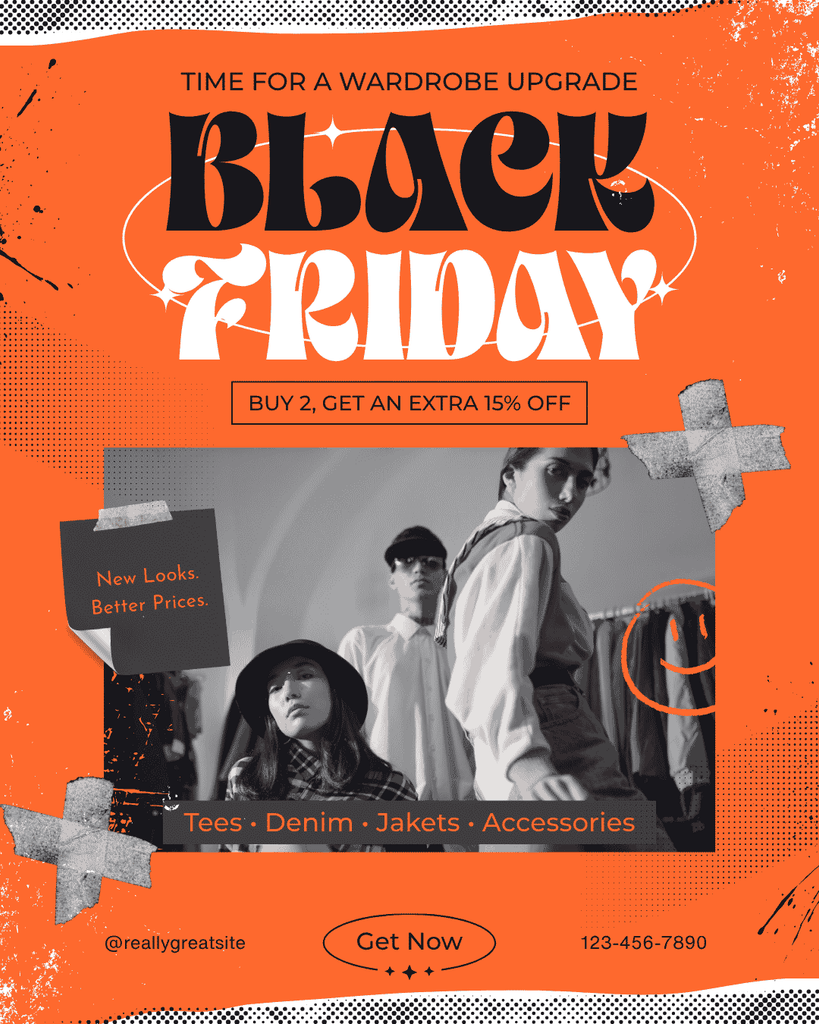
Another direction in Black Friday poster design trends is the use of urban and street-inspired visual language. Grain, tape textures, halftone patterns, handwritten details, black-and-white photography, and oversized expressive typography can make a campaign feel younger and more energetic.
This style works particularly well for streetwear, fashion accessories, creative brands, and youth-focused retail. Instead of looking polished and corporate, the poster feels more like a music flyer or independent magazine spread.
Black Backgrounds Still Work When Used Differently
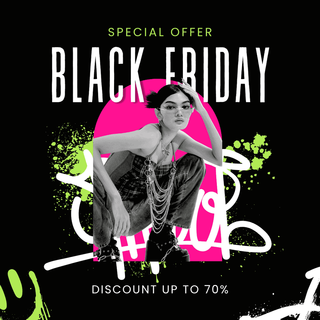
Black remains closely associated with Black Friday, but modern designers are finding ways to make it feel less predictable. Instead of using plain black with yellow sale text, they combine black with neon green, hot pink, white, or expressive photography. This creates a stronger brand personality.
The urban style uses a dark background with bright accent colors and layered graphic elements. Large condensed typography keeps the promotional message clear while the supporting details give the layout more energy.
Font Choice Can Define the Entire Campaign
Typography is often the fastest way to differentiate one Black Friday campaign from another. A condensed sans serif feels urgent and direct, while an elegant serif can make the offer feel premium. More experimental display fonts can push the campaign toward fashion, youth culture, or editorial design.
If you are still deciding which typography direction fits your campaign, explore Best Fonts for Black Friday Deals. That guide looks more closely at how different font personalities can shape promotional graphics and help important sale messages stand out.
Design for Multiple Retail Formats
A strong Black Friday visual should not work only as one poster. The same design system may need to extend into Instagram posts, stories, email banners, website headers, ads, and in-store signage. This makes flexible typography and consistent color systems especially important.
Designers should test the campaign in both vertical and square formats. Large headlines may need different line breaks, while product imagery may require different crops. Building the system early helps the campaign stay recognizable across every channel.
Final Thoughts
The strongest Black Friday poster design trends are moving toward more brand-specific visual identities. Bold typography remains important, but designers are combining it with editorial layouts, bright beauty palettes, tech-inspired gradients, urban textures, and stronger photography. This makes Black Friday campaigns feel less repetitive and more connected to the product being promoted.
The goal is not to add more visual effects. It is to choose a direction that matches the audience and communicate the offer as clearly as possible. When typography, imagery, color, and hierarchy work together, a Black Friday poster can attract attention without looking like every other seasonal sale graphic.

One Comment