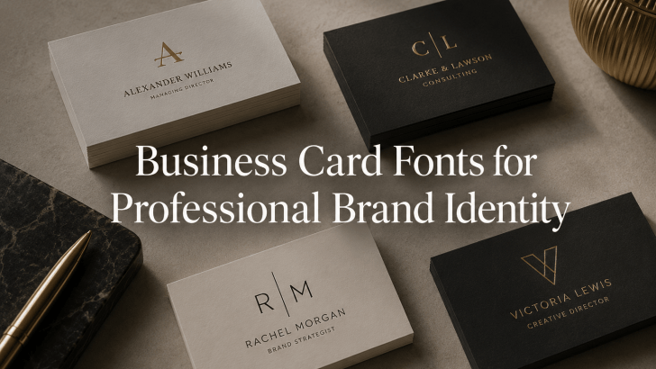
Choosing the right business card fonts for professional brand identity is one of the most overlooked aspects of branding. Many professionals invest in logos, websites, social media, and marketing materials, yet their business cards fail to leave a lasting impression. In many cases, the issue isn’t the layout or color palette; it’s the typography.
A business card is often the first physical interaction someone has with your brand. Whether you’re meeting a potential client, networking at an event, or introducing your company to a new partner, your business card communicates professionalism before a conversation even begins. The right font can make your brand appear trustworthy, modern, luxurious, or creative. The wrong font can undermine credibility and weaken your visual identity.
In today’s digital world, business cards remain powerful networking tools. A thoughtfully designed card supported by strong typography helps reinforce your brand message and improves recognition long after the meeting ends.
Why Typography Matters on Business Cards
Business cards have limited space, which means every design element must work efficiently. Typography carries much of the responsibility for communicating information clearly and creating a memorable impression.
A well-chosen font helps:
- Improve readability
- Strengthen brand personality
- Create visual hierarchy
- Enhance professionalism
- Increase memorability
Because business cards are often viewed for only a few seconds, typography plays a major role in shaping first impressions.
Recommended Business Card Fonts
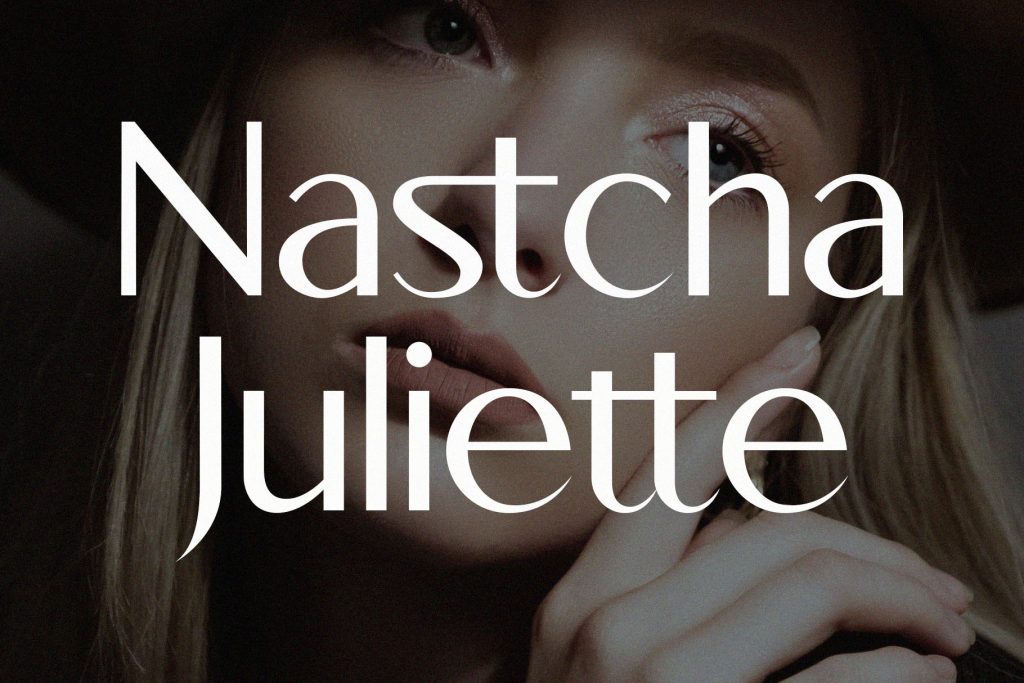
1. Hoodger
2. Rosela

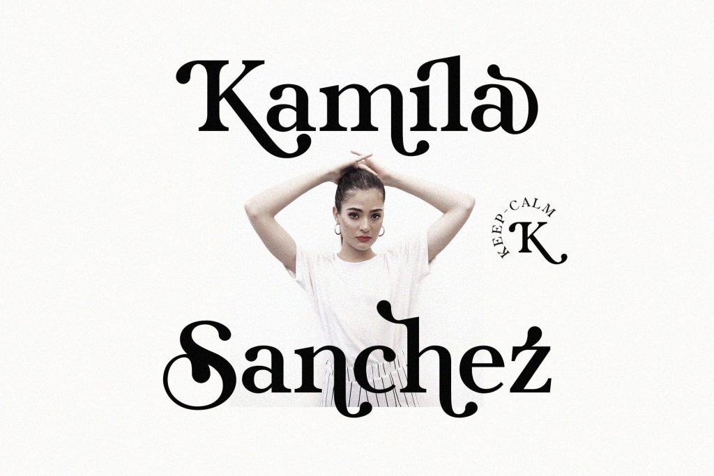
3. Kefhila
4. Fhunca Vinjhae

5. Gavoline
Best Use Cases
Different businesses require different typography approaches. Selecting the right font depends on your audience, industry, and brand positioning.
1. Corporate and Professional Services
For industries where trust is essential, typography should emphasize professionalism and clarity.
Recommended fonts:
- Hoodger
- Kefhila
- Gavoline
These fonts communicate competence and reliability while maintaining excellent readability.
2. Luxury and Premium Brands
Luxury businesses often benefit from typography that feels refined and exclusive.
Recommended fonts:
- Rosela
- Kefhila
- Fhunca Vinjhae
These typefaces help create a premium impression that aligns with high-end products and services.
3. Creative Professionals
Designers, photographers, artists, and content creators often need typography that reflects originality and personality.
Recommended fonts:
- Rosela
- Fhunca Vinjhae
These fonts help establish a memorable visual identity while preserving professionalism.
4. Personal Branding
Independent consultants, coaches, speakers, and entrepreneurs rely heavily on personal reputation. Fonts with distinctive character can help reinforce authenticity and make business cards more memorable.
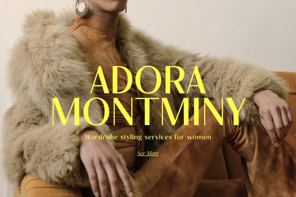
5. Modern Startups
Startups frequently favor clean, minimalist branding systems.
Recommended fonts:
- Hoodger
- Gavoline
Their contemporary appearance supports a modern and innovative brand image.
Tips for Implementation
Choosing a font is only part of creating an effective business card. Proper implementation ensures the typography works as intended.
Prioritize Readability
Business cards contain important information such as:
- Names
- Job titles
- Phone numbers
- Email addresses
- Websites
Every element must remain easy to read at small sizes. Avoid overly decorative fonts for essential contact information.
Establish Visual Hierarchy
Not all information should receive equal emphasis.
Typically:
- Name = most prominent
- Job title = secondary
- Contact details = supporting information
Typography hierarchy helps viewers quickly understand the card.
Limit Font Pairings
Most successful business cards use one or two fonts. Using too many typefaces can make the design feel cluttered and inconsistent.
A common approach is:
- Display font for names or logos
- Simple supporting font for details
Use White Space Effectively
Luxury and professional branding often rely on simplicity. Generous white space improves readability and allows typography to stand out.
Ensure Brand Consistency
Your business card should align with the rest of your visual identity.
Typography should remain consistent across:
- Websites
- Social media
- Marketing materials
- Presentations
- Email signatures
Consistency strengthens brand recognition and professionalism.
How Typography Strengthens Brand Identity
Typography influences how people perceive your business.
The right font can communicate:
- Trust
- Confidence
- Creativity
- Luxury
- Innovation
Because business cards are often exchanged during important professional interactions, typography becomes a subtle but powerful branding tool. A memorable business card increases the likelihood that prospects will remember your name and brand after the meeting ends.
Related Articles You May Like
Want to learn more about typography and branding?
Read “How to Advertise Your Business with Strong Visual Typography” to discover how typography can improve marketing performance and strengthen brand communication.
You can also explore “Best Fonts for Business Advertising to Build a Strong Brand Identity” for additional font recommendations and branding strategies that help businesses create a more professional visual presence.
For more typography inspiration, branding resources, and premium font collections, visit Font Kingdom’s blog and font library.
Conclusion
Choosing the right business card fonts for professional brand identity can significantly improve how your business is perceived. Typography influences first impressions, strengthens recognition, and helps communicate your brand values long before a conversation begins.
Fonts such as Hoodger, Rosela, Kefhila, Fhunca Vinjhae, and Gavoline offer distinctive qualities that work across a wide range of industries and branding styles. Whether your goal is professionalism, creativity, luxury, or modern simplicity, selecting the right typography helps ensure your business card becomes an effective extension of your brand.
In a competitive marketplace, even small details matter. A thoughtfully designed business card supported by strong typography can help you make a lasting impression and build stronger professional connections.