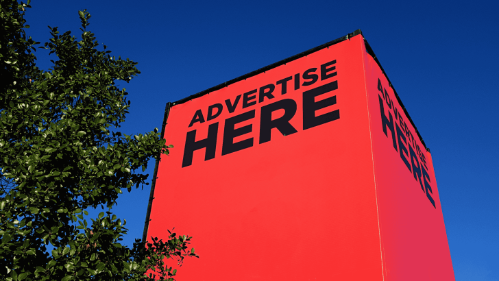
Learning how to advertise your business with strong visual typography can completely transform your marketing results. Typography is not just about choosing a font; it is about how your message is presented visually to attract attention, communicate clearly, and influence customer decisions.
In today’s competitive digital world, people scroll quickly and make instant judgments. Strong visual typography helps your business stand out, deliver your message faster, and create a lasting impression. Whether you are designing social media posts, posters, or website banners, typography plays a critical role in your advertising success.
In this guide, you will learn how typography affects marketing, key strategies to improve your designs, and practical tips for advertising your business effectively with strong typography.
Why Advertise Your Business with Strong Visual Typography Matters
Using the right typography in advertising is essential because it directly impacts how people perceive your brand and message.
When you advertise your business with strong visual typography, you can:
- Capture attention within seconds
- Improve readability and clarity
- Build brand identity and consistency
- Increase engagement and conversions
Typography acts as a visual voice for your brand. A bold font can feel confident and powerful, while a soft script font can feel elegant and personal. Choosing the right typography ensures your message aligns with your brand personality.
Key Elements of Strong Visual Typography in Advertising
To successfully advertise your business with strong visual typography, you need to understand the main elements that make typography effective.
1. Font Selection
Choosing the right font is the foundation of strong typography.
Different fonts communicate different emotions:
- Serif fonts → professional and trustworthy
- Sans-serif fonts → modern and clean
- Script fonts → elegant and personal
- Display fonts → bold and attention-grabbing
Always match your font choice with your brand identity and target audience.
If you want to explore fonts for business advertising, you can read our article here: Best Fonts for Business Advertising to Build a Strong Brand Identity.
2. Typography Hierarchy
Hierarchy helps guide the viewer’s attention.
A good hierarchy includes:
- Headline (largest and boldest)
- Subheadline (supporting information)
- Body text (details)
This structure ensures that your message is easy to scan and understand quickly.
3. Contrast and Readability
Strong contrast makes your text stand out.
Examples:
- Dark text on light background
- Bold headline + lighter body text
- Large title + smaller description
Good contrast ensures that your audience can read your message instantly.
4. Spacing and Alignment
Spacing improves readability and design balance.
Focus on:
Clean spacing makes your design look professional and easy to read.
How to Advertise Your Business with Strong Visual Typography Effectively
Now, let’s explore practical steps to apply typography in your advertising.
1. Focus on Clear Messaging
Your typography should highlight the most important message first.
For example:
- “50% OFF TODAY”
- “New Collection Available”
- “Join Now”
Keep your message short, clear, and impactful.
2. Use Bold Headlines
Bold typography grabs attention immediately.
Use:
- Large font sizes
- Strong weight (bold or extra bold)
- Eye-catching styles
Your headline should be readable even from a distance.
3. Limit Font Combinations
Using too many fonts can make your design messy.
Best practice:
- Use 1–2 fonts
- Combine contrast (bold + simple)
- Keep consistency across designs
This creates a clean and professional look.
4. Match Typography with Branding
Consistency is key in advertising.
Make sure your typography:
- Matches your logo
- Uses consistent font styles
- Reflects your brand personality
This helps build recognition and trust over time.
5. Optimize for Digital Platforms
Different platforms require different typography approaches.
For example:
- Social media → bold and large text
- Website → clean and readable fonts
- Mobile → simple and clear typography
Always test your designs on multiple devices.
Typography Strategies for Different Advertising Channels
To fully advertise your business with strong visual typography, you need to adapt your typography to different platforms.
Social Media Advertising
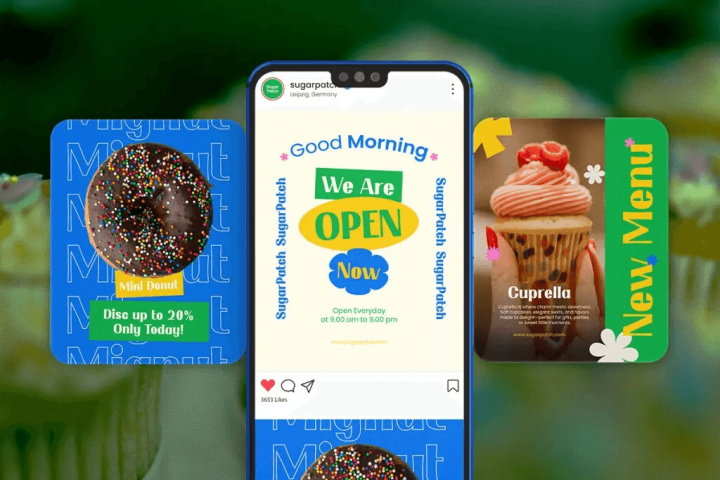
Use bold, eye-catching typography.
Tips:
- Use large headlines
- Add strong contrast colors
- Keep text minimal
Goal: Stop users from scrolling.
Website and Landing Pages

Focus on readability and structure.
Tips:
- Use clear headings (H1, H2, H3)
- Maintain consistent font styles
- Use whitespace effectively
Goal: Improve user experience and conversions.
Print Advertising

Typography must be visible from a distance.
Tips:
- Use large font sizes
- Avoid overly decorative fonts
- Keep the message simple
Goal: Deliver the message quickly.
Conclusion
Learning how to advertise your business with strong visual typography is a powerful skill that can elevate your marketing strategy. Typography is more than just design; it is a communication tool that influences how people see and respond to your brand.
By choosing the right fonts, creating a clear hierarchy, maintaining readability, and adapting your typography to different platforms, you can create advertisements that are both visually appealing and highly effective.
Strong visual typography helps your business stand out, attract attention, and deliver messages with impact. When used correctly, it becomes one of the most valuable tools in your branding and marketing strategy.