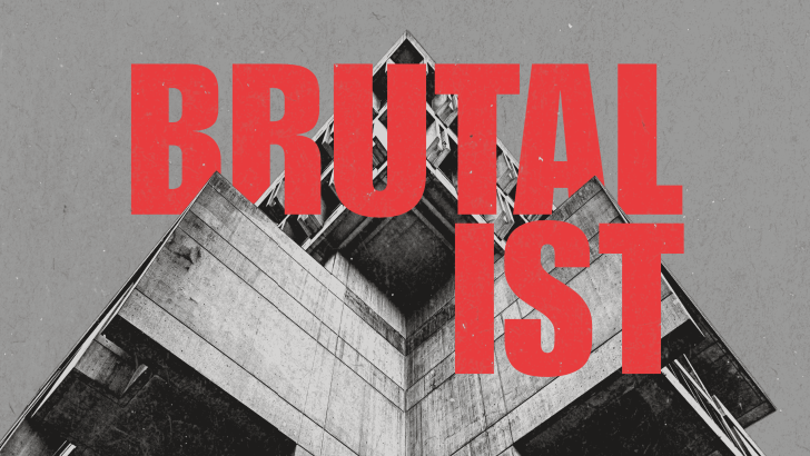
Brutalist design is difficult to ignore. Oversized typography, raw layouts, harsh contrast, visible structure, and unconventional spacing can make a composition feel almost unfinished at first glance. Yet that deliberate roughness is exactly what gives Brutalist visuals their direct and rebellious personality.
Today, the approach appears in posters, websites, editorial layouts, fashion graphics, and experimental branding. Instead of hiding every structural decision behind polished decoration, Brutalist design often exposes it. The result can feel challenging, but also distinctive in a visual landscape filled with increasingly similar templates.
What Is Brutalist Design?
Brutalism originally emerged in architecture rather than graphic design. The movement emphasized materials, construction, and clearly expressed structure, with exposed concrete eventually becoming one of its best-known visual characteristics.
In graphic and digital design, that philosophy becomes more abstract. Designers may expose grids, borders, navigation, text blocks, or structural divisions rather than trying to make them invisible. Large typography and abrupt visual contrasts often become part of that raw visual language.
A Brief History of Brutalism
The roots of Brutalism developed in postwar Europe during the early 1950s. Architects Alison and Peter Smithson became closely associated with the New Brutalism, while architectural critic Reyner Banham helped establish and popularize the term. Le Corbusier’s use of béton brut, or raw concrete, also became an important reference.
By the 1960s and 1970s, Brutalist architecture had expanded internationally. Monumental forms, exposed structural materials, and visible construction became recognizable characteristics of the movement.
Later, designers borrowed its ideas for digital and graphic communication. Web Brutalism, in particular, became associated with rough interfaces and a rejection of increasingly standardized, highly polished web aesthetics.
Brutalist Does Not Mean Randomly Ugly
A common misunderstanding is that anything awkward or unattractive can be called Brutalist. That misses the point. Strong Brutalist work usually has a deliberate structure beneath its rough appearance.
The style challenges conventional expectations about what a “finished” design should look like. An uncomfortable layout can be intentional, but random clutter without hierarchy is simply poor organization. Brutalism works when the visual tension supports a clear idea.
Raw Structure Should Stay Visible
One core principle of Brutalist design is honesty about structure. Borders can remain visible, sections can feel deliberately boxed in, and grid systems do not always need to disappear behind the content.
This makes the construction of the layout part of the visual experience. Thick rules, stark divisions, large blocks, or exposed interface elements can make a design feel functional and almost architectural.
Typography Can Become the Architecture
Typography often carries enormous visual weight in Brutalist layouts. Oversized sans serif headlines, condensed type, heavy display fonts, and dramatic scale contrasts can replace decorative illustration altogether.
A headline might occupy half the poster while supporting information appears dramatically smaller. This imbalance creates tension and establishes hierarchy instantly. The letters become structural forms rather than simply containers for words.
Try Extreme Scale Carefully
Large type is effective because it creates immediate presence. However, pushing every text element to an extreme size removes hierarchy. Brutalist typography still needs clear decisions about which information deserves attention first.
Try one dominant headline and keep the secondary information functional. Unexpected cropping or unusual line breaks can add character without making the entire composition unreadable.
Contrast Should Feel Unapologetic
Brutalist graphics often use strong black-and-white contrast. One aggressive accent color such as red, electric blue, neon green, or acid yellow can make the layout even more direct.
The palette does not always need to feel harmonious in a traditional sense. A slightly uncomfortable color combination can actually support the style. The goal is visual impact rather than softness.
Asymmetry Creates Visual Tension
Brutalist composition does not need to feel perfectly balanced. Text can sit against one edge, images can overlap structural elements, and empty areas can contrast dramatically with dense information.
This asymmetry creates movement and prevents the design from feeling overly controlled. Still, every placement should feel intentional. The strongest layouts look disruptive without actually losing their structure.
What Does Brutalist Design Look Like Today?
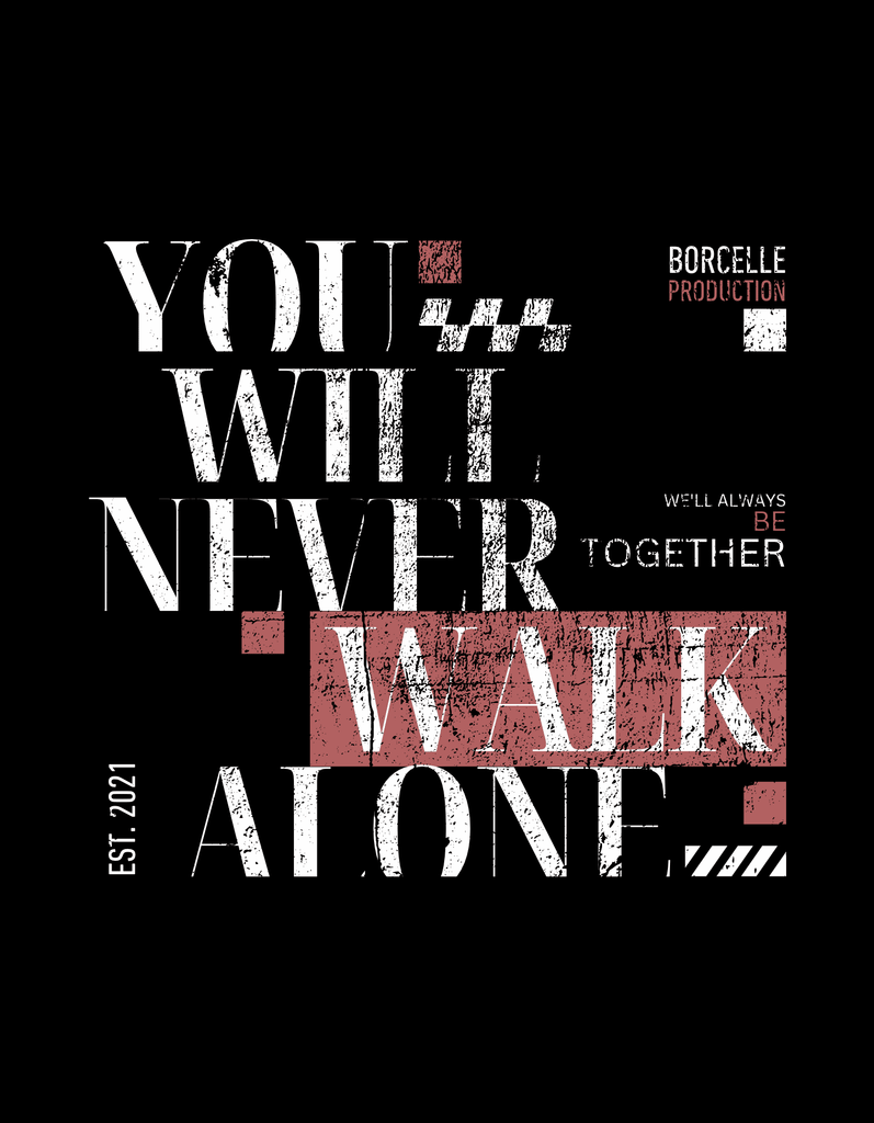
A modern Brutalist poster might combine an oversized condensed headline, monochrome photography, thick borders, and intentionally compressed text. Another version could use a plain white background with black hyperlinks, system-like typography, and exposed grid divisions.
Fashion and cultural graphics can push the style further through rough photography, grain, scribbles, and unusual cropping. Websites may use visible buttons, plain navigation, basic colors, or layouts that deliberately reject the smooth appearance of conventional interfaces.
The point is not to imitate unfinished work. It is to make the underlying structure feel visible and unapologetic.
Font Kingdom Fonts for Brutalist Design
Brutalist typography does not depend on one historical font. Typefaces work when they support scale, contrast, density, and strong hierarchy. Font Kingdom offers several options that can support different interpretations.
Jochepine is particularly useful for oversized headlines. Its condensed, all-caps construction creates vertical impact while conserving horizontal space, making it suitable for posters and dense editorial compositions.
Jacob’s offers another condensed sans serif direction. It works well when a headline needs to feel large, compressed, and visually dominant without occupying the full width of a layout.
For supporting text, Beatrice provides a cleaner counterpoint. Its balanced proportions and straightforward sans serif structure can handle practical information while a more aggressive headline carries the Brutalist personality.
Can Bold Display Fonts Work Too?
Yes. A more experimental Brutalist composition can use Chimor when the typography itself needs to become the visual event. Its thick, chunky shapes create immediate presence and can work particularly well when the rest of the layout stays restrained.
The important part is contrast. If the font is already loud, avoid making every other element equally expressive. Brutalist design becomes stronger when one dominant decision controls the composition.
Final Thoughts
Brutalist design works because it turns rawness into a deliberate visual strategy. Exposed structure, oversized typography, aggressive contrast, asymmetry, and unconventional spacing can create compositions that feel more direct than polished mainstream design.
Start with structure rather than random distortion. Choose one strong visual idea, build a clear hierarchy, and use fonts such as Jochepine or Jacob’s for condensed impact, Beatrice for functional contrast, or Chimor for a more experimental statement. When the roughness feels intentional, Brutalist design becomes provocative without becoming careless.
