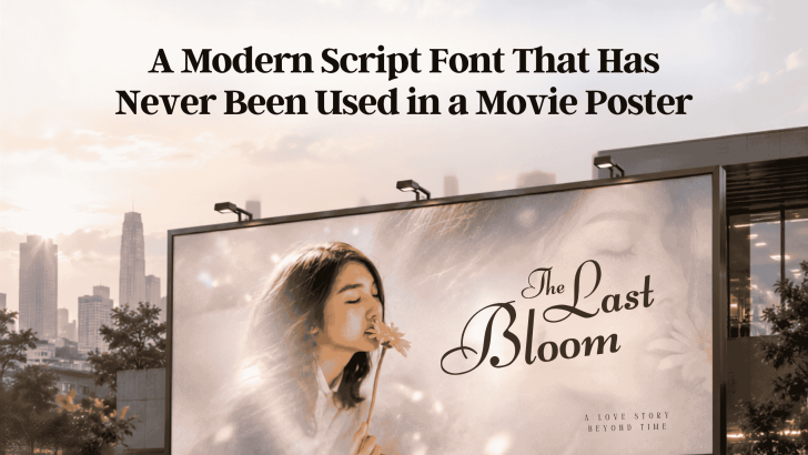
Finding a modern script font that has never been used in a movie poster sounds like the perfect way to create an original film identity. In practice, proving that a typeface has literally never appeared on any movie poster worldwide is nearly impossible. A more useful goal is to choose a modern script font that is not strongly associated with familiar film titles and can give your poster a fresher visual personality.
Script fonts can be especially effective for romance, drama, horror, coming-of-age stories, and independent films. Their handwritten qualities introduce emotion that a neutral sans serif may not communicate as quickly. However, the font still needs to match the story rather than becoming decoration.
What Is a Modern Script Font?
A script font is inspired by handwriting, calligraphy, or hand-drawn lettering. Characters often include flowing strokes, connected letters, distinctive terminals, and natural variations that make the typography feel more personal.
Modern script fonts usually simplify traditional calligraphic details. The result can feel cleaner, more contemporary, and easier to combine with photography or cinematic layouts. Unlike classic formal scripts, modern scripts don’t always need elegant flourishes. Some styles can look raw, spontaneous, romantic, or even unsettling depending on their stroke shape and rhythm.
Why Script Fonts Work for Movie Posters
Movie posters need typography that quickly introduces the story’s tone. Script fonts can carry emotion through their letterforms before audiences know anything about the plot.
Script Fonts Add Human Emotion
Because script typography resembles handwriting, it often feels personal. A soft flowing script may suggest intimacy or romance, while irregular strokes can create tension or mystery. This makes script fonts useful for character-driven films where emotion is more important than a highly corporate visual style.
They Can Make a Film Title More Memorable
A distinctive handwritten title can function almost like a custom logo. Unique curves, ligatures, and letter connections can help viewers remember the film name. However, avoid excessive flourishes if they make the title difficult to recognize at thumbnail size. Movie posters now appear on streaming platforms and social media, so small-screen readability matters too.
What Script Font Fits a Movie Poster?
The right font depends heavily on genre and visual direction.
Romance and Drama
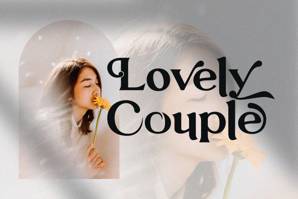
Look for elegant scripts with smooth curves, controlled contrast, and graceful connections. These features can complement portraits, soft lighting, and emotional storytelling.
Horror and Thriller
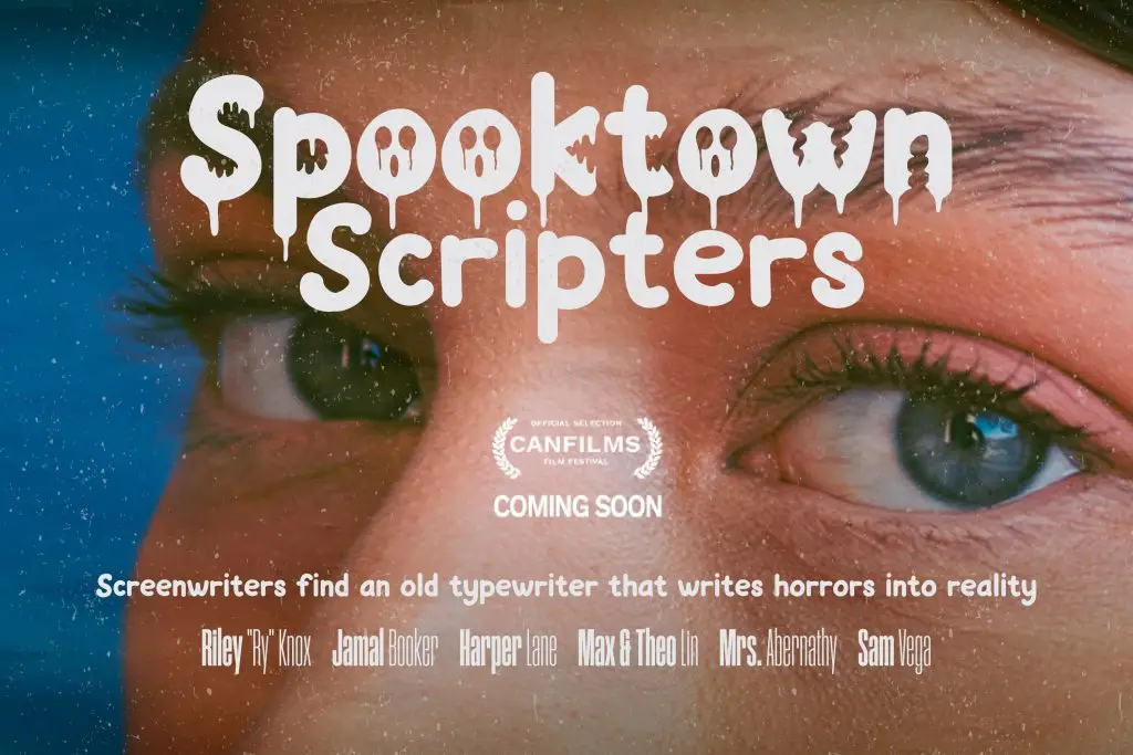
A script font does not need dripping or damaged effects to feel disturbing. Uneven baselines, sharp terminals, thin strokes, or unpredictable connections can create a more subtle psychological tension.
Indie and Coming-of-Age Films
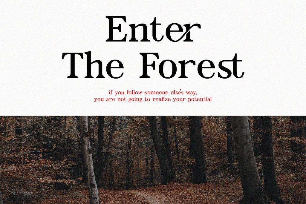
Loose handwritten styles can make a poster feel personal and authentic. They work particularly well with candid photography, collage layouts, and understated color palettes.
Understanding why these structural choices change perception is easier when you understand the letterform itself. Read Anatomy of Typography for Strong Visual Identity to see how curves, angles, proportions, and stroke contrast influence visual personality.
How to Make a Script Font Feel Original
Choosing a less familiar font is only the beginning. The composition also determines whether the movie identity feels unique. Experiment with scale, letter spacing, placement, and contrast. Instead of centering the title automatically, try integrating it with the subject, image crop, or negative space.
You can also customize selected letters or ligatures while respecting the font license. Small adjustments can make a title feel more specific to the story. Most importantly, avoid copying the typography treatment of a famous film simply because it uses a similar genre.
Conclusion
Searching for a modern script font that has never been used in a movie poster is better approached as a search for fresh visual territory, not an absolute claim of worldwide exclusivity. A strong script font should support the film’s emotion, remain readable, and feel distinctive within the genre.
