
Choosing the right display font for social media is essential for creating eye-catching content. Social media platforms are highly visual spaces where users scroll quickly through hundreds of posts. A strong display font can help your message stand out, improve readability, and strengthen your brand identity.
Typography is one of the most powerful elements in digital design. When used correctly, the right display font can transform a simple post into a professional and engaging visual.
In this article, we will explore how to choose the best display font for social media design, why it matters, and the types of fonts that work best for modern digital content.
What Is a Display Font?
Display fonts are typefaces designed mainly for large text such as titles, headings, and promotional graphics. Unlike body text fonts that prioritize long reading comfort, display fonts focus on style and personality.
They are commonly used in:
- Instagram posts
- TikTok cover graphics
- YouTube thumbnails
- Promotional banners
- Social media advertisements
Because social media users scroll quickly, a strong display font can help your message stand out in just a few seconds.
Why Display Fonts Are Important for Social Media
Using the display font for social media design can dramatically improve your content performance. Typography influences how people perceive your message and brand.
1. Captures Attention Quickly
Social media feeds move fast. A bold display font helps stop the scroll and immediately grabs attention.
2. Strengthens Visual Branding
Consistent typography helps build brand recognition. Many successful brands use distinctive display fonts in their content.
3. Improves Content Readability
Large, clear typography ensures your message can be understood instantly, even on small smartphone screens.
4. Adds Personality to Designs
Display fonts communicate emotion and style. A playful font creates a fun mood, while a bold, modern font conveys professionalism.
Characteristics of the Best Display Font for Social Media Design
Not all display fonts perform well on social media. The best ones usually share several important characteristics.
Bold and High Contrast
Fonts with thick strokes and strong contrast are easier to read on mobile screens. Thin or overly decorative fonts can be difficult to read quickly.
Clear Letter Shapes
A good display font should maintain clarity even when viewed on small screens.
Unique but Not Overly Complex
Creative fonts attract attention, but they should not sacrifice readability.
Compatible With Visual Content
Display fonts should complement images, colors, and graphics used in your design.
Popular Types of Display Fonts for Social Media
Different social media niches may require different font styles. Here are some of the most popular types.
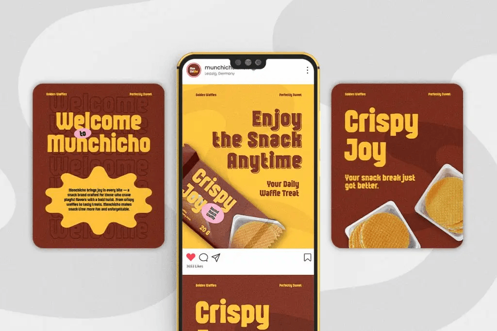
Glibby
Glibby is a fun and unique display font designed to make any project stand out. It combines bold letterforms with quirky, handcrafted details, giving your design an energetic and joyful vibe. Perfect for branding, posters, kids’ books, social media posts, packaging, and event invitations.
Kinzle
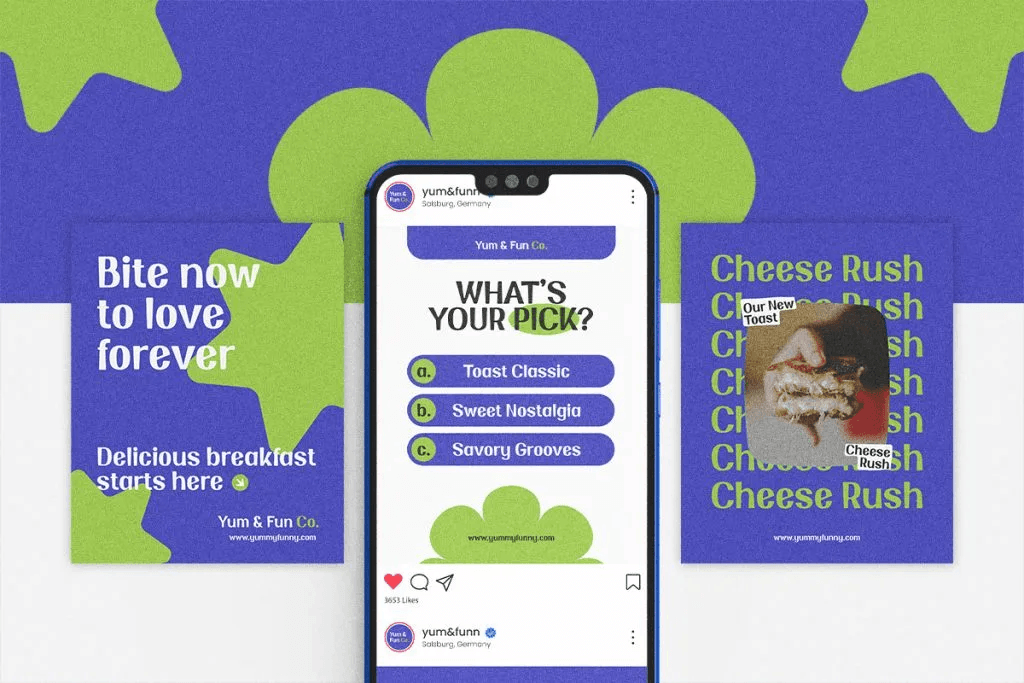
Kinzle is a retro fun display font that effortlessly blends bold 70s and 90s charm with a modern twist. Not only does it feature playful, chunky letterforms, but it also brings an undeniable energy to every project. This makes it the ideal choice for branding, social media content, and eye-catching posters. With Kinzle, your designs will instantly stand out with its vibrant and fun personality.
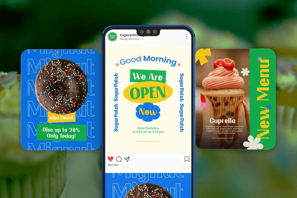
Snaklet
Snaklet is a bold handwritten font designed for snack and dessert packaging. With its fun, playful vibe, it’s perfect for food branding, candy labels, and social media promotions.
How to Choose the Right Display Font for Social Media
Choosing the right font requires more than simply picking a style that looks good. Here are practical tips designers can follow.
Match the Font With Your Brand
Your typography should reflect your brand personality. A playful brand may use rounded fonts, while a luxury brand may prefer elegant serif display fonts.
Test the Font on Mobile Screens
Most social media users access content through smartphones. Always test your typography on small screens.
Limit the Number of Fonts
Using too many fonts can make designs look messy. Ideally, use one display font for headlines and one supporting font for smaller text.
Maintain Visual Balance
Typography should work harmoniously with images, colors, and layout elements.
Where to Find High-Quality Display Fonts
Designers can find display fonts from many sources, including font marketplaces and design platforms. If you are building social media templates or branding assets, it is important to choose fonts that are well-crafted and versatile.
You can explore various creative fonts and typography resources at
Font Kingdom font collection
This platform offers inspiration and useful information for designers looking to improve their social media visuals.