Choosing the right Chinese New Year fonts 2026 is essential when designing festive cards and greeting layouts. Typography plays a powerful role in expressing celebration, prosperity, and cultural symbolism. The right font can transform a simple greeting into a meaningful design that feels joyful, elegant, and culturally connected.
As we approach the Lunar New Year 2026, designers are looking for fonts that balance tradition with modern aesthetics. In this guide, we explore five of the best font styles for Chinese New Year cards and greeting designs, along with tips for using them effectively.
Why Typography Matters for Chinese New Year Designs
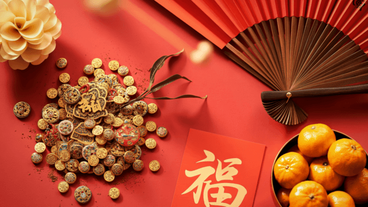
Chinese New Year is rich in symbolism. Colors like red and gold represent prosperity and good fortune, while traditional calligraphy reflects heritage and cultural pride. Typography should align with these values.
Good Chinese New Year fonts 2026 designs should:
- Reflect celebration and joy
- Maintain readability
- Complement red and gold palettes
- Support both print and digital formats
If you’re exploring typography basics for festive designs, you may also enjoy: What Is Typography? Definition, Examples, and Practical Uses
5 Best Fonts for Chinese New Year 2026 Cards
Below are five font categories that work beautifully for Chinese New Year greeting cards.
1. Traditional Calligraphy-Inspired Fonts
Calligraphy is deeply connected to Chinese culture. Fonts inspired by brush strokes create authenticity and elegance.
Why They Work
- Reflect cultural heritage
- Feel artistic and ceremonial
- Pair beautifully with gold accents
Use them for large titles rather than long paragraphs.
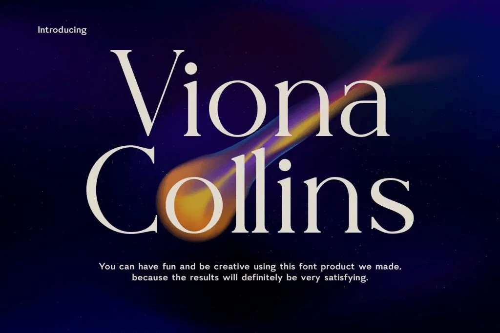
2. Elegant Serif Fonts for Formal Greetings
Elegant serif fonts add sophistication and refinement. They are excellent for premium greeting cards and formal invitations.
Best Use Cases
- Luxury greeting cards
- Corporate Lunar New Year messages
- High-end packaging designs
Serif fonts bring structure and readability while still feeling celebratory.
For more serif inspiration, see: What Is a Serif Font? History, Features, and Examples
3. Modern Sans Serif Fonts with Clean Lines
Not all Chinese New Year designs need to be traditional. Many brands prefer contemporary layouts.

Why Sans Serif Works
- Clean and minimal
- Great for digital cards
- Easy to read on mobile screens
Modern sans-serif fonts allow festive colors and illustrations to stand out without overwhelming the design.
You may also like: Sans Serif Fonts: Complete Guide for Modern Designers.
4. Decorative Display Fonts with Festive Style
Display fonts with decorative elements can enhance celebration themes.
When to Use Them
- Posters
- Social media graphics
- Event banners
Choose decorative fonts carefully to avoid readability issues. Use them primarily for short phrases.
5. Gold-Effect and Luxury Script Fonts
Script fonts that mimic elegant handwriting add warmth and personality.
Ideal For:
- Personalized greeting cards
- Family messages
- Romantic Lunar New Year notes
Gold-effect typography combined with red backgrounds creates a strong festive contrast.
How to Pair Chinese New Year Fonts 2026 Effectively
- Display or calligraphy font for headlines
- Serif or sans serif for body text
- Smaller weight for details
Avoid mixing too many decorative fonts in one design.
Color and Typography Harmony
Typography must align with traditional Lunar New Year colors:
- Red → Luck and happiness
- Gold → Wealth and prosperity
- Black → Elegance
Ensure sufficient contrast for readability.
Digital vs Print: Choosing the Right Font Style
| For Print Cards | For Digital Greetings |
| Prioritize elegance | Prioritize readability |
| Ensure clear letter spacing | Test on mobile screens |
| Use high-resolution fonts | Avoid overly thin strokes |
| Print allows more detail in brush and script fonts. | Sans serif fonts often perform better for small screens. |
Design Tips for Chinese New Year Cards in 2026
Here are practical design tips:
- Use bold headlines with brush-style fonts
- Keep body text clean and legible
- Combine gold foil effects with serif elegance
- Maintain a balance between decoration and clarity
Final Thoughts on Chinese New Year Fonts 2026
Choosing the right Chinese New Year fonts 2026 helps communicate joy, prosperity, and cultural appreciation. Whether you prefer traditional calligraphy, elegant serif fonts, or modern sans serif styles, the key is balance.
Typography should enhance the festive atmosphere without sacrificing readability. By combining thoughtful font selection, color harmony, and proper hierarchy, designers can create meaningful greeting cards that feel both celebratory and refined.
With the right approach, your Lunar New Year 2026 designs will stand out while honoring tradition and embracing modern creativity.