Business Card Fonts for Professional Brand Identity

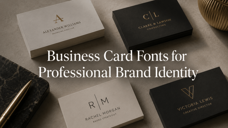
Choosing the right business card fonts for professional brand identity is one of the most overlooked aspects of branding. Many professionals invest in logos, websites, social media, and marketing materials, yet their business cards fail to leave a lasting impression. In many cases, the issue isn’t the layout or color palette; it’s the typography. A …

Continue reading →

Creative Handwritten Fonts for Fiction Book Cover Design

Choosing creative handwritten fonts for fiction book cover design can solve one of the most common challenges faced by authors, publishers, and book cover designers: creating an emotional connection before a reader even opens the book. A great fiction cover does more than display a title. It communicates genre, mood, personality, and story expectations within …

Continue reading →

Why Serif Fonts Work Well for Luxury Hotel Branding?

Understanding why serif fonts work well for luxury hotel branding is essential for hospitality businesses that want to create a premium and memorable brand identity. In the luxury hotel industry, first impressions matter. Before guests experience the service, step into a lobby, or book a suite, they interact with branding elements such as logos, websites, …

Continue reading →

Luxury Hotel Fonts for Premium Hospitality Branding

Choosing the right luxury hotel fonts for premium hospitality branding is often the difference between a brand that feels exclusive and one that feels ordinary. Many hotels invest heavily in architecture, interior design, photography, and guest experiences, yet their branding fails to communicate the same level of sophistication. In many cases, the missing ingredient is …

Continue reading →

The Role of Sans-Serif Fonts in Summer Posters

When designing seasonal marketing materials, many creative designers struggle with one common problem: their posters are visually appealing but fail to convey their message quickly. Bright colors, tropical imagery, and summer-themed illustrations may grab attention, but if the typography is difficult to read, the overall design becomes less effective. This is where sans-serif fonts in …

Continue reading →