
The debate around typeface vs font is one of the most common sources of confusion in design. Many people use the terms interchangeably, but they do not mean the same thing. While the difference may seem small at first, understanding it is essential for designers, developers, and anyone working with typography.
In this guide, we’ll break down the difference between typeface and font in simple terms and provide clear examples to help you use both terms correctly.
What Is a Typeface?
A typeface refers to the overall design of a set of letters, numbers, and symbols. It is the visual concept or style of the characters.
For example, when you think of a classic serif style or a modern sans serif style, you are thinking about a typeface.
Typeface as a Design Family

A typeface is like a family name. It includes multiple variations such as:
- Light
- Regular
- Bold
- Italic
- Condensed
All of these variations belong to the same typeface but are different fonts within that family.
If you want to understand more about typography basics, you may also read: What Is Typography? Definition, Examples, and Practical Uses
What Is a Font?
A font is a specific variation within a typeface. It refers to the exact weight, size, and style of the typeface being used.
For example:
- Regular 12pt
- Bold 16pt
- Italic 14pt
Each of these is a font, even though they all belong to the same typeface.
Typeface vs Font: The Core Difference
Understanding typeface vs font becomes easier with a simple analogy.
Simple Analogy
- Typeface = The overall design family
- Font = A specific member of that family
Think of a typeface as a song and a font as a specific performance of that song. The composition stays the same, but the variation changes.
Why People Confuse the Terms
Today, digital tools allow users to change weight and size easily from a dropdown menu. Because everything appears in one interface, many people casually say “font” when they mean “typeface.”
However, technically speaking:
- The typeface is the design
- The font is the specific instance of that design
Practical Examples of Typeface vs Font
Example 1: Serif Family
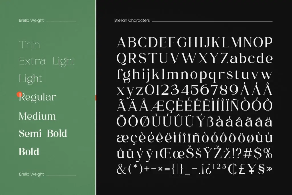
In a serif typeface, you might find:
- Regular
- Medium
- Semi Bold
- Bold
Each weight is a font. The entire collection is the typeface.
Example 2: Sans Serif Family
Imagine a modern sans-serif typeface. Within that typeface, you may have:
- Regular
- Bold
- Italic
Again, each variation is a font. The overall design structure is the typeface.
Why Understanding Typeface vs Font Matters
1. Professional Communication
When designers collaborate with developers, printers, or branding teams, precision matters. Using the correct terminology avoids confusion.
For example:
- Saying “use the bold font” refers to a specific weight
- Saying “use that typeface” refers to the design family
2. Branding and Identity
In branding, a company typically selects a typeface for its identity system. From that typeface, specific fonts are chosen for headlines, body text, and captions.
Understanding this distinction helps maintain visual consistency.
When Should You Use Each Term?
Here is a simple rule:
- Use “typeface” when referring to the overall design style
- Use “font” when referring to a specific weight, size, or variation
This guideline keeps your terminology accurate and professional.
For more typography inspiration and real-world font examples, you can browse the latest collections on Font Kingdom’s Pinterest, where we regularly share curated design insights.
Final Thoughts on Typeface vs Font
The difference between typeface and font may seem subtle, but it plays an important role in typography. A typeface represents the overall design family, while a font refers to a specific weight or variation within that family.
By understanding this distinction, designers can communicate more precisely, maintain stronger branding systems, and deepen their knowledge of typography fundamentals. While everyday language may blur the terms, professional design benefits from clarity.
Seo Services Marketplace
Hello just wanted to give you a quick heads up. The text in your content seem
to be running off the screen in Firefox. I’m not sure if this is a formatting issue or something
to do with internet browser compatibility but I figured I’d
post to let you know. The layout look great though! Hoope
you get the problem resolved soon. Thanks
Muh Sodikin
Thank you for bringing this to my attention! I really appreciate the feedback. It sounds like it might be a browser compatibility issue, and I’ll make sure to look into it. I’m glad to hear that the layout is looking great otherwise! I’ll work on resolving the issue as soon as possible. Thanks again for your help!