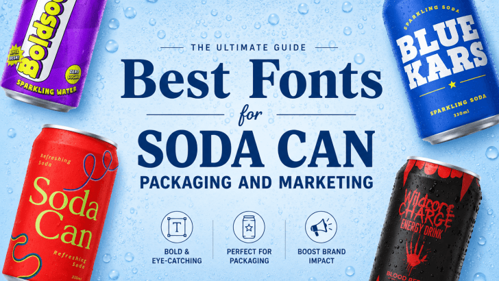
Best fonts for soda can packaging can completely change how customers perceive a beverage brand. In today’s competitive drink industry, soda packaging needs to stand out instantly on crowded store shelves and social media feeds. While colors and illustrations play an important role, typography often becomes the first visual element to capture attention.
Fonts help communicate flavor, energy, personality, and emotional identity. A bold retro font may create nostalgic vibes, while a playful rounded typeface can make a soda feel sweeter and more approachable. Experimental fonts can even make products appear edgy and trendy for younger audiences.
In this article, we’ll explore why typography matters in beverage branding and recommend five creative fonts that work perfectly for soda can packaging and marketing: Boldova, Caners, Chubzy, Freakdrip, and Karens.
Why Typography Matters in Soda Packaging
Typography is one of the strongest visual branding tools in beverage marketing. Customers often decide within seconds whether a product feels exciting, refreshing, premium, or fun.
Good typography helps:
- Increase shelf visibility
- Strengthen brand identity
- Improve product memorability
- Create an emotional connection
- Enhance marketing campaigns
Soda packaging especially relies on typography because cans have limited design space. The font needs to communicate personality quickly and effectively.
What Makes a Great Soda Packaging Font?
Not every font works well for beverage branding. Soda can typography usually needs strong visibility and a bold personality.
Important Characteristics
Bold and Readable
Customers should instantly recognize the product name, even from a distance.
Strong Personality
Typography should visually reflect the drink flavor and brand identity.
Flexible Usage
The font should work across:
- Soda cans
- Advertisements
- Posters
- Social media graphics
- Merchandise
Memorable Appearance
Distinctive typography helps products stand out from competitors.
Best Fonts for Soda Can Packaging
Here are five excellent font choices for soda branding and beverage marketing.
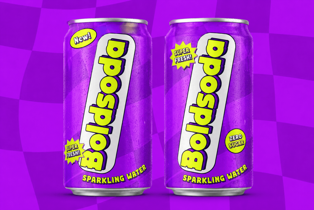
Boldova – Funky Retro Soda Font
Font Overview
Boldova is a bold retro-inspired display font with chunky letterforms, layered shadows, and energetic visual impact. The typography feels playful, nostalgic, and highly expressive, making it ideal for colorful soda branding.
Its exaggerated boldness creates a strong shelf presence while maintaining a fun, youthful personality.
Why Boldova Works for Soda Packaging
Boldova works beautifully for soda can design because:
- Thick letters improve readability on packaging.
- Retro aesthetics create nostalgic emotional appeal.
- Layered shadows make the typography feel dynamic and energetic.
- The font instantly grabs attention.
The vibrant personality of Boldova works especially well for sparkling drinks and youth-oriented soda campaigns.
Best Use Cases
Boldova is perfect for:
- Sparkling water branding
- Summer soda campaigns
- Retro cola advertisements
- Colorful fruit drinks
- Limited edition soda packaging
Its playful retro vibe creates packaging that feels exciting and memorable.
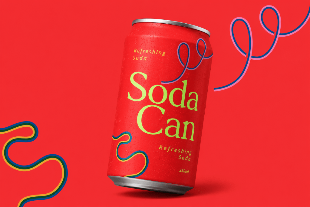
Caners – Elegant Soda Branding Font
Font Overview
Caners is a refined serif font with elegant proportions and a sophisticated style. Compared to flashier display fonts, Caners creates a cleaner, more premium soda branding aesthetic.
The typography feels modern yet timeless, making it ideal for beverage brands targeting minimalist or upscale audiences.
Why Caners Works for Soda Packaging
Caners creates a refreshing and elegant feeling through:
- Clean serif structure
- Sophisticated readability
- Modern luxury aesthetics
- Minimal visual presentation
This font works especially well for premium soda brands and modern sparkling beverages.
Best Use Cases
Caners is ideal for:
- Premium sparkling soda
- Minimal beverage packaging
- Luxury soda branding
- Boutique drink labels
- Elegant summer campaigns
Its refined typography helps products feel modern and sophisticated.
Chubzy – Playful Bubble Beverage Font
Font Overview
Chubzy is a rounded display font with oversized bubble-like shapes and a cheerful personality. The typography feels soft, sweet, and approachable, making it perfect for colorful beverage packaging.
Its thick, rounded forms create highly readable soda branding while adding playful energy.
Why Chubzy Works for Soda Packaging
Rounded fonts psychologically feel:
- Friendlier
- Sweeter
- More fun
- More youthful
Chubzy helps soda products feel:
- Refreshing
- Energetic
- Family-friendly
- Social-media-ready
The playful structure also works perfectly for vibrant can illustrations.
Best Use Cases
Chubzy works beautifully for:
- Orange soda branding
- Bubble drinks
- Fruit-flavored beverages
- Candy-inspired sodas
- Youth-focused drink campaigns
Its bubbly personality makes packaging feel cheerful and approachable.
Freakdrip – Wild Experimental Soda Font
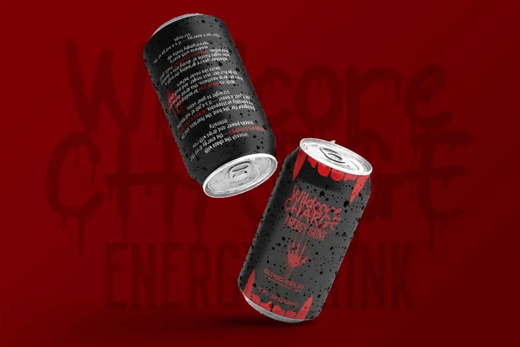
Font Overview
Freakdrip is an edgy dripping display font with chaotic letterforms and rebellious visual energy. Inspired by horror and underground aesthetics, the font feels loud, unconventional, and highly expressive.
Its dramatic dripping details create immediate visual impact.
Why Freakdrip Works for Soda Packaging
Freakdrip is highly effective for:
- Experimental soda brands
- Alternative beverage campaigns
- Streetwear-inspired products
- Viral social media branding
The typography feels:
- Bold
- Aggressive
- Trendy
- Energetic
This helps soda products stand out dramatically from traditional competitors.
Best Use Cases
Freakdrip is perfect for:
- Energy soda branding
- Dark-themed beverages
- Halloween drink campaigns
- Limited edition cans
- Alternative youth branding
Its rebellious appearance creates an unforgettable visual identity.
Karens – Bold Vintage Beverage Font
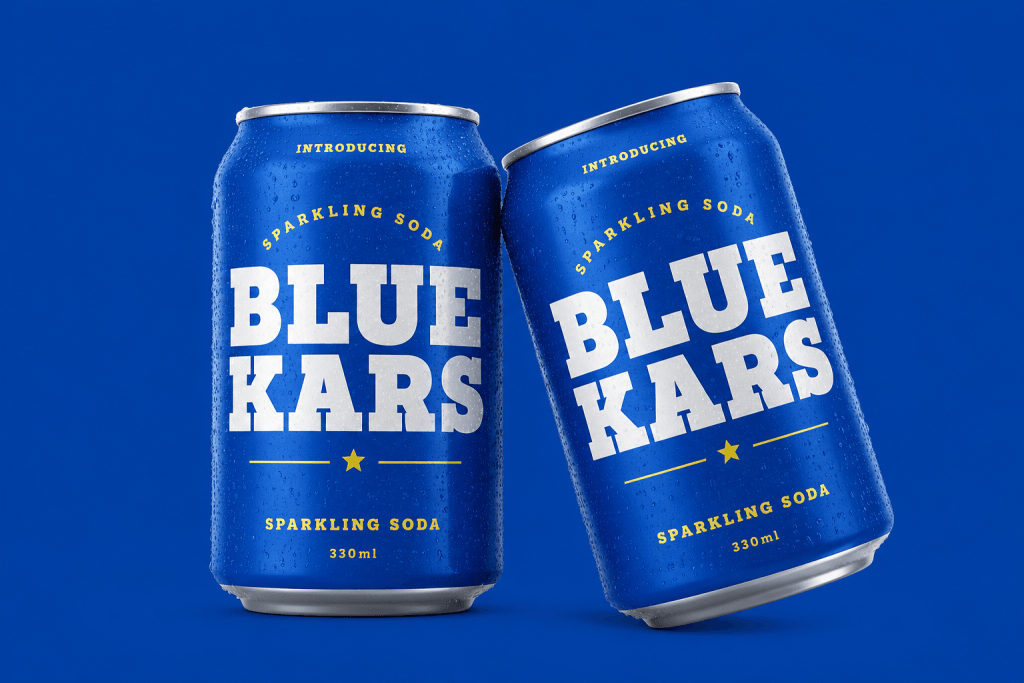
Font Overview
Karens is a strong slab-serif font with thick blocky shapes and vintage-inspired personality. The typography feels classic, bold, and highly dependable while maintaining modern visual energy.
Its large condensed letters create excellent readability for soda packaging.
Why Karens Works for Soda Packaging
Karens works well because:
- Bold slab-serif typography improves visibility.
- Vintage structure creates nostalgic branding.
- Thick letterforms feel strong and refreshing.
- The font works perfectly on large packaging layouts.
This style feels particularly effective for classic sparkling soda campaigns.
Best Use Cases
Karens is ideal for:
- Classic soda branding
- Vintage beverage advertisements
- Cola packaging
- Summer drink campaigns
- Sports-inspired beverage marketing
Its bold appearance creates a timeless, trusted branding.
Typography Trends in Soda Marketing
Retro Typography
Retro-inspired fonts remain highly popular in beverage branding because they create:
- Nostalgia
- Emotional familiarity
- Fun summer energy
Many soda brands use retro typography to create memorable packaging experiences.
Bold Display Fonts
Oversized typography helps products:
- Grab attention quickly
- Improve shelf visibility
- Feel more energetic
This trend is especially strong in youth-focused beverage branding.
Minimal Premium Typography
Modern beverage brands increasingly use minimalist typography for:
- Luxury sparkling water
- Healthy drinks
- Boutique soda branding
Minimal typography creates cleaner and more sophisticated packaging aesthetics.
Tips for Designing Soda Packaging Typography
Use Strong Contrast
Typography should clearly stand out against packaging colors.
Popular combinations include:
- White on dark backgrounds
- Neon colors
- Metallic typography
- Bright retro palettes
Strong contrast improves visibility dramatically.
Keep Layouts Clean
Too many decorative elements can reduce readability.
Focus on:
- Clear hierarchy
- Balanced spacing
- Strong typography placement
Minimal clutter creates more professional packaging.
Test Typography on Real Mockups
Fonts may appear different once applied to curved can surfaces.
Always preview typography on:
- Soda can mockups
- Advertisements
- Social media posts
- Product photos
Testing ensures stronger final designs.
Conclusion
Choosing the best fonts for soda can packaging is essential for creating memorable beverage branding and eye-catching marketing campaigns. Typography influences how customers emotionally perceive products and can dramatically improve packaging visibility.
Fonts like Boldova, Caners, Chubzy, Freakdrip, and Karens each offer unique personalities that can help soda brands stand out in competitive markets. Whether you want playful retro energy, elegant minimalism, experimental edge, or bold vintage aesthetics, the right typography can completely transform beverage packaging.