
Understanding tracking in typography is essential for designers who want clean, readable, and professional layouts. While many people focus on font choice or hierarchy, spacing between letters across an entire word or paragraph often gets overlooked. Yet tracking plays a powerful role in readability, tone, and visual balance.
When tracking is used correctly, text feels open, elegant, and intentional. When misused, it can make designs look awkward, cramped, or unprofessional. In this guide, we’ll explore the history of tracking, its benefits, common mistakes, and practical solutions to improve your typography instantly.
The History of Tracking in Typography
Tracking in the Era of Metal Type
In traditional printing, letter spacing adjustments were limited. Printers worked with physical metal blocks, and spacing adjustments required inserting thin metal pieces between characters. While kerning focused on individual letter pairs, tracking adjustments affected entire lines.
Because manual spacing required physical effort, designers carefully considered how much space was needed for readability.
Digital Typography and Modern Tracking
With the rise of digital design tools, tracking became easier and more flexible. Designers can now adjust spacing instantly using software sliders.
Today, tracking in typography is commonly adjusted in:
- Logos
- Headlines
- All-caps text
- Branding materials
- Web design
Digital tools allow for precise spacing control, but they also make it easier to misuse tracking.
If you need a refresher on typography fundamentals, read:
What Is Typography? Definition, Examples, and Practical Uses
What Is Tracking in Typography?
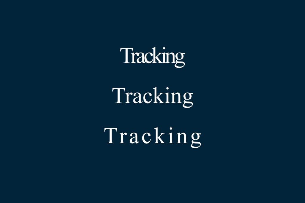
Tracking refers to the uniform spacing between letters within a word, sentence, or block of text.
Unlike kerning, which adjusts spacing between specific letter pairs, tracking applies consistent spacing to all characters in a selected area.
Benefits of Tracking in Typography
1. Improved Readability
Balanced letter spacing makes text easier to read, especially in headlines and all-caps designs.
2. Enhanced Visual Tone
Tracking influences how text feels. Wider tracking can create:
- Luxury
- Sophistication
- Modern minimalism
Tighter tracking can communicate:
- Urgency
- Boldness
- Compact design
3. Better Hierarchy
Tracking adjustments can help differentiate headings from body text without changing font size.
Common Mistakes in Tracking in Typography
Even experienced designers sometimes misuse tracking. Here are the most common issues.
1. Over-Tracking Text
Excessive spacing makes words feel disconnected.
Why It’s a Problem
Too much tracking can:
- Break word recognition
- Reduce reading speed
- Look amateurish
This mistake often happens in body text where spacing should remain subtle.
2. Overly Tight Tracking
Letters placed too close together reduce clarity.
Why It’s a Problem
Tight tracking can:
- Cause letters to overlap visually
- Create a crowded appearance
- Reduce legibility
This is especially noticeable in small font sizes.
3. Using the Same Tracking Everywhere
Different text sizes require different spacing adjustments.
Why It’s a Problem
Large headlines may benefit from slight increases in tracking, while body text should remain neutral.
Uniform tracking across all elements can disrupt hierarchy.
4. Ignoring Font Characteristics
Not all fonts respond the same way to tracking adjustments.
Why It’s a Problem
Some fonts are designed with tight internal spacing. Adding too much tracking can distort their intended appearance.
Understanding font design prevents unnecessary changes.
For guidance on related spacing issues, see:
What Is Kerning in Typography? A Complete Guide for Designers
How to Fix Tracking Mistakes
Fortunately, tracking issues are easy to correct once identified.
Solution 1: Adjust Tracking Based on Text Size
General guidelines:
- Body text → Keep tracking near default
- Headlines → Slightly increase tracking if needed
- All caps → Add small positive tracking
These adjustments improve clarity without exaggeration.
Solution 2: Test at Different Zoom Levels
Viewing text at various sizes reveals spacing inconsistencies.
Zoom out to evaluate overall balance. Zoom in to inspect details.
Solution 3: Focus on Optical Balance
Typography is visual, not mathematical. Even spacing may look uneven due to letter shapes.
Adjust tracking until the white space between letters appears balanced.
Solution 4: Avoid Extreme Values
Small changes make big differences. Increase or decrease tracking gradually rather than dramatically.
Subtle refinement improves professionalism.
Why Tracking Matters for Designers
Typography is often the difference between amateur and professional design. Small spacing adjustments show attention to detail.
When tracking is balanced:
- Text looks polished
- Reading feels comfortable
- Branding feels intentional
Design is not just about what you add; it’s also about how you space elements.
Final Thoughts on Tracking in Typography
Mastering tracking in typography helps designers refine clarity, tone, and visual harmony. From its roots in traditional printing to modern digital tools, tracking remains a crucial typographic adjustment.
By understanding its history, benefits, common mistakes, and practical solutions, designers can improve readability and strengthen brand identity.
Typography excellence lives in subtle details. Tracking is one of the most powerful yet underestimated tools in your design toolkit.