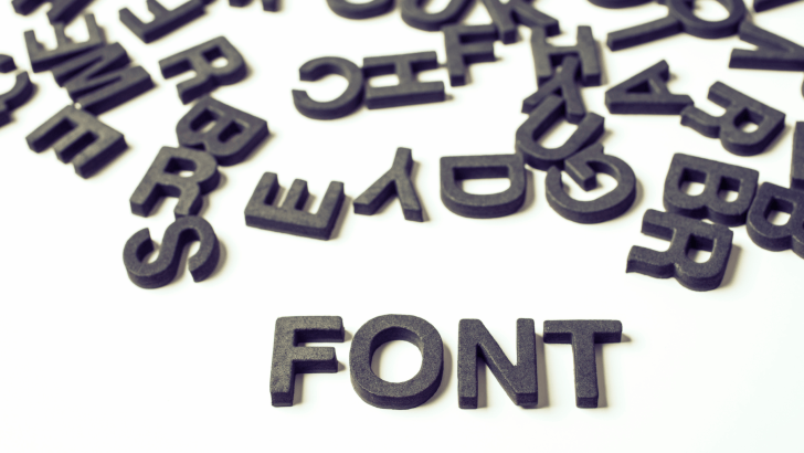
Learning how to choose the right font is one of the most important skills in design. Fonts do more than display text; they communicate mood, personality, and intention. A well-chosen font can make a design feel professional and engaging, while the wrong font can confuse users or weaken your message.
In this step-by-step guide, you’ll learn how to choose the right font for your design, whether you’re working on branding, websites, social media, presentations, or print materials.
Why You Should Choose the Right Font for Your Design
Before jumping into the steps, it’s important to understand why font choice matters so much.
Fonts affect:
- Readability and clarity
- Emotional tone and personality
- Brand recognition and trust
- User experience across devices
If you want to understand typography fundamentals first, you may find this helpful: What Is Typography? Definition, Examples, and Practical Uses
Step 1: Understand the Purpose to Choose the Right Font
The first step is choosing the right font, which involves knowing what your design is meant to do.
Ask These Questions Before Choosing the Right Font
- Is the design informative or expressive?
- Is it for digital or print use?
- Who is the target audience?
For example, educational materials need clarity, while event posters can be more expressive.
Step 2: Define the Brand or Project Personality
Fonts have personalities, just like brands.
Match Font Style to Tone
- Formal → serif fonts
- Modern → sans-serif fonts
- Playful → rounded or handwritten fonts
- Elegant → refined serif or script fonts
Choosing a font that matches the tone helps the design feel consistent and intentional.
Step 3: Prioritize Readability When You Choose the Right Font
No matter how beautiful a font looks, it must be readable.
Factors That Affect Readability
- Letter shape clarity
- Spacing between letters and lines
- Font size at different screen resolutions
Body text should always be easier to read than decorative headlines.
Step 4: Choose Between Serif, Sans-Serif, or Script Fonts
Understanding font categories helps narrow your options.
Serif Fonts
Best for:
- Long reading
- Editorial design
- Formal or traditional projects
Sans-Serif Fonts
Best for:
- Websites and apps
- Modern layouts
- User interfaces
Script and Decorative Fonts
Best for:
- Accents and headlines
- Invitations or creative projects
Avoid using script fonts for long paragraphs.
Step 5: Limit the Number of Fonts When You Choose the Right Font
One common mistake is using too many fonts.
Best Practice to Choose the Right Font
- Use 1–2 fonts for most designs
- Use 3 fonts maximum for complex layouts
Too many fonts can make a design feel chaotic and unprofessional.
Step 6: Test Font Pairings Carefully
Font pairing helps create hierarchy and balance.
Common Font Pairing Combinations
- Serif headline + sans-serif body
- Bold display font + neutral supporting font
- One font family with multiple weights
Always test pairings to ensure they complement rather than compete.
Step 7: Check Font Compatibility Across Devices
Designs are viewed on many screens.
Test Fonts On:
- Desktop monitors
- Mobile phones
- Tablets
- Printed materials
Some fonts look great on large screens but fail at small sizes.
Step 8: Consider Accessibility and Inclusivity
Good design should be readable for everyone.
Accessibility Tips
- Use sufficient contrast
- Avoid overly thin fonts
- Ensure text remains legible for all users
Accessible typography improves usability and professionalism.
Step 9: Avoid Trend-Driven Font Choices
Trends change quickly.
Why Timeless Fonts Work Better
- They age well
- They maintain consistency
- They protect long-term brand identity
Trend-based fonts can make designs look outdated quickly.
Step 10: Test, Review, and Refine
Choosing a font is not the final step; it’s part of an ongoing process.
How to Refine Font Choices
- Get feedback from others
- Test readability in real layouts
- Make small adjustments to spacing and size
Minor tweaks often make a big difference.
Practical Applications of Font Selection
Knowing how to choose the right font applies across many projects.
1. Branding and Logos
Fonts define brand personality and recognition.
2. Websites and Digital Products
Fonts guide users and improve navigation.
3. Print and Marketing Materials
Fonts influence how information is perceived and remembered.
For logo-focused projects, you may also find this relevant: How to Choose the Best Fonts for Logos in 2026
Final Thoughts on Choose the Right Font
Choosing the right font is about making thoughtful decisions. When you choose the right font, you improve clarity, strengthen identity, and create designs that feel intentional and professional.
By following these step-by-step guidelines, you can confidently select fonts that support your message, engage your audience, and elevate the overall quality of your design work.