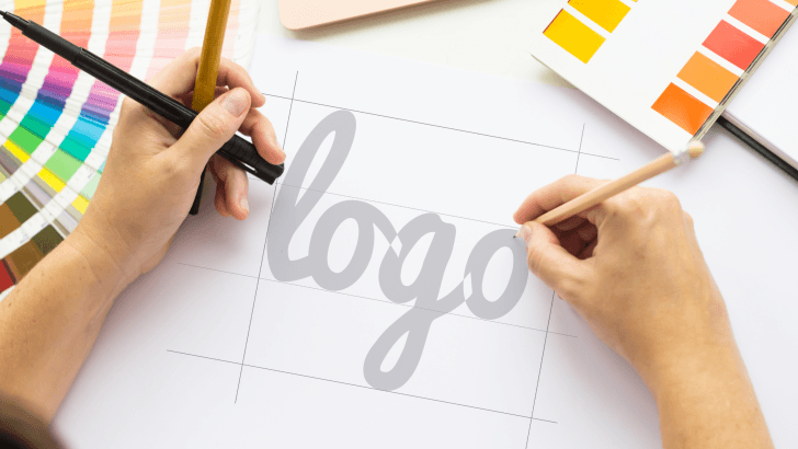
Choosing the best fonts for logos in 2026 is no longer just about aesthetics. Typography has become a strategic branding tool that shapes how people recognize, trust, and remember a brand. In a world where logos appear everywhere, from websites and apps to packaging and social media, the right font choice can make the difference between a brand that feels modern and one that feels outdated.
This guide will help you understand how to choose the best logo fonts in 2026, what trends to pay attention to, and how to avoid common mistakes that weaken brand identity.
Why Choosing the Best Fonts for Logos Matters in 2026
A logo is often the first visual interaction people have with a brand. Before colors, slogans, or messaging, typography speaks first.
Fonts Shape Brand Perception
Different fonts communicate different personalities. A bold sans-serif may feel confident and innovative, while a refined serif can suggest heritage and trust.
Logos Must Work Everywhere
Logo fonts must perform well across:
- Websites and mobile apps
- Social media profiles
- Print materials and packaging
- Small icons and large displays
A great logo font remains legible and recognizable in all contexts.
If you want to understand how typography supports overall branding, you may also find this helpful: The Impact of Typography on Brand Identity: A Deep Dive
Best Fonts for Logos: Key Typography Trends in 2026
Understanding current and emerging trends helps you make future-proof decisions.
1. Minimalist and Clean Typography
In 2026, simplicity continues to dominate logo design. Clean fonts with balanced proportions feel timeless and adaptable.
2. Custom and Modified Fonts
Many brands now customize existing fonts to create unique logos. Small adjustments to letterforms help brands stand out without sacrificing readability.
3. Human-Centered Design
Fonts with subtle curves and organic details feel more approachable, reflecting the growing demand for authenticity and human connection.
Serif vs Sans-Serif: Which Is Better for Logos?
There is no universal answer; it depends on brand positioning.
Best Sans-Serif Fonts for Logos in 2026
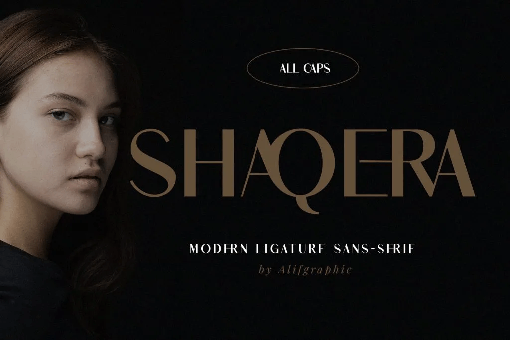
Sans-serif fonts are widely used for:
- Tech startups
- Digital products
- Modern consumer brands
They feel clean, scalable, and contemporary.
Best Serif Fonts for Logos with Timeless Appeal
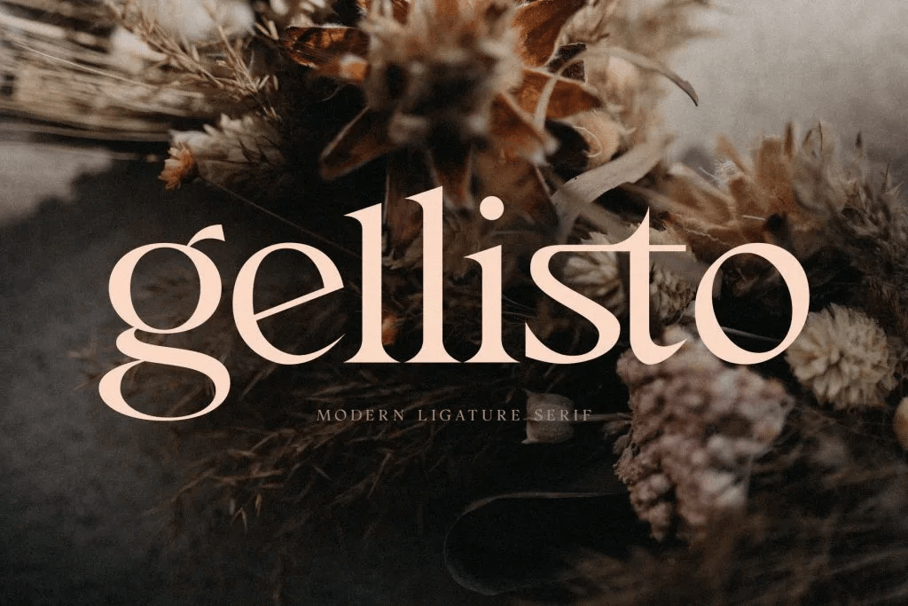
Serif fonts are often chosen by:
- Luxury brands
- Editorial and publishing companies
- Heritage-inspired businesses
They communicate stability, tradition, and sophistication.
How to Match the Best Fonts for Logos with Brand Personality
Choosing the best fonts for logos starts with understanding your brand’s character.
Questions to Ask Before Choosing a Font
- Is the brand modern or traditional?
- Is it playful or serious?
- Is it premium or accessible?
- Who is the target audience?
The answers guide whether you choose a geometric sans-serif, an elegant serif, or a more expressive typeface.
Readability and Scalability When Choosing the Best Fonts for Logos
A logo font must be functional, not just attractive.
Legibility at Small Sizes
Logos often appear as:
- App icons
- Social media avatars
- Website headers
Fonts with clear letterforms and moderate spacing perform best.
Scalability Across Formats
The best logo fonts maintain clarity whether they are printed on business cards or displayed on billboards.
Font Weight, Spacing, and Customization
Small typographic adjustments have a big impact on logos.
Font Weight
Medium or semi-bold weights are commonly used for logos because they balance visibility and elegance.
Letter Spacing (Tracking)
Proper spacing improves clarity and gives logos a more refined appearance. Overly tight or loose spacing can weaken readability.
Custom Tweaks
Customizing a font, such as modifying one letter, can make a logo distinctive while still feeling professional.
Common Mistakes When Choosing Logo Fonts
1. Following Trends Too Closely
Overly trendy fonts may look dated quickly. Timeless design ensures long-term relevance.
2. Choosing Decorative Fonts
Highly decorative fonts often reduce readability and limit scalability.
3. Ignoring Brand Consistency
The logo font should align with fonts used across websites, packaging, and marketing materials.
How Logo Fonts Influence Brand Trust
Clear Fonts Feel Professional
Clean, balanced fonts suggest that a brand is reliable and established.
Consistency Builds Recognition
Using the same logo font consistently across platforms strengthens brand recall.
Thoughtful Design Signals Care
Well-designed logos show attention to detail, which builds consumer confidence.
Testing and Refining Logo Fonts in 2026
Choosing a font is not the final step; it’s part of an ongoing process.
Test Across Real Scenarios
Preview your logo font on:
- Websites
- Social media
- Packaging mockups
- Mobile screens
Gather Feedback
Feedback from users or clients can reveal readability issues or mismatched brand perception.
Refine Over Time
The best logos evolve subtly, not dramatically. Minor typographic refinements keep brands fresh without losing recognition.
Final Thoughts on Choosing the Best Fonts for Logos in 2026
Selecting the best fonts for logos in 2026 requires a balance between style, function, and brand identity. A great logo font is readable, scalable, and aligned with the brand’s personality, while remaining timeless enough to grow with the business.
For designers looking for real-world inspiration and practical examples, exploring curated logo typography references can be incredibly helpful. You can find a wide range of modern and timeless logo font ideas on Font Kingdom’s Pinterest, where branding, logo design, and typography trends for 2026 are regularly showcased.