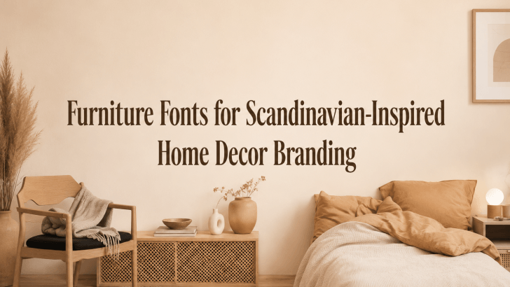
Choosing the right furniture fonts for Scandinavian-inspired home decor branding can help designers solve one common branding problem: making a furniture business look clean, warm, modern, and trustworthy without feeling too plain. Scandinavian-inspired decor is known for simplicity, natural materials, soft colors, functional design, and calm visual balance. Because of that, the typography must support the same feeling.
Many furniture brands use beautiful product photography and neutral color palettes, but their fonts do not always match the mood. A font that feels too decorative can make the brand look crowded. A font that feels too cold can remove the warmth that Scandinavian interiors usually bring. The best typography should feel simple, readable, elegant, and human.
For home decor brands, fonts appear everywhere. They are used in logos, product catalogs, websites, packaging, price tags, care cards, social media posts, and showroom materials. When the font choice is consistent, the brand feels more polished and easier to recognize.
Why Typography Matters in Scandinavian Home Decor Branding
Scandinavian-inspired branding depends on clarity and atmosphere. The visual identity should feel calm, useful, and beautifully minimal.
Fonts Create a Clean First Impression
A furniture brand often needs to communicate quality before customers visit the showroom or touch the product. Typography helps create that first impression. A clean font can make the brand feel organized, professional, and modern. For Scandinavian-inspired home decor, the font should not compete with the product. Instead, it should support the furniture’s natural textures, simple shapes, and comfortable lifestyle appeal.
Fonts Support Warm Minimalism
Scandinavian design is not only minimal. It is also warm. This is why font selection matters. A typeface should feel simple, but not lifeless. It should have enough personality to make the brand feel inviting. The right font can make a furniture brand feel calm, natural, stylish, and approachable.
Recommended Furniture Fonts for Scandinavian-Inspired Branding
1. Gillty
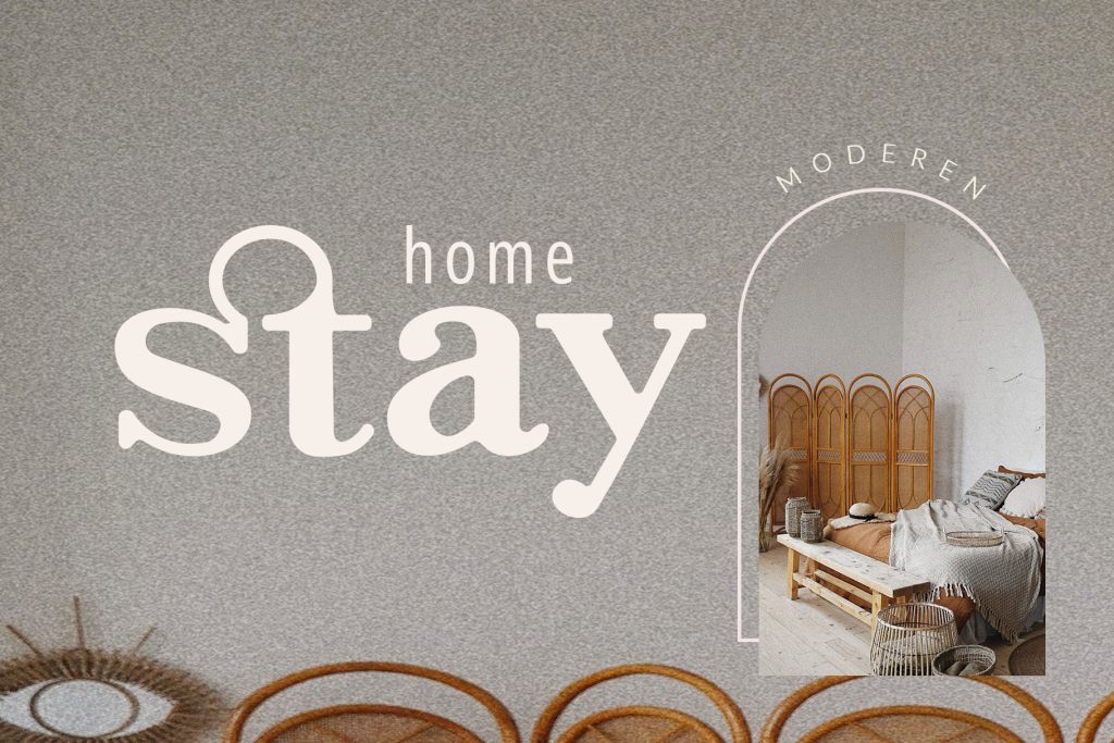
2. Karenz
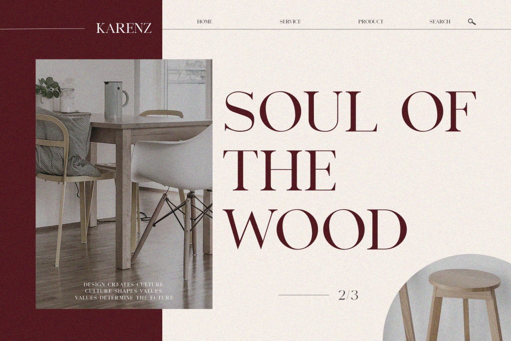
3. The Braga
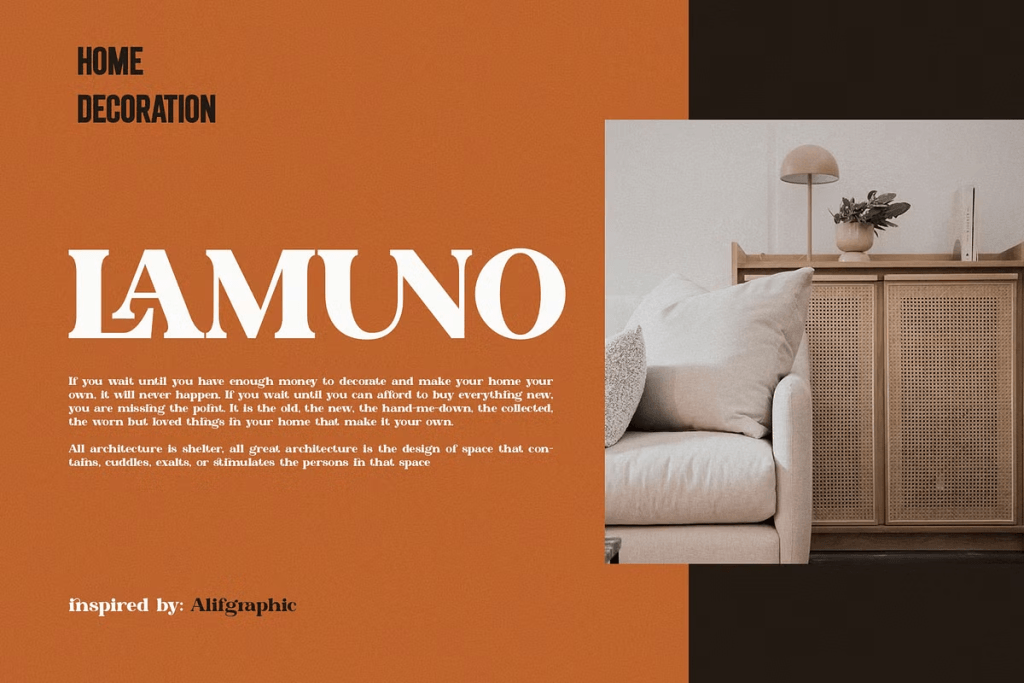
4. Maktron

5. Jochepine
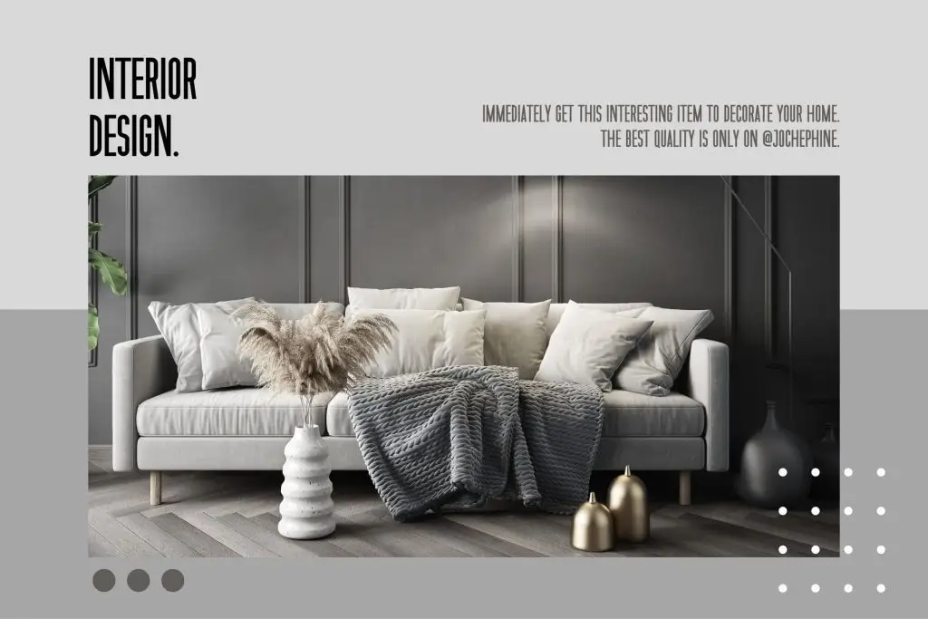
6. Viona Collins

7. Sharone
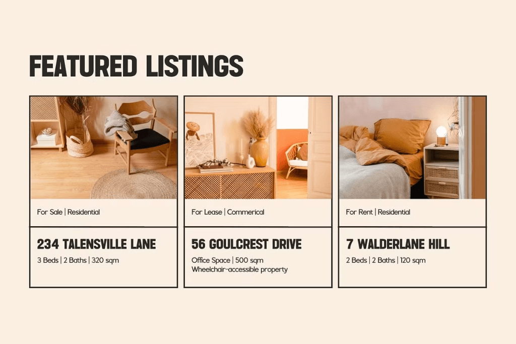
Best Use Case for Scandinavian Furniture Fonts
Furniture fonts should be chosen based on where they will appear. Each brand touchpoint needs a slightly different typography role.
Logo and Brand Identity
For logos, choose fonts that are memorable but still readable. The Braga, Viona Collins, and Sharone are strong options for elegant furniture branding, while Maktron works better for modern and minimal identities.
Product Catalogs and Lookbooks
Catalogs need typography that supports reading and browsing. Use expressive fonts for headings and clean supporting fonts for product descriptions, dimensions, materials, and pricing.
Packaging and Product Tags
Packaging should feel simple and intentional. Use typography that looks polished on small cards, labels, and wrapping materials. Karenz and Gillty can work well for this purpose.
Social Media and Website Design
For digital branding, readability is important. Fonts must remain clear on mobile screens. Use larger font sizes, enough spacing, and strong contrast to keep the layout clean.
Tips for Implementation
A good font choice is even stronger when paired with the right layout strategy.
Keep the Font System Simple
Scandinavian-inspired branding should avoid visual clutter. Use one main font for headings and one supporting font for body text. This keeps the brand consistent and easy to recognize.
Simple Pairing Idea
Pair an elegant display font with a clean sans-serif font. Use the expressive font for titles, logos, and campaigns, then use the simpler font for product details and longer descriptions.
Use Generous White Space
White space is essential in Scandinavian design. It makes the layout feel calm, breathable, and premium. Avoid placing too much text around product photos.
Let typography and furniture images have enough room to stand out.
Match Font Mood with Product Style
A wooden furniture brand may need warmer typography, while a modular furniture brand may need a cleaner and more structured font. Match the font personality to the product style.
Prioritize Readability
Furniture branding often includes important information such as material, size, color, care instructions, and price. Use readable fonts for these details. Save decorative or expressive fonts for short headlines.
Read Related Articles
If you want to improve your overall visual strategy, read “Typography Tips for Home Decor Brands.” This article explains how typography can help home decor businesses create clearer, more consistent, and more attractive brand materials.
You can also continue with “Home Furniture Font Trends Designers Should Know in 2026” to explore more font trends and recommendations for furniture branding, catalogs, websites, and promotional design.

Conclusion
Using the right furniture fonts for Scandinavian-inspired home decor branding can help designers create visual identities that feel clean, warm, and professional. Scandinavian design is built around simplicity, comfort, and balance, so typography should reflect those same values.
Fonts like Gillty, Karenz, The Braga, Maktron, Jochepine, Viona Collins, and Sharone each offer a different mood for furniture branding. Some feel modern and structured, while others feel elegant, warm, or boutique-inspired.
By choosing fonts carefully, keeping the font system simple, using generous white space, and prioritizing readability, designers can build home decor branding that feels calm, stylish, and memorable. The right font does not only display text. It helps customers feel the beauty of a home decor brand before they even enter the room.
