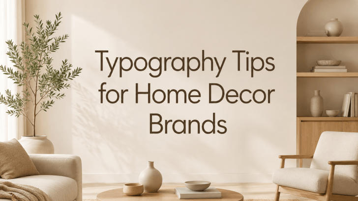
If you’re searching for typography tips for home decor brands, you’re already thinking about one of the most overlooked elements of successful branding. While many home decor businesses focus heavily on products, photography, and packaging, typography plays an equally important role in shaping how customers perceive a brand.
Whether you sell wall art, furniture, decorative accessories, candles, textiles, or interior styling services, the fonts you choose help communicate your brand personality before customers even read your message. The right typography can make a brand feel modern, luxurious, minimalist, cozy, handmade, or premium.
In today’s competitive market, typography is more than just selecting attractive fonts. It is a strategic design tool that helps create consistency, trust, and emotional connection. For home decor brands aiming to stand out, understanding typography fundamentals is essential.
Why Typography Matters for Home Decor Brands
Typography influences how customers experience your brand across every touchpoint.
From your logo and website to product packaging and social media graphics, typography creates a visual language that customers quickly recognize.
Typography Shapes First Impressions
Studies consistently show that people form opinions within seconds of seeing a brand.
Before customers evaluate your products, they often notice:
- Logo design
- Website appearance
- Product labels
- Social media visuals
- Marketing materials
Typography directly affects all of these elements.
A well-chosen font instantly communicates professionalism and design quality.
Typography Supports Brand Recognition
Successful home decor brands create consistency.
When customers repeatedly encounter the same typography style, they begin associating it with your business.
This consistency strengthens:
- Brand awareness
- Customer trust
- Visual recognition
- Perceived professionalism
Over time, typography becomes part of your brand identity.
1. Understand Your Brand Personality First
Before selecting fonts, define your brand personality. Different typography styles communicate different emotions.
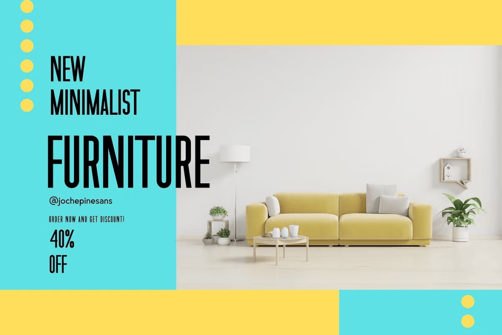
Modern Minimalist Brands
Minimalist home decor brands typically benefit from:
- Clean sans-serif fonts
- Generous spacing
- Simple layouts
- Neutral color palettes
These typography choices communicate sophistication and clarity.
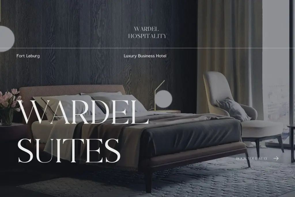
Luxury Home Decor Brands
Premium home decor companies often use:
- Elegant serif fonts
- High-contrast typography
- Refined letterforms
- Balanced spacing
These characteristics create a sense of exclusivity and craftsmanship.
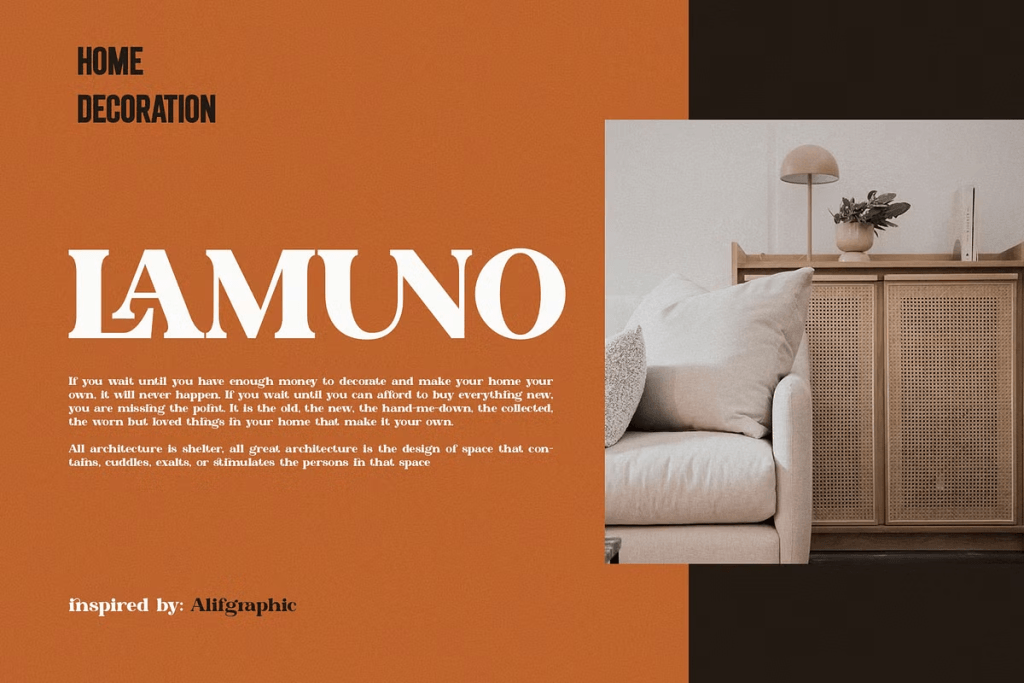
Handmade and Artisan Brands
Brands focused on handmade products frequently choose:
- Script fonts
- Ligature typography
- Organic letterforms
- Personalized typography styles
This approach creates warmth and authenticity.
2. Choose Readability Over Decoration
One of the most important typography tips for home decor brands is prioritizing readability. Many businesses select overly decorative fonts that look beautiful but become difficult to read.
Why Readability Matters
Customers interact with typography in various situations:
- Mobile browsing
- Social media scrolling
- Product packaging
- Printed catalogs
- Website navigation
If customers struggle to read your content, engagement suffers.
Use Decorative Fonts Strategically
Decorative fonts work best when reserved for:
- Headlines
- Logos
- Product collections
- Promotional campaigns
For body text, choose highly readable typefaces that support a pleasant reading experience.
3. Create a Typography Hierarchy
A strong typography hierarchy helps customers navigate information efficiently. Without hierarchy, designs often feel cluttered and confusing.
Primary Typeface
Your primary font should represent your brand identity and appear consistently across major branding elements.
Examples include:
- Logo
- Website headings
- Product packaging
- Marketing campaigns
Secondary Typeface
A secondary font supports the primary typeface.
It often appears in:
- Body text
- Product descriptions
- Website content
- Blog articles
Combining two complementary fonts creates balance and flexibility.
Accent Typography
Accent fonts can add personality when used sparingly.
They are commonly used for:
- Seasonal campaigns
- Quotes
- Product launches
- Decorative design elements
4. Match Typography to Interior Design Trends
Home decor customers are highly influenced by design aesthetics. Your typography should align with the visual styles your audience appreciates.
Scandinavian-Inspired Brands
Scandinavian aesthetics typically pair well with:
- Minimal sans-serif fonts
- Clean layouts
- Soft typography contrast
Modern Organic Brands
Organic design trends often benefit from:
- Elegant serif fonts
- Humanist sans serifs
- Soft ligature typography
Contemporary Luxury Brands
Luxury-focused businesses frequently use typography that feels:
- Refined
- Timeless
- Editorial
- Sophisticated
Typography should reinforce the visual atmosphere your products create.
5. Use Typography Consistently Across Channels
Consistency is one of the most valuable branding principles. Customers should recognize your brand whether they encounter it on Instagram, your website, or product packaging.
Website Typography
Your website should maintain consistent font usage across:
- Headlines
- Product pages
- Navigation menus
- Blog articles
Social Media Typography
Many home decor brands create strong visual identities by using the same typography system in:
- Instagram posts
- Pinterest graphics
- Facebook ads
- Email marketing
Packaging Typography
Packaging is often the first physical interaction customers have with your brand.
Consistent typography strengthens brand recognition and creates a premium experience.
6. Typography and Product Photography
Typography and photography should work together rather than compete for attention.
Let Images Breathe
Home decor photography often showcases texture, materials, and styling details.
Typography should complement these visuals without overwhelming them.
Maintain Visual Balance
Use typography to guide attention toward key information while allowing products to remain the focal point.
Good typography enhances presentation rather than dominating it.
Typography Trends in the Home Decor Industry
Typography continues evolving alongside interior design trends.
Several styles are becoming increasingly popular among home decor brands.
Elegant Serif Revival
Serif typography is making a strong comeback, particularly among luxury and premium brands.
Refined Ligature Fonts
Ligature typography adds sophistication and custom character to branding systems.
Editorial-Inspired Typography
Many brands now adopt typography inspired by interior magazines and design publications.
Minimal Sans Serif Systems

Clean sans-serif fonts remain popular because they offer versatility and timeless appeal.
You can discover more font inspiration and branding resources in the article Home Decor Design Ideas Using Stylish Ligature Typography. If you’re exploring fonts specifically designed for branding projects, browse the latest collections available at Font Kingdom.
Conclusion
These typography tips for home decor brands demonstrate that typography is far more than a decorative design choice. It is a strategic branding asset that influences perception, recognition, and customer trust.
By choosing readable fonts, creating consistent typography systems, aligning typography with brand personality, and maintaining visual harmony across all channels, home decor businesses can build stronger and more memorable brands.
As the home decor industry becomes increasingly competitive, brands that invest in thoughtful typography will be better positioned to attract attention, communicate value, and create lasting impressions.