The Anatomy of Typography: A Beginner-Friendly Guide

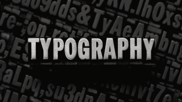
The anatomy of typography is the foundation of understanding how letters are structured and how they function in design. Before choosing beautiful fonts or experimenting with layouts, designers must first understand how letters are built. Every typeface is constructed using structural lines and detailed parts that influence readability, balance, and personality. What Is the Anatomy …

Continue reading →

Leading in Typography: How Line Spacing Improves Readability

Understanding leading in typography is essential for designers who want clean, readable, and professional layouts. While font choice and size often get most of the attention, line spacing plays an equally important role in how text feels and functions. Poor leading can make beautiful typography difficult to read, while well-balanced leading enhances clarity and visual …

Continue reading →