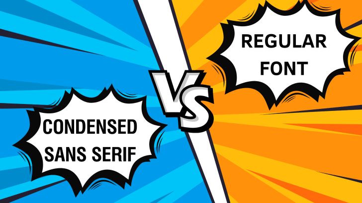
Understanding the difference between condensed sans-serif vs regular fonts is essential for designers who want to create visually balanced and effective layouts. Typography is not only about choosing a beautiful font; it is about choosing the right structure, spacing, and proportion that match your design goals.
Condensed sans-serif and regular fonts are commonly used in branding, editorial design, websites, and marketing materials. While they may look similar at first glance, they serve very different purposes.
In this article, we will explore the key differences between condensed sans-serif and regular fonts, including their characteristics, advantages, and when to use each one.
What Is Condensed Sans Serif vs Regular Font?
To fully understand condensed sans serif vs regular font, we need to define both styles clearly.
What Is a Condensed Sans Serif Font?
A condensed sans-serif font is a typeface where the letters are narrower than standard fonts. The width of each character is compressed, allowing more text to fit into a limited horizontal space.
Key traits:
- Narrow letterforms
- Reduced spacing width
- Clean and modern appearance
- High space efficiency
Condensed fonts are often used in headlines, posters, and layouts where space is limited.
What Is a Regular Font?
A regular font refers to the standard-width version of a typeface. It has balanced proportions and natural spacing, making it easier to read in most situations.
Key traits:
- Normal letter width
- Balanced spacing
- High readability
- Versatile usage
Regular fonts are commonly used for body text, paragraphs, and general content.
Key Differences Between Condensed Sans Serif vs Regular Font
Here are the most important differences between condensed sans serif vs regular fonts.
1. Letter Width and Proportion
The most obvious difference is the width of the letters.
- Condensed fonts → Narrow and compressed
- Regular fonts → Standard and balanced
Condensed fonts allow designers to fit more text into tight spaces, while regular fonts provide a more natural reading experience.
2. Readability
Readability is a critical factor in typography.
- Condensed fonts → Less readable in long text
- Regular fonts → Highly readable for paragraphs
Because condensed fonts have tighter spacing, they can feel crowded when used in large blocks of text.
3. Visual Impact
Condensed fonts tend to create stronger visual emphasis.
- Condensed fonts → Bold, compact, attention-grabbing
- Regular fonts → Neutral, clean, and easy to read
This is why condensed fonts are often used for headlines and titles.
4. Space Efficiency
One of the biggest advantages of condensed fonts is space-saving.
- Condensed fonts → Ideal for limited space
- Regular fonts → Require more horizontal space
Designers use condensed fonts on posters, banners, or mobile layouts.
5. Design Mood and Style
Typography also affects emotional perception.
- Condensed sans serif → Modern, professional, efficient
- Regular font → Friendly, stable, and versatile
Condensed fonts often feel more structured and formal, while regular fonts feel more relaxed.
When to Use Condensed Sans Serif Fonts
Condensed fonts are powerful when used in the right context.
1. Headlines and Titles

Condensed fonts work best for headlines because they:
- Save space
- Create a strong visual hierarchy
- Attract attention
2. Posters and Advertising

In posters, space is limited, and impact is important. Condensed fonts help deliver bold messages clearly.
3. Branding and Logos

Some brands use condensed fonts to create a sleek and modern identity.
4. Mobile and UI Design

Condensed fonts can be useful in mobile layouts where screen space is limited.
When to Use Regular Fonts
Regular fonts are more versatile and widely used.
1. Body Text and Paragraphs
Regular fonts are ideal for long-form reading because they are comfortable for the eyes.
2. Websites and Blogs
Most websites use regular fonts to maintain readability and accessibility.
3. Educational and Professional Content
Regular fonts are better for clarity in documents, presentations, and reports.
Pros and Cons of Condensed Sans Serif vs Regular Font
Condensed Sans Serif Fonts
Pros:
- Space-efficient
- Strong visual impact
- Modern appearance
Cons:
- Lower readability in long text
- Can feel crowded
- Not suitable for body text
Regular Fonts
Pros:
- High readability
- Flexible and versatile
- Works for all types of content
Cons:
- Takes more space
- Less visually striking
How to Choose Between Condensed Sans Serif vs Regular Font
Choosing between a condensed regular font depends on your design needs.
1. Consider Your Layout Space
If you have limited space, condensed fonts are a better choice. If space is not an issue, regular fonts provide better readability.
2. Define Your Content Type
- Headlines → Condensed fonts
- Paragraphs → Regular fonts
Using the right font for the right content improves user experience.
3. Combine Both Styles
One of the best strategies is combining both fonts:
- Condensed font → Headline
- Regular font → Body text
This creates a clear hierarchy and balanced design.
4. Think About Brand Personality
Typography reflects brand identity.
- Condensed → Modern, bold, efficient
- Regular → Friendly, readable, neutral
Choose a font style that aligns with your brand message.
Common Mistakes to Avoid
Using Condensed Fonts for Long Text
This reduces readability and makes content harder to understand.
Not Creating Hierarchy
Using only one font style can make your design look flat. Combine styles for better structure.
Ignoring Spacing
Condensed fonts need proper spacing adjustments to avoid a cramped appearance.
Conclusion
Understanding the difference between condensed sans-serif and regular font helps designers make smarter typography decisions. While condensed fonts are excellent for saving space and creating a strong visual impact, regular fonts provide better readability and versatility.
The key is knowing when to use each style. By combining both strategically, you can create designs that are not only visually appealing but also functional and easy to read.
One Comment