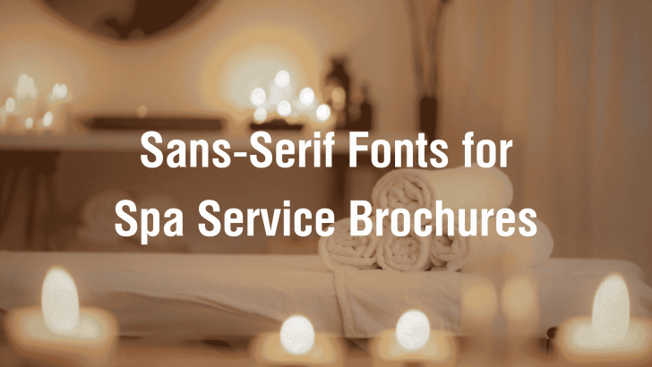
Choosing the right sans-serif fonts for a spa service brochure can help address one of the biggest challenges in wellness branding: making service information feel clear, calming, and premium all at once. Many spa brochures include beautiful photos, soft colors, and soothing visuals, but they can still feel confusing because the typography is too decorative, too small, or inconsistent.
A spa brochure should do more than list treatments. It should guide potential clients through a relaxing brand experience before they even book a service. Typography plays a major role in that process. The right sans-serif font can make a brochure feel clean, modern, trustworthy, and easy to read.
Whether you are designing a brochure for a day spa, wellness studio, massage therapy center, beauty clinic, or resort spa, sans-serif typography can help create a polished and professional first impression. In this article, we will explore why sans-serif fonts work so well for spa brochures, recommended fonts from Font Kingdom, best use cases, practical implementation tips, and related articles to continue your typography research.
Why Sans-Serif Fonts Work for Spa Brochures
Sans-serif fonts are widely used in modern branding because they offer clarity and simplicity. Unlike serif fonts, sans-serif typefaces do not have small decorative strokes at the ends of letters. This clean structure makes them highly readable across both print and digital formats.
For spa businesses, this matters because clients often scan brochures. They want to understand services, pricing, treatment benefits, booking details, and brand atmosphere without feeling overwhelmed.
Clean Typography Creates a Calming Impression
Spa branding is closely connected to emotion. Clients expect a sense of calm, balance, comfort, and care. Overly decorative typography can make a brochure feel busy, while clean sans-serif fonts support a more peaceful visual experience.
Sans-serif fonts help communicate:
- Simplicity
- Cleanliness
- Modern wellness
- Professional care
- Soft sophistication
These qualities are especially important for spa service brochures because the design should reflect the relaxing experience clients hope to receive.
Better Readability for Service Information
Spa brochures often contain practical information such as treatment names, descriptions, duration, prices, packages, and contact details. If the font is difficult to read, clients may lose interest.
Sans-serif fonts perform well because they keep information clear. They are especially useful for small text, menu-style layouts, and service descriptions.
Recommended Sans-Serif Fonts for Spa Service Brochures
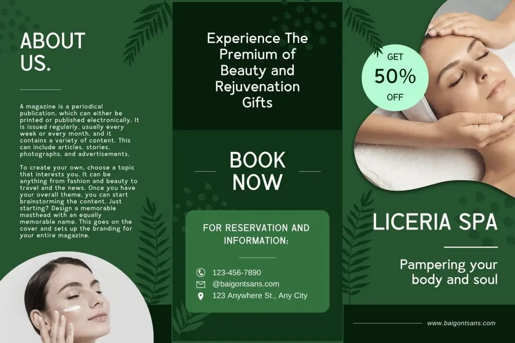
1. Baigont
2. Gafhote
3. Fagheto
4. Fougie
5. Tracey Jodgey
Best Use Case
Sans-serif fonts can be used throughout a spa service brochure. The key is knowing where each font style performs best.
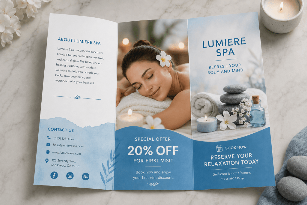
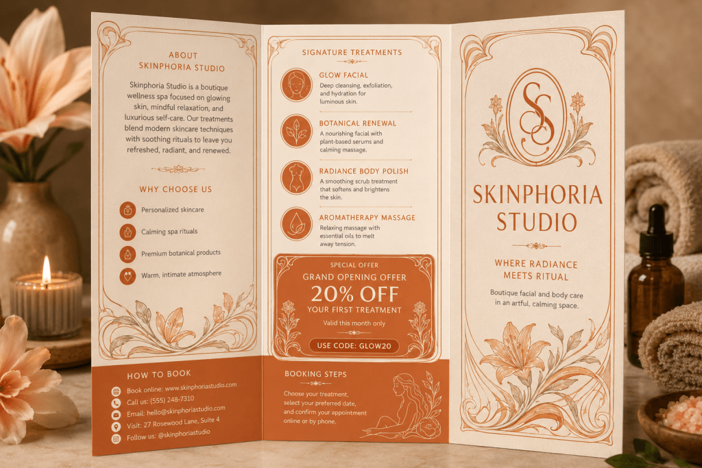
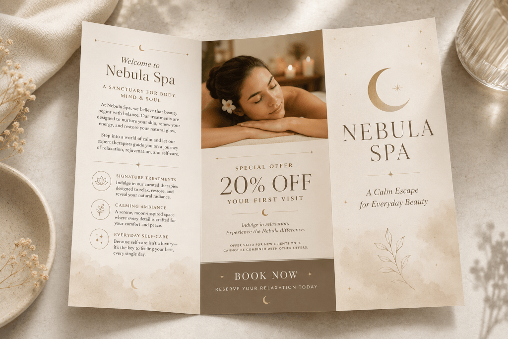
Brochure Cover
The cover is the first thing potential clients see. Use a strong sans-serif font for the spa name, headline, or main promotional message.
For example:
- Relaxation Starts Here
- Signature Spa Treatments
- Wellness Services Menu
Fonts like Baigont, Gafhote, and Fagheto are useful for brochure covers because they create immediate visual impact.
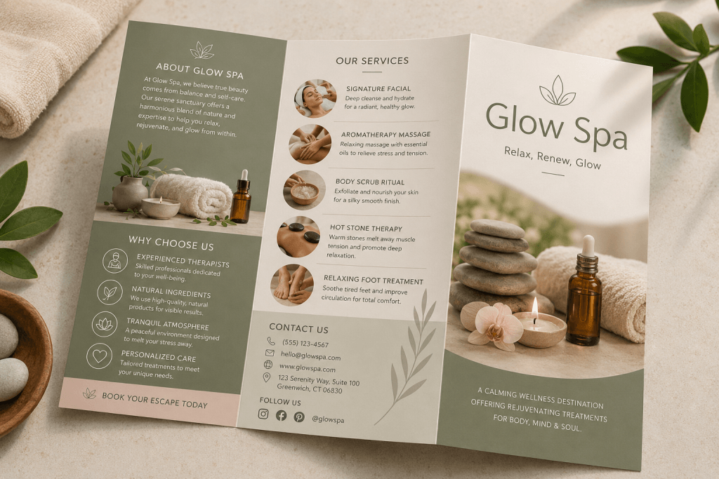
Service Menu Pages
Service menu pages require clarity. Clients need to easily compare treatments, durations, and prices.
Use sans-serif typography for:
- Treatment categories
- Service names
- Short descriptions
- Duration and price details
A clean font structure makes the brochure easier to scan.
Package Promotions
Spa packages often combine several services, such as a massage, a facial, a body scrub, and aromatherapy. Typography should make these packages feel special and valuable. Use a slightly more expressive sans-serif font for package names, then pair it with a simple supporting font for descriptions.
Wellness and Beauty Branding
Sans-serif fonts are also suitable for spa brands that want to appear modern and premium. They work well across brochures, websites, social media posts, booking pages, and printed service cards.
Tips for Implementation
Choosing the font is only the beginning. To make your brochure look professional, you need to use typography intentionally.
1. Create a Clear Hierarchy
A good brochure should guide the reader naturally. Use different font sizes and weights to separate information.
For example:
- Spa name or headline: largest
- Service category: medium
- Description and details: smaller
- Contact information: clean and readable
Hierarchy helps clients understand your offer quickly.
2. Use Enough White Space
Spa brochures should feel calm, not crowded. White space gives the layout breathing room and makes the typography feel more elegant. Avoid placing too much text on one page. Instead, divide services into clear sections with comfortable spacing.
3. Pair Sans-Serif Fonts Carefully
A strong font pairing can improve both readability and style. For spa brochures, try these combinations:
- Bold sans-serif for headings + light sans-serif for body text
- Modern sans-serif for service names + simple neutral font for descriptions
- Stylish sans-serif for the cover + clean font for pricing and booking details
Avoid using too many fonts in one brochure. Two fonts are usually enough.
4. Match Typography with the Spa Mood
Different spa brands need different typography moods.
For example:
- Luxury spa: elegant, spacious, refined sans-serif
- Beauty clinic: clean, professional, modern sans-serif
- Holistic wellness studio: soft, calm, natural sans-serif
- Boutique spa: distinctive and stylish sans-serif
The font should match the experience clients expect.
5. Make Contact Details Easy to Find
A brochure should support conversion. Make sure booking information is clear and visible.
Include:
- Phone number
- Website
- Social media handle
- Address
- Booking CTA
Use readable sans-serif typography so clients can act quickly.
Read Related Articles
If you want to understand the foundation of clean modern typography, read Sans Serif Fonts: Complete Guide for Modern Designers.
You can also explore Best Travel Fonts for Posters, Brochures, and Tourism Branding for more brochure-focused inspiration.
Conclusion
Using sans-serif fonts for spa service brochures is a smart way to create brochures that feel clean, calming, and professional. Spa clients need information that is easy to understand, but they also expect a visual experience that feels relaxing and trustworthy.
Fonts such as Baigont, Gafhote, Fagheto, Fougie, and Tracey Jodgey offer different personalities for spa and wellness branding. Some feel bold and modern, while others feel soft, stylish, or boutique-inspired.
By choosing the right font, creating a clear hierarchy, using enough white space, and keeping service information readable, designers can build spa brochures that not only look beautiful but also support booking decisions. In wellness branding, typography is more than decoration. It is part of the client experience.