
Understanding how business card fonts build trust and brand recognition is essential for any business looking to create a strong professional image. While many companies focus on logos, colors, and marketing materials, typography often receives far less attention than it deserves. Yet the fonts used on a business card can significantly influence how people perceive a brand.
A business card is often one of the first physical interactions a customer, client, or business partner has with your company. Within seconds, people form impressions about your professionalism, credibility, and attention to detail. Typography plays a major role in shaping those impressions.
The right font can make a business appear trustworthy, established, modern, or innovative. The wrong font can create confusion, reduce readability, and weaken brand perception. In today’s competitive market, understanding the relationship between typography, trust, and recognition can help businesses create more effective branding materials.
Why First Impressions Matter
People make judgments quickly. Research consistently shows that individuals form opinions about a brand within seconds of encountering its visual identity. Before reading your website, reviewing your portfolio, or speaking with your team, someone may encounter your business card.
This small piece of marketing material often communicates:
- Professionalism
- Credibility
- Personality
- Brand values
- Attention to detail
Typography helps shape each of these perceptions.
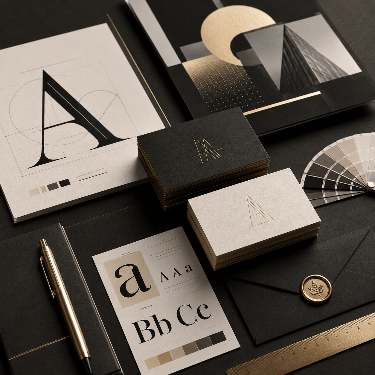
Business Cards as Brand Ambassadors
A business card serves as a miniature representation of your entire brand.
Every design decision matters, including:
- Font choice
- Font size
- Spacing
- Hierarchy
- Layout
When these elements work together, they create a positive and memorable first impression.
The Psychology of Typography
Fonts influence emotions and perceptions in subtle but powerful ways. Different typefaces communicate different characteristics.
Serif Fonts and Trust
Serif fonts are often associated with:
- Tradition
- Stability
- Authority
- Reliability
Because of these qualities, many industries such as law, finance, consulting, and luxury branding use serif typography. People often perceive serif fonts as trustworthy because they have a long history in publishing, education, and professional communication.
Sans-Serif Fonts and Modernity
Sans-serif fonts communicate:
- Simplicity
- Innovation
- Efficiency
- Clarity
Technology companies, startups, and creative agencies frequently use sans-serif fonts to project a modern image. These fonts feel approachable while maintaining professionalism.
Script and Decorative Fonts
Script fonts can communicate:
- Creativity
- Personality
- Elegance
However, they should be used carefully because excessive decoration can reduce readability. The key is matching typography to brand identity.
How Fonts Build Trust
Trust is one of the most valuable assets a business can earn. Typography contributes to trust in several important ways.
1. Readability Creates Confidence
When information is easy to read, people feel more comfortable engaging with a brand.
A readable business card allows recipients to quickly find:
- Names
- Titles
- Phone numbers
- Email addresses
- Websites
Poor readability creates frustration and can damage credibility.
2. Consistency Signals Professionalism
Consistent typography demonstrates attention to detail.
When the same fonts appear across:
- Business cards
- Websites
- Presentations
- Social media
- Marketing materials
Customers begin to view the business as organized and professional. Consistency builds familiarity, and familiarity often leads to trust.
3. Quality Typography Reflects Quality Service
People frequently associate visual quality with business quality. A thoughtfully designed business card suggests that the company values professionalism and invests in its brand. This perception can positively influence customer expectations.
How Fonts Build Brand Recognition
Trust is important, but recognition is equally valuable. Brand recognition helps customers remember your business long after an initial interaction.
1. Typography Creates Visual Identity
Many successful brands are recognizable partly because of their typography. Think about how certain fonts immediately remind you of specific companies. Typography becomes a visual signature. When customers repeatedly encounter the same font style, they begin associating it with the brand itself.
2. Repetition Strengthens Memory
Brand recognition develops through repetition. Using consistent typography across all channels helps reinforce memory.
Examples include:
- Business cards
- Packaging
- Advertising
- Email signatures
- Brochures
Every interaction strengthens recognition.
3. Distinctive Fonts Improve Recall
Fonts with unique characteristics often create stronger memory associations. This does not mean choosing unusual fonts simply to stand out. Instead, businesses should select typography that reflects their personality while remaining professional and readable.
Choosing the Right Font for Your Brand
Corporate Brands
Professional industries often benefit from fonts that communicate trust and authority.
These may include:
- Traditional serif fonts
- Clean sans-serif fonts
- Minimalist typography systems
Creative Businesses
Designers, photographers, and artists may choose typography that expresses creativity while remaining legible. Distinctive fonts can help creative professionals stand out.
Luxury Brands
Luxury businesses often use typography that feels elegant and timeless. Well-crafted serif fonts frequently perform well in these environments.
Startups and Technology Companies
Modern businesses often favor clean sans-serif fonts because they communicate innovation and efficiency. The goal is always alignment between typography and brand personality.
Building a Strong Typography System
The most successful brands think beyond individual business cards. They create complete typography systems.
A typography system typically includes:
- Primary font
- Secondary font
- Heading styles
- Body text styles
- Spacing guidelines
This approach ensures consistency across all touchpoints. Strong systems improve both trust and recognition over time.
Why Business Cards Still Matter
Despite the growth of digital communication, business cards remain highly relevant.
They offer:
- Personal connection
- Professional credibility
- Easy information exchange
- Memorable brand experiences
Typography plays a central role in maximizing these benefits. A well-designed business card often remains in someone’s wallet, on their desk, or in their contact collection long after a meeting has ended.
Related Articles You May Like
If you’re interested in business card branding, you can read the article “How to Advertise Your Business with Powerful Visual Typography.”
For typography inspiration, branding resources, and a collection of other premium fonts, visit Business Card Fonts for a Professional Brand Identity.
Conclusion
Understanding how business card fonts build trust and brand recognition can help businesses create stronger and more effective branding materials. Typography influences first impressions, improves readability, reinforces professionalism, and helps customers remember your brand.
By choosing fonts that align with your brand personality, maintaining consistency across all marketing materials, and prioritizing readability, businesses can transform a simple business card into a powerful branding tool.
In a world where first impressions happen quickly, typography remains one of the most valuable investments a brand can make. The right font doesn’t simply display information; it helps communicate credibility, strengthen recognition, and build lasting relationships with customers.