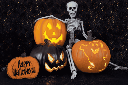
Understanding how to choose the perfect spooky font for your design is essential if you want to create strong and memorable Halloween visuals. Typography plays a key role in setting the mood, especially in spooky or horror-themed designs.
A well-chosen spooky font can instantly create feelings of fear, mystery, or even fun. On the other hand, choosing the wrong font can make your design look confusing or less impactful. That is why designers need to carefully consider style, readability, and audience when selecting Halloween typography.
In this article, you will learn how to choose the perfect spooky font for your design, including practical tips, benefits, and common mistakes to avoid.
Why Learning How to Choose the Perfect Spooky Font for Your Design Matters
Typography is not just decoration; it is communication. Choosing the right spooky font helps deliver the message clearly while enhancing the overall design.
When you understand how to choose the perfect spooky font for your design, you can:
- Build a strong visual theme
- Capture attention instantly
- Create emotional impact
- Improve design consistency
A good font choice can turn a simple design into something eye-catching and memorable. If you’re looking for inspiration, check out our guide on Best Spooky Fonts for Halloween Design to discover the perfect spooky typography.
Benefits of Choosing the Perfect Spooky Font for Your Design
Selecting the right spooky font brings several advantages.
1. Creates Strong Visual Impact
Spooky fonts are designed to stand out. Their unique shapes and effects make your design more noticeable.
2. Enhances Theme and Atmosphere
A horror-themed font can strengthen the Halloween vibe, making your design feel more immersive.
3. Improves Brand Identity
Consistent typography helps your design look more professional and recognizable.
4. Increases Engagement
Eye-catching fonts can attract more viewers, especially on social media and promotional materials.
How to Choose the Perfect Spooky Font for Your Design
Here are step-by-step tips to help you choose the right spooky font.
1. Understand Your Design Purpose
Before choosing a font, ask yourself:
- Is this design for horror or fun Halloween?
- Is it for adults or children?
- Is it for print or digital?
For example:
- Horror posters → scary, rough fonts
- Kids events → playful spooky fonts
Understanding your purpose will guide your font selection.
2. Match the Mood and Theme
Different spooky fonts create different emotions.
Examples:
- Dripping fonts → horror and fear
- Slime fonts → fun and playful
- Script spooky fonts → elegant Halloween
Choose a font that supports your design concept.
3. Prioritize Readability
Even though spooky fonts are decorative, readability is still important.
Tips:
- Avoid overly complex fonts for small text
- Use spooky fonts mainly for headlines
- Combine with simple fonts for body text
A readable design is always more effective.
4. Combine Fonts Wisely
Font pairing is important in design.
Best practice:
- Spooky font → headline
- Clean sans-serif → body text
This creates balance and keeps your design easy to read.
5. Consider Your Audience
Your target audience affects your font choice.
Examples:
- Kids → playful and soft spooky fonts
- Adults → darker and more intense fonts
- General audience → balanced spooky style
Always design with your audience in mind.
6. Test Font in Different Sizes
A font may look good at large sizes, but be illegible at small sizes.
Make sure your font works in:
- Posters
- Social media
- Mobile screens
Testing ensures consistency across platforms.
7. Use Color to Support Typography
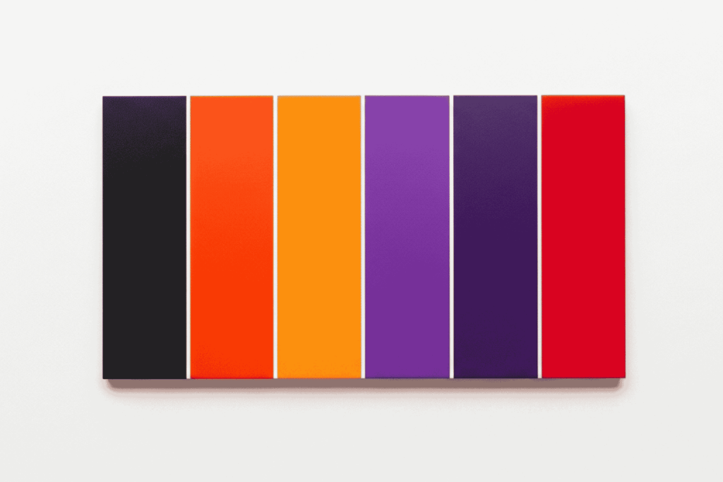
Spooky fonts work best when combined with the right colors.
Common Halloween colors:
- Black
- Orange
- Purple
- Red
Color enhances the effect of your font and strengthens the theme.
Common Mistakes When Choosing Spooky Fonts
Even though spooky fonts are fun, there are common mistakes designers should avoid.
1. Using Spooky Fonts for Long Text
Spooky fonts are decorative and not suitable for paragraphs.
Solution:
Use them only for titles or highlights.
2. Using Too Many Fonts
Too many fonts can make your design look messy.
Solution:
Use 1 spooky font + 1 supporting font.
3. Ignoring Readability
Some fonts look cool but are hard to read.
Solution:
Always test readability before finalizing your design.
4. Not Matching the Theme
Using a playful font for a horror design can confuse your audience.
Solution:
Always match font style with the design purpose.
5. Following Trends Without Strategy
Trendy fonts are not always suitable for your project.
Solution:
Choose fonts based on design needs, not just trends.
Practical Example of Choosing the Perfect Spooky Font for Your Design
Let’s say you are designing a Halloween poster.
Steps:
- Define purpose → Halloween party
- Choose mood → fun and spooky
- Select font → slime-style spooky font
- Pair font → simple sans-serif for details
- Add color → orange + black
- Test readability → adjust size and spacing
This simple process helps ensure your design looks professional and effective.
Conclusion
Learning how to choose the perfect spooky font for your design is an important skill for any designer working on Halloween or horror-themed projects. The right font can enhance your message, attract attention, and create a strong visual identity.
By understanding your design purpose, choosing the right mood, maintaining readability, and avoiding common mistakes, you can create designs that are both visually appealing and effective.
Typography is not just about style; it is about communication. When used correctly, spooky fonts can transform your design into something truly unforgettable.