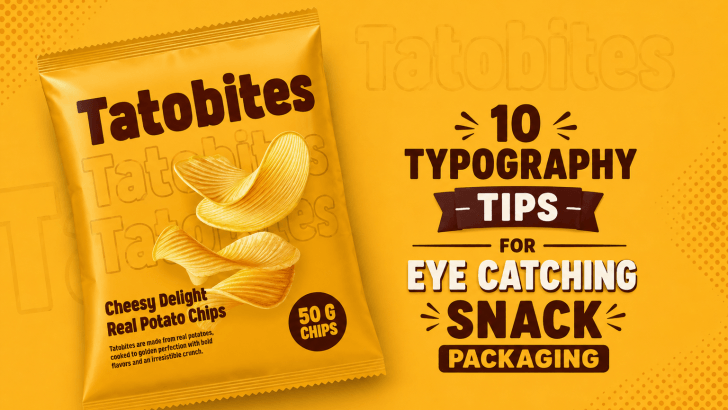
Typography tips for snack packaging are essential for brands that want to stand out in today’s competitive food market. In supermarkets, convenience stores, and online marketplaces, snack products compete for attention within seconds. While colors and illustrations are important, typography often becomes the element that immediately grabs customer interest.
The right typography can make snack packaging feel fun, delicious, premium, nostalgic, or modern. It also helps customers quickly recognize product names, flavors, and brand personalities. Whether you are designing packaging for chips, candy, cookies, beverages, or desserts, strong typography can dramatically improve your branding.
In this article, we’ll explore 10 typography tips to create eye-catching snack packaging designs that are both memorable and visually effective.
Why Typography Matters in Snack Packaging
Typography is more than just choosing a nice-looking font. It helps communicate emotion, flavor, and product identity.
Good typography can:
- Increase shelf visibility
- Improve readability
- Strengthen branding
- Create emotional appeal
- Make products more memorable
When typography is used correctly, customers instantly understand a snack product’s personality before even tasting it.
1. Choose Fonts That Match the Snack Personality
The first typography rule is choosing fonts that reflect the snack itself.
For example:
- Rounded fonts feel playful and sweet.
- Bold retro fonts feel energetic and nostalgic.
- Minimal sans-serif fonts feel modern and clean.
- Handwritten fonts feel homemade and authentic.
A spicy snack may use bold, aggressive typography, while a dessert brand may use soft and cheerful fonts.
Typography should visually represent the flavor experience.
2. Prioritize Readability
Creative typography is important, but readability should always come first.
Customers need to quickly recognize:
- Product names
- Flavor variants
- Important labels
- Promotional text
Avoid overly decorative fonts that become difficult to read, especially from a distance.
Readability Tips
- Use Large Headlines
Snack names should be highly visible on shelves.
- Avoid Thin Lettering
Thin fonts can disappear on busy packaging backgrounds.
- Test Packaging Sizes
Typography should remain clear in both print and digital previews.
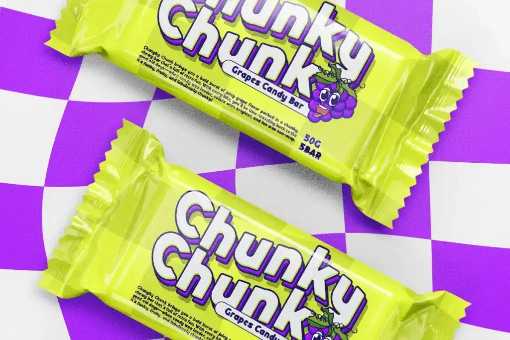
3. Use Bold Display Fonts for Impact
Snack packaging needs to compete visually with many other products. Bold display fonts help create a stronger visual impact.
Display fonts work well because they:
- Grab attention quickly
- Add personality
- Improve shelf visibility
- Create memorable branding
Large chunky typography is especially effective for:
- Candy packaging
- Chips branding
- Beverage advertisements
- Limited edition snacks
Bold fonts make products feel more exciting and energetic.
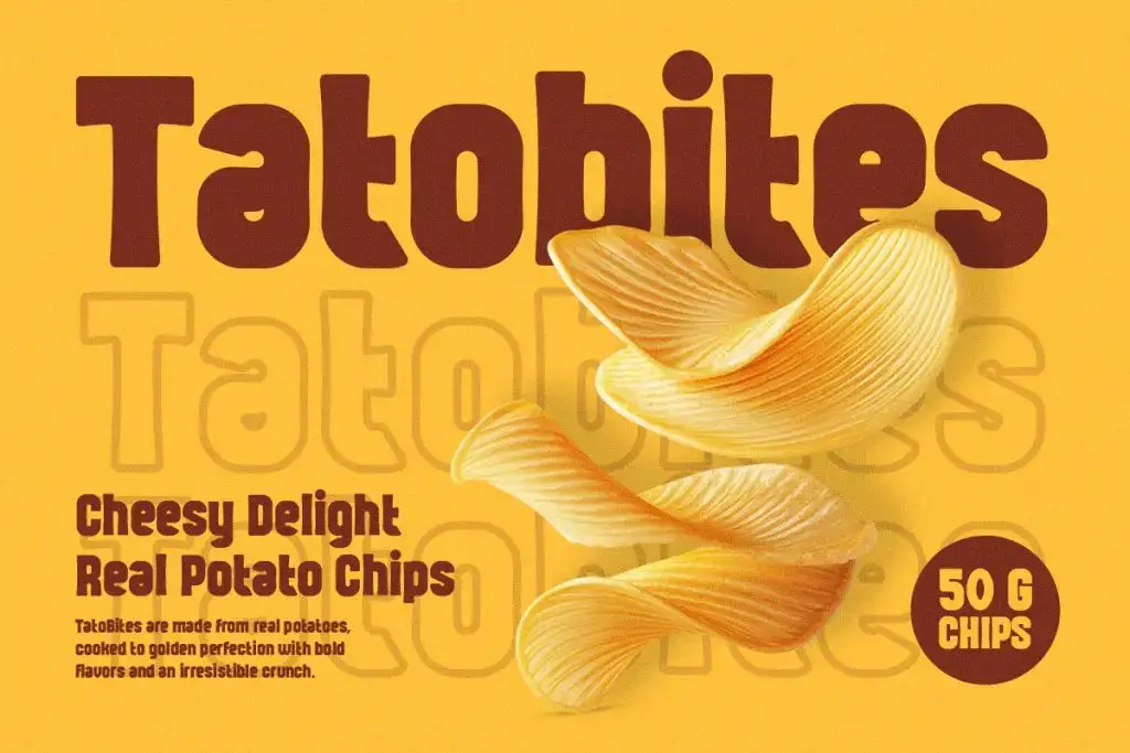
4. Create Strong Typography Hierarchy
Typography hierarchy helps organize information clearly.
Customers should instantly know:
- Product name
- Flavor
- Supporting information
Without hierarchy, packaging can feel confusing and cluttered.
How to Create a Hierarchy
- Use Different Font Sizes
The product name should always be the largest text.
- Combine Font Weights
Use bold headlines with lighter supporting text.
- Add Contrast
Different colors and spacing help separate information.
Good hierarchy improves both aesthetics and readability.
5. Use Color Psychology in Typography
Typography color strongly affects customer perception.
Different colors create different emotional responses:
- Red feels energetic and excited.
- Yellow feels cheerful and playful.
- Brown feels warm and delicious.
- Green feels fresh and natural.
- Black feels premium and bold.
Typography color should match both the product flavor and overall branding.
For example, sour candy often uses neon colors, while luxury chocolate packaging uses darker, elegant tones.
6. Add Fun Typography Effects Carefully
Typography effects can make packaging more dynamic and eye-catching.
Popular effects include:
- Shadows
- Outlines
- 3D effects
- Layered typography
- Dripping effects
- Retro textures
However, effects should not overpower readability.
The best typography effects enhance the design without making text difficult to understand.
7. Use Consistent Typography Across Branding
Consistency builds stronger brand recognition.
Use similar typography styles across:
- Packaging
- Social media
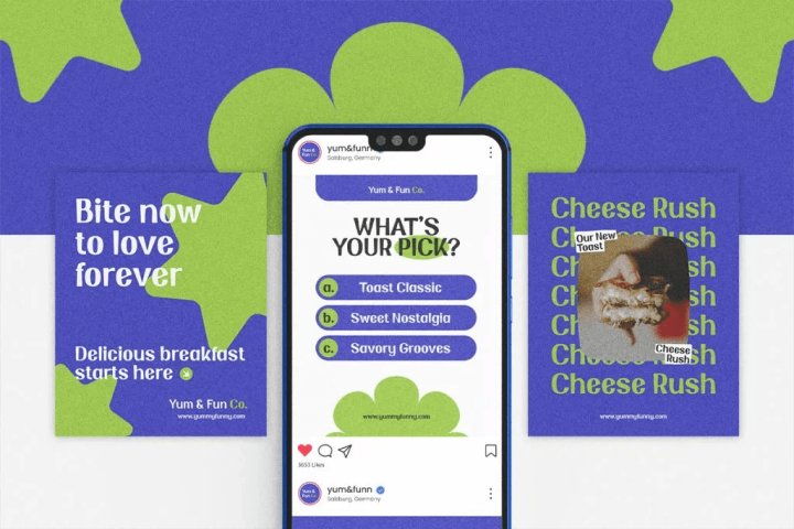
- Advertisements
- Website banners
- Promotional posters
When typography remains consistent, customers can recognize products more easily.
Strong typography systems help brands appear more professional and trustworthy.
8. Leave Enough Spacing
Crowded typography can make packaging feel messy and overwhelming.
Good spacing improves:
- Readability
- Visual balance
- Professional appearance
Important Spacing Areas
- Letter Spacing
Avoid letters touching too closely.
- Line Spacing
Text blocks need breathing room.
- Margins
Keep typography away from packaging edges.
Minimal spacing adjustments can significantly improve design quality.
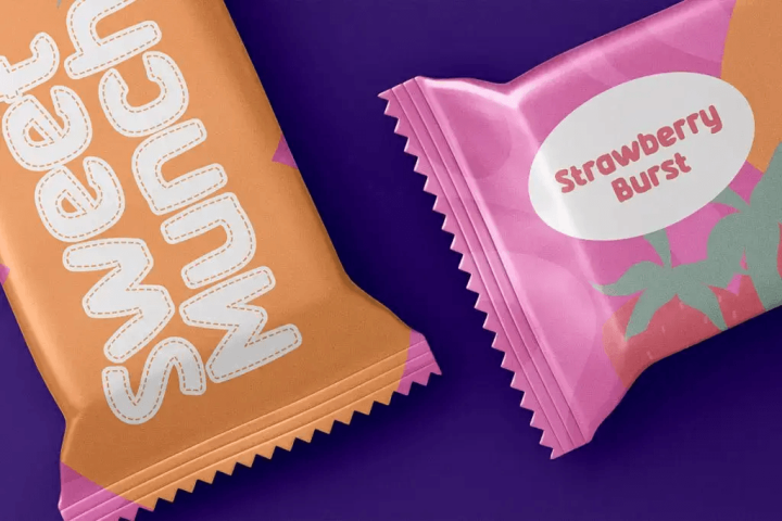
9. Combine Typography with Illustrations
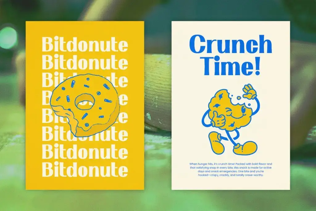
Typography works best when integrated naturally with visual elements.
For snack packaging, designers often combine typography with:
- Mascots
- Food illustrations
- Icons
- Background patterns
- Shapes and frames
This creates more immersive and engaging packaging designs.
For example:
- Candy brands may wrap text around playful illustrations.
- Beverage labels may use typography integrated with fruit graphics.
- Dessert packaging often combines rounded typography with sweet decorative elements.
Typography should feel connected to the overall visual storytelling.
10. Test Typography on Real Packaging Mockups
Typography can look very different once applied to actual packaging.
Always preview designs on:
- Pouches
- Boxes
- Bottles
- Cans
- Social media advertisements
Mockups help identify:
- Readability issues
- Contrast problems
- Spacing mistakes
- Weak visual hierarchy
Testing designs before production ensures better final results.
The Future of Typography in Snack Branding
Modern snack packaging is becoming more expressive and experimental.
Current typography trends include:
- Retro-inspired fonts
- Chubby display fonts
- Minimal clean typography
- Hand-drawn lettering
- Bold colorful type
- 3D typography
Brands are increasingly using typography as the main visual attraction instead of relying only on illustrations.
As social media continues influencing product discovery, typography will become even more important for creating shareable and memorable packaging designs.
Conclusion
These typography tips for snack packaging can help brands create stronger visual identities and more eye-catching product designs. Typography is one of the most powerful tools in packaging because it communicates personality, emotion, and flavor instantly.
By focusing on readability, hierarchy, spacing, color, and consistency, designers can create snack packaging that attracts customers and strengthens brand recognition.
Whether you’re designing candy wrappers, beverage labels, cookie boxes, or social media advertisements, great typography can turn ordinary packaging into something unforgettable.