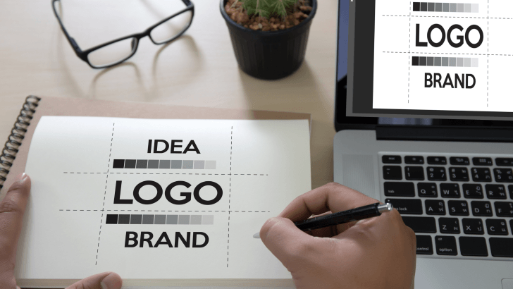
Choosing the right branding logo fonts is one of the most important steps in creating a logo that truly stands out. Typography defines how a brand is perceived at first glance, influencing recognition, trust, and memorability across digital and physical touchpoints. In competitive markets, logo fonts are not just visual elements; they are strategic branding tools.
Today, logo design is not just about looking good; it’s about differentiation. In this article, we’ll explore how the best fonts for branding logo design help brands stand out, what characteristics to look for, and how designers use typography strategically to create strong visual identities.
Why Fonts Matter in Branding Logo Design
A logo is the visual shorthand of a brand. Typography gives that shorthand a voice.
Fonts Communicate Before Words
Before anyone reads a brand name, the font already sends a signal. Sharp fonts may feel bold and modern, while soft curves can feel friendly and approachable.
Typography Creates Recognition
When used consistently, a logo font becomes inseparable from the brand itself. Think of how certain letter shapes instantly remind people of specific brands, even without color or icons.
If you want to understand how to choose the best fonts for logos, you may find this useful:
How to Choose the Best Fonts for Logos in 2026
What Makes Branding Logo Fonts Stand Out?
Not every attractive font works well in a logo. The best branding logo fonts share several important qualities.
1. Distinctive Letterforms
Standout logo fonts often have unique details, custom curves, unusual proportions, or subtle modifications that make them recognizable.
2. Simplicity with Character
Fonts that are too decorative lose clarity. Fonts that are too plain fade into the background. The balance between simplicity and personality is key.
3. Scalability and Flexibility
A strong logo font works equally well:
- On a website header
- As a social media avatar
- On packaging and print
- In large-scale signage
Sans-Serif vs Serif for Branding Logo Fonts
The sans-serif vs serif choice strongly affects how a brand is perceived.
Sans-Serif Fonts for Bold Brand Presence
Sans-serif fonts are popular for brands that want to feel:
- Modern
- Confident
- Digital-first
They often stand out through clean shapes and strong spacing.
Serif Fonts for Authority and Identity
Serif fonts bring a sense of structure and heritage.
They are often chosen by:
- Premium brands
- Editorial or cultural brands
- Companies emphasizing trust and longevity
Serif logo fonts tend to feel established and thoughtful.
Display Fonts That Make Logos Stand Out

Display fonts are designed to attract attention.
When to Use Display Branding Logo Fonts
Display fonts work best when:
- The brand wants immediate impact
- The logo is mostly used at larger sizes
- The font is paired with simpler supporting typography
They are common in fashion, entertainment, and creative industries.
Minimal Fonts That Still Feel Unique

Minimal does not mean boring.
Why Minimal Branding Logo Fonts Work
Minimal fonts stand out through:
- Precision
- Spacing
- Subtle customization
Many modern brands customize minimalist fonts by altering one or two letters to create a distinctive logo without sacrificing clarity.
Custom vs Ready-Made Fonts for Logo Design
Choosing between custom and existing fonts is a strategic decision.
Ready-Made Fonts
Pros:
- Faster to implement
- Cost-effective
- Large variety available
Cons:
- Risk of similarity with other brands
If you’re exploring fonts, you may find inspiration on Pinterest.
Custom or Modified Fonts
Pros:
- Strong differentiation
- Exclusive brand identity
- Better long-term recognition
Cons:
- Higher time and cost investment
Many brands start with a ready-made font and customize it slightly for their logo.
How Branding Logo Fonts Influence Brand Perception
Typography affects how people feel about a brand.
Strong Fonts Build Confidence
Clear, balanced fonts suggest professionalism and reliability.
Unique Fonts Increase Memorability
Distinct letterforms help brands stand out in crowded markets.
Consistent Fonts Build Trust
Using the same logo font across platforms reinforces familiarity and trust.
Common Font Mistakes in Branding Logo Design
Even experienced designers can weaken a logo with poor font choices.
Following Trends Too Closely
Trendy fonts can date a logo quickly.
Overdecorating Letterforms
Too many visual effects reduce readability and scalability.
Ignoring Context
A logo font should match the brand’s industry, audience, and tone.
Testing Branding Logo Fonts Before Finalizing
Choosing a logo font should never be rushed.
Test in Real Situations
Preview the logo font on:
- Websites
- Social media profiles
- Business cards
- Packaging mockups
Get Feedback
Fresh eyes can reveal whether a font feels distinctive or generic.
Refine Over Time
Small typographic adjustments can dramatically improve clarity and impact.
Final Thoughts on Branding Logo Fonts That Stand Out
Choosing the best branding logo fonts is about more than visual appeal; it’s about strategy. The right font helps a logo stand out, communicate personality, and remain recognizable as the brand grows.
By focusing on clarity, uniqueness, and consistency, designers can create logo typography that not only looks good today but continues to represent the brand confidently in the future.