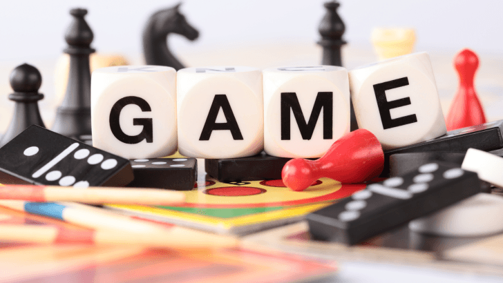
Designing games for children is all about fun, imagination, and clarity. Colors, characters, and animations matter, but typography plays a surprisingly big role too. Choosing the right kids’ game fonts helps make games easier to read, more engaging, and visually exciting for young players.
In this article, we’ll explore why typography matters in kids game design, what makes a font suitable for children, and the 9 best fonts for kids game design that are playful, readable, and eye-catching in 2026.
Why Typography Matters in Fonts for Kids Game Design
Kids interact with games differently from adults. Fonts must support learning, play, and enjoyment simultaneously.
Fonts Affect Readability and Focus
Children are still developing reading skills. Fonts with clear shapes and generous spacing help kids recognize letters quickly and avoid confusion.
Typography Shapes the Game’s Personality
Fonts can make a game feel:
- Fun and silly
- Friendly and welcoming
- Adventurous and imaginative
The right font supports the game’s theme and keeps kids emotionally engaged.
Typography plays an important role in child-friendly digital experiences. Many designers look for visual inspiration from curated font collections and playful typography examples. You can explore a wide range of kid-friendly game typography ideas on Font Kingdom’s Pinterest, which showcases fun and readable fonts used in creative projects.
Additionally, you can read the article Best Fonts for Roblox Horror Game Titles for additional font recommendations.
What Makes a Font Suitable for Kids’ Games?
Not every playful font works well in games. The best kids’ game fonts share a few important characteristics.
1. Simple Letter Shapes
Avoid overly complex or decorative characters that make letters hard to distinguish.
2. Rounded and Friendly Style
Rounded edges feel softer and more approachable, which works well for young audiences.
3. High Readability on Screens
Fonts must stay clear on small screens, buttons, menus, and dialogue boxes.
4 Best Fonts for Kids Game That Are Fun and Eye-Catching
Below are nine fun and eye-catching fonts commonly used or inspired by kids-focused digital experiences.
1. Zombox – Spooky Fonts for Kids Game
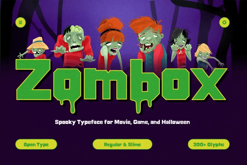
Zombox is a spooky zombie-inspired display typeface built for designers who want to capture the raw, undead energy of horror. With its jagged, decayed letterforms and spine-chilling vibe, Zombox is perfect for projects that demand a terrifying yet bold presence.
2. Woodzy – A Fun Font for Kids Game

Woodzy is the perfect playful font for kids, bringing a sense of adventure to your designs. Featuring rounded edges, quirky details, and bold strokes, Woodzy adds charm and fun to any project, whether it’s for kids’ games, branding, or outdoor products. This playful font for kids is ideal for creating engaging, nature-inspired designs.
3. Ranventure – Bold Display Video Game Font

Ranventure is a bold display video game font that brings energy to your designs. Built for gamers and content creators, it features chunky, expressive letterforms that inject fun and character into your project. Whether you’re designing a game interface, making YouTube content, or creating retro-inspired visuals, Ranventure ensures your message stands out.
4. Kinzle – Retro Fun Display Font
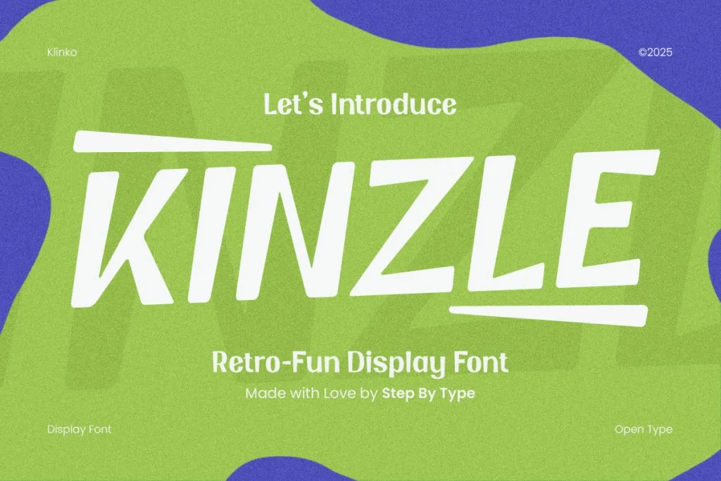
Kinzle is a retro fun display font that effortlessly blends bold 70s and 90s charm with a modern twist. Not only does it feature playful, chunky letterforms, but it also brings an undeniable energy to every project. This makes it the ideal choice for branding, social media content, and a handcrafted font built for gamers
Common Font Mistakes in Kids Game Design
Even fun fonts can cause problems if misused.
1. Overusing Decorative Fonts
Too many playful fonts make screens chaotic and hard to read.
2. Poor Contrast
Low contrast between text and background reduces readability, especially on tablets and phones.
3. Ignoring Accessibility
Good kids’ game fonts should support readability for children with different learning abilities.
How Fonts for Kids Game Influence Engagement
Typography directly affects how long kids stay engaged.
Friendly Fonts Reduce Frustration
Clear text helps kids understand instructions faster.
Fun Fonts Increase Emotional Connection
Playful typography supports positive feelings and curiosity.
Consistent Fonts Build Familiarity
Using the same font style throughout the game helps kids feel oriented and confident.
Final Thoughts on Choosing Fonts for Kids Game
Choosing the right kids’ game fonts is about balancing fun and function. Fonts should be playful enough to excite young players, yet clear enough to support learning and smooth gameplay.
By focusing on readability, friendly shapes, and thoughtful font pairing, designers can create kids’ games that are visually engaging, accessible, and enjoyable for years to come.