Typography in visual storytelling plays a much bigger role than most people realize. While images, colors, and layouts often receive the most attention, typography quietly shapes how audiences feel, think, and connect with a story. The right font can make a design feel emotional, playful, dramatic, elegant, or even mysterious before a single sentence is fully read.
From movie posters and advertisements to websites and social media graphics, typography helps communicate personality and emotion. Designers use fonts not only to deliver information but also to create atmosphere and strengthen storytelling. In many cases, typography becomes the voice of the visual itself.
In this article, we’ll explore why typography matters in storytelling, how it affects audience perception, and why choosing the right font can completely transform a design project.
What Is Typography in Visual Storytelling?
Typography in visual storytelling refers to the use of fonts, text styles, spacing, and layout to support and enhance a narrative. It combines both communication and emotion through letterforms.
Typography is not simply about making text readable. It also influences:
- Mood
- Tone
- Emotion
- Brand identity
- Audience engagement
- Visual hierarchy
For example, a horror movie poster often uses sharp or distorted typography to create fear, while children’s brands typically use rounded, playful fonts to appear friendly and fun.
Typography helps audiences understand the story before they even start reading.
Why Typography Matters in Storytelling
Creating Emotional Impact
Fonts have emotional personalities. Some fonts feel elegant and luxurious, while others feel energetic or chaotic.
A serif font with thin strokes may create a classic and sophisticated atmosphere. Meanwhile, a chunky display font with rounded edges can feel playful and cheerful.
Designers use typography strategically to influence emotional responses from audiences.
Examples:
- Horror fonts create tension and fear.
- Retro fonts create nostalgia.
- Script fonts feel romantic and personal.
- Minimalist sans-serif fonts feel modern and clean.
The emotional impact of typography is often subconscious, but it strongly affects how people experience visual content.
Guiding the Viewer’s Attention
Typography also helps direct the viewer’s eyes across a design. Through size, weight, spacing, and contrast, designers can create a clear reading flow.
This is called visual hierarchy.
For example:
- Large bold headlines grab attention first.
- Subheadings provide structure.
- Smaller body text delivers details.
Without a strong typography hierarchy, designs can feel confusing and difficult to understand.
Strengthening Brand Identity
Typography is a key part of branding. Many famous brands are instantly recognizable because of their typography style.
Think about how luxury brands use elegant serif fonts, while tech companies often use clean geometric sans-serif typefaces.
Typography helps brands communicate:
- Personality
- Values
- Target audience
- Industry positioning
Consistent typography creates stronger brand recognition and trust.
How Typography Influences Different Media
Typography in Advertising
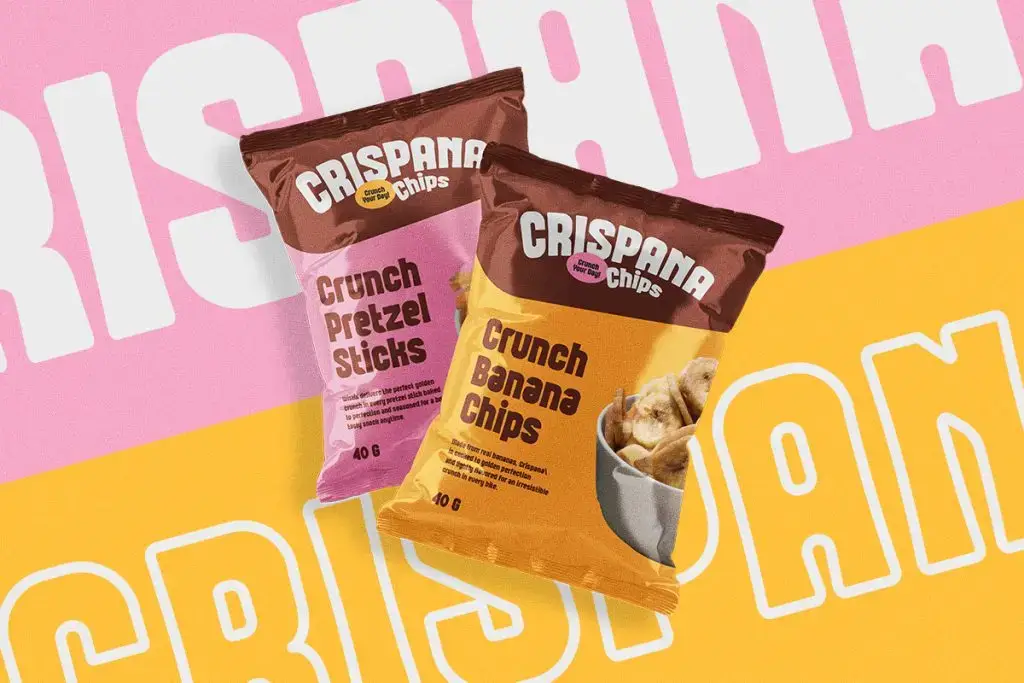
Advertising relies heavily on visual storytelling, and typography plays a key role in quickly capturing attention.
Bold display fonts are commonly used in:
- Billboards
- Product packaging
- Social media ads
- Promotional posters
The font style immediately communicates the energy of the campaign.
For example:
- Thick retro fonts feel energetic and nostalgic.
- Luxury serif fonts create premium impressions.
- Handwritten fonts feel authentic and personal.
Good advertising typography makes messages memorable.
Typography in Movies and Games
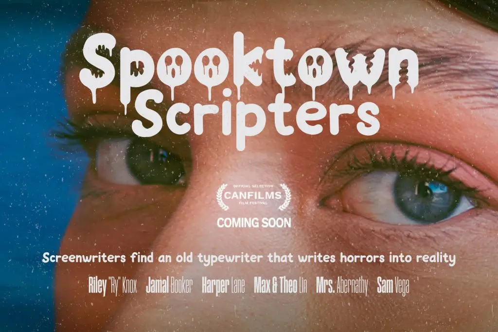
Typography is also essential in entertainment industries like movies and gaming.
A game title font helps players instantly understand the game genre. Horror games use dripping or distressed fonts, while adventure games often use rugged or fantasy-inspired typography.
Movie posters use typography to create emotional expectations before audiences even watch the film.
Typography helps establish:
- Genre
- Mood
- Time period
- Narrative tone
That’s why choosing the right font is critical for entertainment branding.
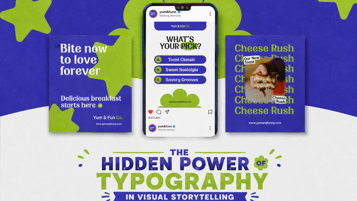
Typography in Social Media Content
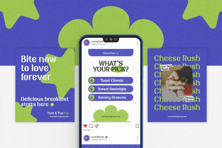
On social media, typography helps content stand out in crowded feeds.
Creators often use:
- Large bold headlines
- Playful display fonts
- Minimal modern typography
- Colorful text overlays
Typography improves readability while also strengthening visual identity.
Strong typography can increase:
- Engagement
- Brand recognition
- Content memorability
This is especially important for creators and businesses building online audiences.
Key Elements of Effective Typography
Font Style
The font itself communicates personality.
- Serif Fonts
Elegant, classic, trustworthy.
- Sans-Serif Fonts
Modern, clean, professional.
- Display Fonts
Creative, expressive, attention-grabbing.
- Script Fonts
Personal, artistic, emotional.
Choosing the right font style depends on the story you want to tell.
Spacing and Alignment
Typography is not only about fonts. Spacing also affects readability and aesthetics.
Important typography elements include:
- Letter spacing
- Line spacing
- Paragraph spacing
- Text alignment
Poor spacing can make even beautiful fonts difficult to read. Good typography balances creativity with readability.
Color and Contrast
Typography color influences emotional perception and visibility.
For example:
- Red text feels energetic or urgent.
- Black typography feels bold and premium.
- Pastel colors feel soft and friendly.
Contrast also ensures readability across backgrounds.
Strong typography always considers accessibility and user experience.
Common Typography Mistakes in Storytelling
Using Too Many Fonts
One common mistake is mixing too many font styles in a single design. This creates visual chaos and weakens storytelling.
Most professional designs use:
- One display font
- One supporting body font
Consistency creates a stronger visual identity.
Ignoring Readability
Decorative fonts may look attractive, but they should remain readable.
Typography should enhance communication, not make it harder.
Always test typography across:
- Desktop
- Mobile devices
- Print materials
- Social media previews
Weak Hierarchy
When all text looks similar, audiences don’t know where to focus.
Typography hierarchy helps organize information clearly.
Use:
- Different font sizes
- Bold weights
- Spacing variations
- Color contrast
This improves user experience significantly.
The Future of Typography in Visual Storytelling
Typography continues evolving alongside digital design trends. Today, designers experiment with:
- Animated typography
- Variable fonts
- 3D typography
- Interactive text effects
- AI-generated font styles
Modern audiences expect visuals to feel immersive and engaging. Typography is becoming more expressive and dynamic than ever before.
Brands and creators that understand typography can create stronger emotional connections with audiences.
Looking for typography inspiration? Explore Font Licensing Basics to avoid legal issues and find modern font ideas on Creative Market.
Conclusion
The hidden power of typography in visual storytelling goes far beyond simple readability. Typography shapes emotion, strengthens branding, guides attention, and helps audiences connect with stories on a deeper level.
Whether you’re designing advertisements, social media graphics, movie posters, websites, or packaging, choosing the right typography can dramatically improve the effectiveness of your visuals.
Great storytelling is not only about words or images. Sometimes, the font itself becomes part of the story.